Hello! As we approach the middle of the year, I wanted to step back and review some of the most interesting ideas about design that we’ve heard so far in 2023. Hopefully they’ll bring you some inspiration for the months to come 🪄
You can read my 2022 idea roundups here, here and here.
Enjoying Design Lobster? Please share it with a friend, colleague or fellow designer.
1. Collect things that you love.
Design is the act of seeking something, though at the beginning (and throughout) you aren’t quite sure exactly what. As a consequence, during the design process it’s not uncommon to feel quite lost.
One way to navigate through this is to keep a collection of things that you love. These don’t have to be from the same design discipline, in fact it helps if they don’t. It only matters that they move you in some way.
Examples of well-made, self-contained things can guide us towards what we need to do to achieve something similar in our own work, even if we can’t full articulate exactly what we’ve learned from them. If I’m feeling stuck or lost, sometimes just being in the presence of some of the things I’ve collected can feel like finding a compass, and knowing which way is north again.
🎁 More nice things in the full essay
2. Understand intent.
T9 (Text on 9 keys) is a predictive text technology developed for mobile phones around 1995 by Cliff Kushler and Martin King of Tegic Communications. Originally created as an eye-tracking system for those with motor impairments, the concept was adapted for mobile phones' numerical keypads.
The system greatly sped up text entry by predicting intended words based on a single tap for each letter. Despite initial difficulties getting users to trust T9’s predictive capabilities, its popularity soared with the rise of SMS texting in the late 90s, proving the power of design that can quickly work out an individual’s intent.
☎️ Read the full story of T9 in Design Lobster #125
3. Balance familiarity with surprise.
Design involves a delicate balance between familiarity and novelty. While established patterns help users comprehend and use a product, novel elements make it stand out. The challenge lies in maintaining freshness without being overwhelming or cognitively draining.
Derek Thompson, in his book Hitmakers, introduces the concept of the Aesthetic Aha! Moment, a transition from confusion to clarity when one encounters something unexpected yet linked to something familiar. Successful art, music, and design guide this journey from unfamiliarity to familiarity, resulting in a product that is exciting yet comfortable. Achieving this balance requires skill, creativity, and a touch of luck.
💥 More unexpected design in Design Lobster #132
4. Think about the in-between states.
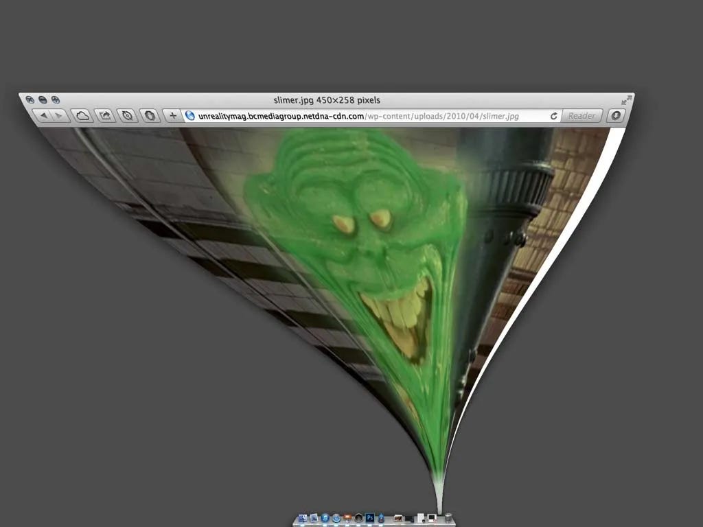
In his 2013 article What Screens Want designer Frank Chimero argued that the essential quality of a screen is its ability to transform from one state to another – a quality he called Flux.
His essay is a great reminder for designers to focus not just on appearances but also on the interactive behaviour and transitions between fixed states of screen elements. Designing these transitional moments is crucial to helping users understand how components relate to each other, and thus how to use your design.
🤏 More beautiful surfaces in Design Lobster #126
5. Consider your user’s health.
In the 1930s, architect Alvar Aalto designed a revolutionary tuberculosis sanatorium in Finland's Paimio pine woods. In an era before antibiotics, the sanatorium was conceived as a medical instrument to aid patients' recovery, offering sunlight and fresh air through south-facing private balconies and a rooftop terrace overlooking the forest.
Aalto focused on health-oriented details, such as glare-free bedside lights, splash-minimising sinks, and a bent plywood Paimio chair designed to aid breathing. Whatever you’re designing, there’s much to learn from Aalto’s deep consideration of the health impacts of design choices.
❤️ Even more healthy design in Design Lobster #127
6. Indulge in a little whimsy.
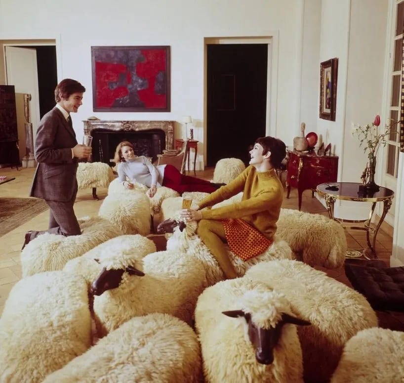
In 1965, sculptor François-Xavier Lalanne unveiled his Moutons de Laine at the Salon de la Jeune Peinture in Paris, startling attendees with realistic sheep-shaped chairs crafted from cast bronze and real sheepskin.
With their moutons, Lalanne and his wife Claude introduced a whimsical rural element into urban salons, at the same time subtly satirising bourgeois ‘herd mentality’. Despite their potential discomfort for sitting, the Moutons became iconic, finding their way into the collections of Yves Saint-Laurent and Karl Lagerfeld, among others.
🐑 More surprises in Design Lobster #132
7. Take the path of least resistance.
Douglas Engelbart, known for inventing the computer mouse, also experimented with foot-controlled interfaces. This inspired the development of products like the Versatron Foot Mouse and the Mole in the 1980s. These pressure-sensitive mats, controlled by foot movements, never gained wide adoption beyond some niche accessibility uses, largely due to their steep learning curve compared to hand-controlled interfaces, which many users were already using elsewhere.
If you’re trying to get somebody set up quickly with a design, the right choice is often to use elements that they’re already familiar with, rather than reinventing the wheel (or mouse).
🦶 More footloose design in Design Lobster #130
8. Know what the deluxe version is.
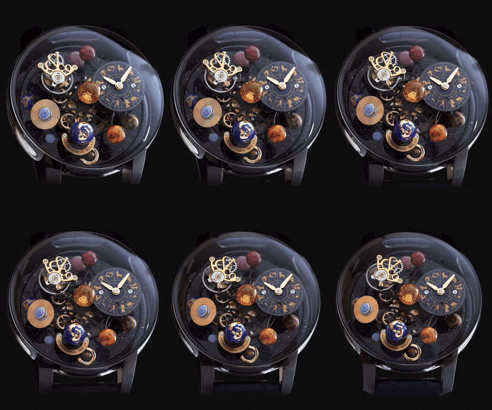
The Astronomia Solar watch by Jacob & Co., retailing over $300,000, is a testament to opulence and excess. With an 18 karat rose gold zodiac dial, hand-assembled flying tourbillon, and a rotating collection of semi-precious planets orbiting a Citrine Quartz Sun, this miniature wrist-worn solar system is as about as extravagant as design can get.
The designer Jacob Arobo gained recognition for his excessive designs among hip hop stars in the '80s and '90s, capitalising on the attention-grabbing power of his creations. Whilst I normally plead in this newsletter for greater simplicity and restraint, I do think it sometimes helps us to imagine the most elaborate version of our design too, if only as a thought experiment.
💸 More luxurious design in Design Lobster #129
9. Work with, not against, materials.
Donald Judd, known for his minimalist geometric sculptures, ventured into furniture design in the 70s, fueled by his aversion to the overly decorative furniture prevalent then. His creation is a strikingly minimal chair, composed of just four precisely-cut Douglas Fir boards. His clean-lined aesthetic reflects a respect for materials, aiming to interfere minimally with the factory-made elements.
Judd had an approach to design that revered the intrinsic qualities of the materials, resulting in furniture that is reduced to its fundamental form and function (even if occasionally a little uncomfortable as a consequence).
🪑 Even more clean lines in Design Lobster #133
10. Do a little less.
Design is, and will always be, a low-bandwidth medium and that makes it crucial to be highly selective about what we try to get across. Try to do too much and your many good intentions will simply drown each other out.
As designers, we should always be questioning how much ‘less’ our designs can be. To challenge ourselves to deliver more, and more emotion especially, with ever more limited means.
✏️ Read the full essay: Doing less
Thanks for reading this special edition of Design Lobster. See you in a couple of weeks.
Ben 🦞
And lastly, a design remix…

Enjoyed this special edition? Let me know by clicking the heart button.
👇





Good one! I really like this one :)
Oh the days of the T9. I was wireless computing director for a national mobile phone chain in New Zealand, and the things we went though at the end of the end of the 90s was amazing. One of my favourite creations of the time was the Palm Pilot with it's graffiti. In no time flat I was able to use its custom handwriting recognition on the screen taking notes almost as fast as an old school secretary.