Happy Monday! This week’s Design Lobster is gliding over some beautiful surfaces. We’re exploring Frank Chimero’s ideas about the true nature of screens, and admiring a beautiful early 20th-century lacquer screen by Eileen Gray. Sometimes it’s ok to be superficial 👅
✨Enjoying Design Lobster? Please share it with a friend, colleague or fellow designer.
Question: What does a screen want?

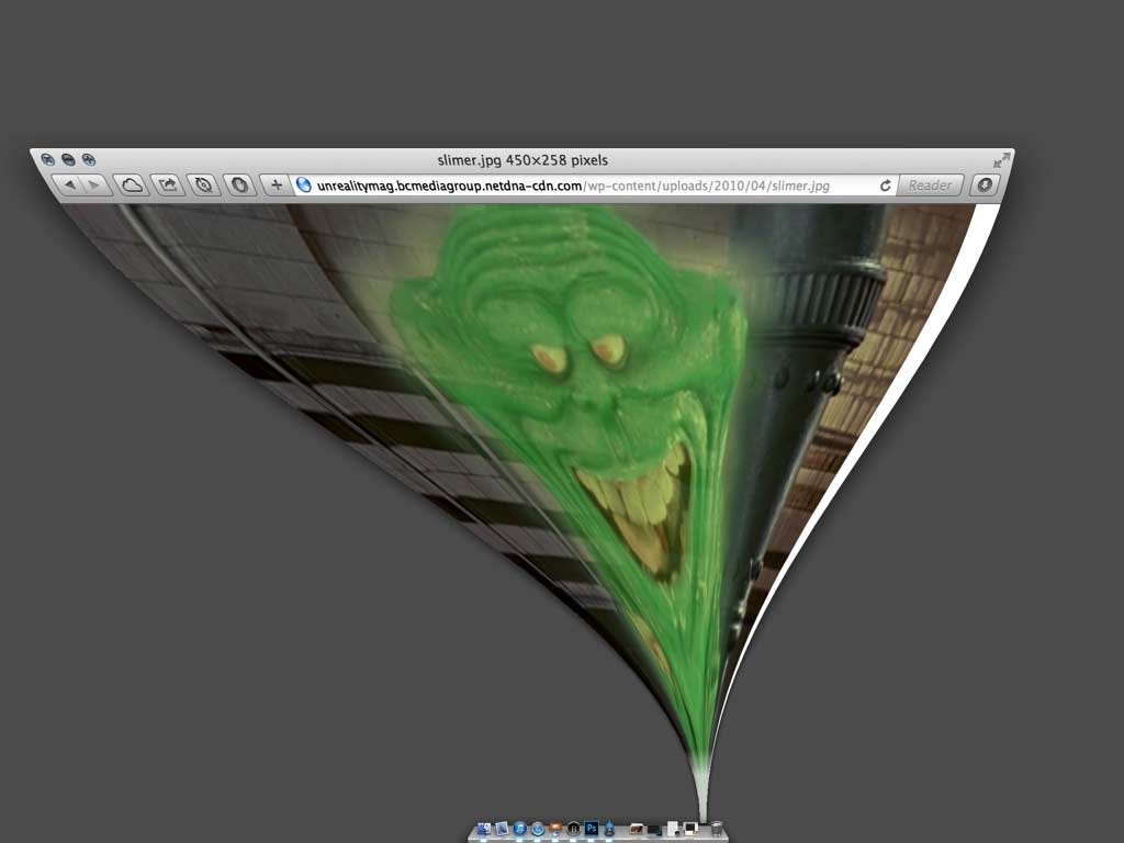
When I was researching last week’s essay, I was reminded of this wonderful 2013 piece – What Screens Want – by designer Frank Chimero. In it, he provides a potted history of the moving surface we call a screen and articulates what he believes is the fundamental quality of this medium - Flux.
Flux, in Chimero’s formulation, is the capacity for a screen to change from one thing to another, its malleability. And he believes it’s our job as designers to be intentional about how things move and change on a screen so the next person understands what they are and how they relate to each to each other without any need for cumbersome explanation:
A designer’s work is not only about how the things look, but also their behaviors in response to interaction, and the adjustments they make between their fixed states. In fact, designing the way elements adapt and morph in the in-between moments is half of your work as a designer. You’re crafting the interstitials.
Its a provocation that I’ve always taken seriously when designing an interface for a screen. It’s often more technically difficult than I’d like to achieve smooth transitions between states, but the extra effort always makes learning a new tool much easier for the end-user.
Design takeaway: How well-crafted are your interstitials?
✍️ Read Frank Chimero’s 2013 essay in full
Object: Le Destin screen
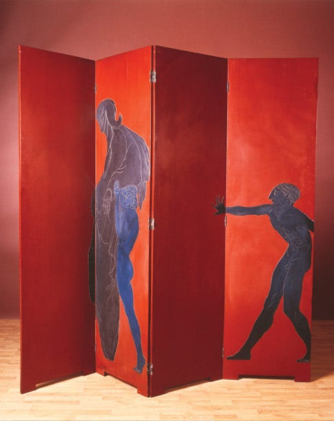
Working from her studio in Paris, architect and designer Eileen Gray created "Le Destin" in 1914 – selling it to the famous art collector Jacques Doucet that same year. Each of the four hinged panels is made of wood and heavily lacquered, the base in red and the figures – which reportedly are based on a drawing of a lunatic incarcerated in La Salpetrière hospital – in shades of silver and blue.
The design resulted from her obsession with the difficult and time-consuming art of lacquer-making, which she had learned under the tutelage of Japanese master Seizo Sugawara. Gray was unusual in combining an interest in this ancient craft along with a highly progressive Modernist spirit – the final design hovers between these sensibilities making it feel somehow timeless.
Over the years, the screen has had many admirers. In 1972 Yves Saint Laurent famously bought it for his apartment on rue de Babylone, where it lived until the contents were auctioned in 2009.
I have always been interested in screens as a supremely practical form of sculpture, able to bring character to a space at the same time as subdividing it to create more privacy. I would love to see more everyday objects made with as much obsessive craft as this screen. Just look at the way the hand of the smaller figure’s hand reaches into the next panel as if he is pushing it himself 😍
Design takeaway: How could you elevate your design with some principles from an older craft tradition?
🪑 We sat on an unconventional chair by Eileen Gray in Design Lobster #5
Quote: “Surface is never just a surface. It is always the revelation of something else.”
– Juhani Pallasmaa
We last heard from architectural theorist and philosopher Juhani Pallasmaa in Design Lobster #120. This quote is rather mysterious, but I like the way it suggests that a surface always reveals more than we realise. If we design something carefully, even the outermost layer of something can reveal great depths.
Have a great week,
Ben 🦞
Enjoyed this week’s Design Lobster? Let me know by clicking the heart button ❤️
👇


