🖐 Five ideas about design
A new species of Design Lobster
Hello and happy Monday! I promised you that this year I’d be tweaking the regular schedule to try out some new writing formats. Well here is the first fruit of that effort – I’ve trawled the Design Lobster archives to find five ideas about design for you to bring to your work this week.
Love this new kind of lobster? Hate it? Let me know in the comments! Ben 🦞
✨Enjoying Design Lobster? Please share it with a friend, colleague or fellow designer.
1. Be more specific.
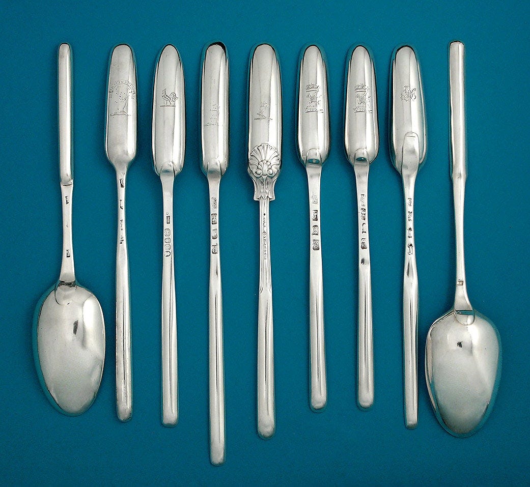
In the very first Design Lobster I shared the story of the marrow spoon. Just one delightfully odd example of the veritable Cambrian explosion of cutlery species that occurred in the 19th century. Grape shears? Asparagus tongs? Terrapin forks? Back then you were covered with a specialist tool for every possible delicacy.
The marrow spoon’s narrow scoop allowed a Victorian diner to elegantly remove bone marrow from a bone without getting their fingers dirty in the process. The design matched an impressive attentiveness the shape of bones and the physics of marrow extraction with some now perhaps rather old-fashioned assumptions about what constituted acceptable table manners and etiquette.
Designers nowadays operate in a very different world, but there’s something we can take from the particularity with which these spoons fitted their context. How could you take more delight in the specifics of the situation you are designing in?
🥄 Victorian cutlery YouTube is where it’s at
2. Paint around your stones.
In the north-east of Lanzarote a series of caves known as Jameos were created by the lava flows of a huge volcanic eruption. In the 1960’s with the arrival of tourism on the island, it was decided to develop these extraordinary natural phenomena into an attraction, initially a nightclub followed by a pool complex and concert hall.
It’s not difficult to imagine how this effort could have been a disaster if it had not been for the guiding hand of César Manrique – a local artist who, on returning to Lanzarote after stints in New York and Madrid took it as his mission to protect and beautify the island he loved. His approach, which borrowed from the ideas of Land Art was to work with rather than against the natural features of the caves, making the smallest adjustments possible to accommodate the new program.
As befitting this approach, no architectural drawings were ever made. Instead, Manrique and his team instead worked directly with the site, rearranging boulders and painting around individual rocks to bring the natural and artificial elements together.
I think there’s a lot for designers of all kinds to learn from this approach. Working with, rather than against the elements of the situation in which you find yourself operating is useful whether or not you find yourself in a volcanic cave. Every project has it’s stones, lumpy obstacles or constraints we can’t do anything about. It’s up to us to paint around them and turn them into features.
▶️ Here’s a documentary about Manrique’s work (Spanish with English subtitles)
3. Make the personal, universal.
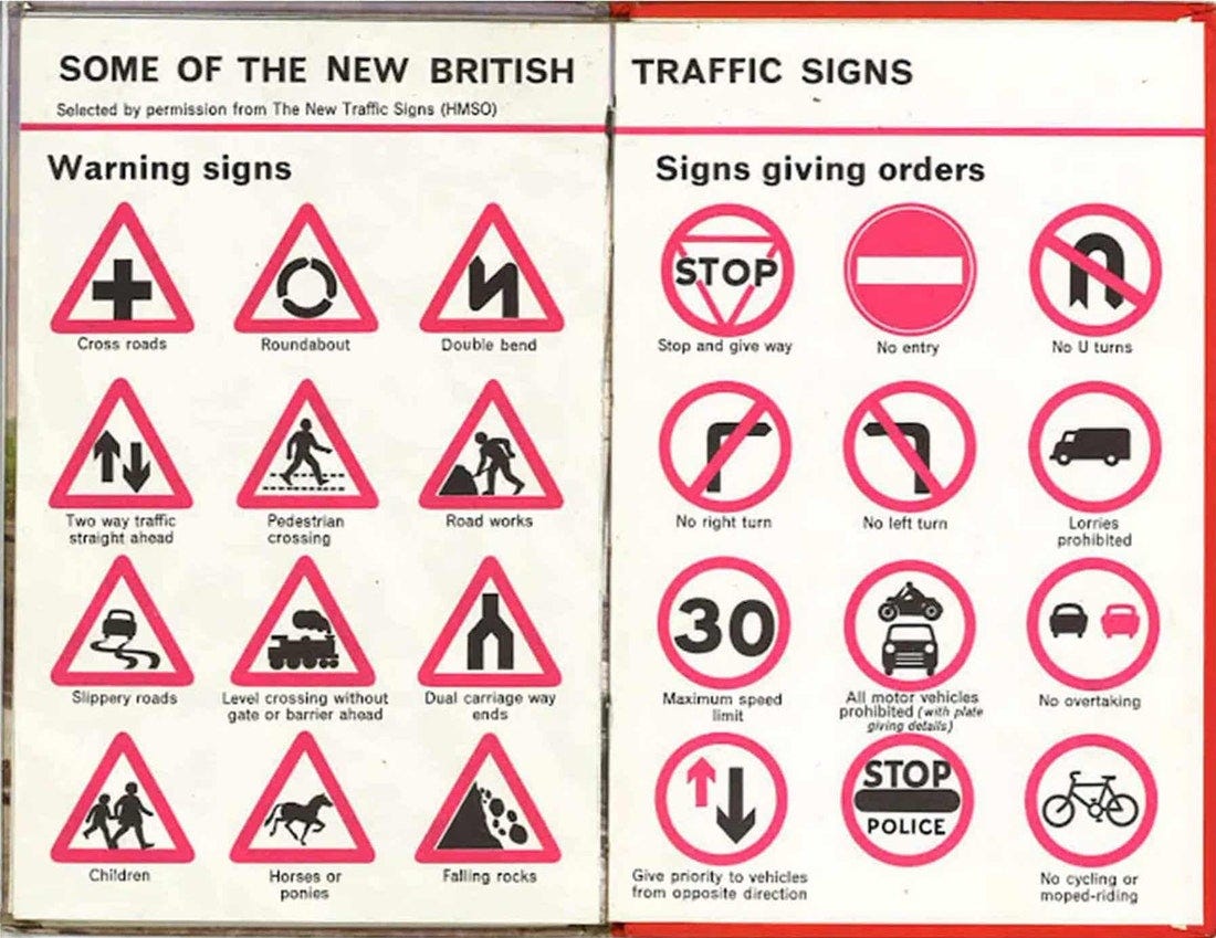
In 1957 Margaret Calvert worked with Jock Kinneir on the huge task of overhauling British road signs for the arrival of motorways. As well as devising a new kind of font that was legible at high-speed, Calvert also designed a group of distinctive black, white and red pictograms for order or warning signs, shown above.
Many of the signs came from Calvert’s own lived experience. The school children sign was based on a photograph from her childhood and the galloping horse came out of her interest in the photography of Eadweard Muybridge. Her ability to distill these personal images into simple but distinct universal symbols, comprehensible at speed from a passing car, is something I believe we can all learn from.
One of the paradoxes of creative work is that it is often through intense attentiveness to our own experience that we make connections to others. In the same way that vulnerability brings people closer, designing with the full awareness of your particular perspective can result in solutions that work better for everyone.
⛔️ Watch a documentary about Margaret Calvert’s work on UK road signs
4. Keep a peripheral view.
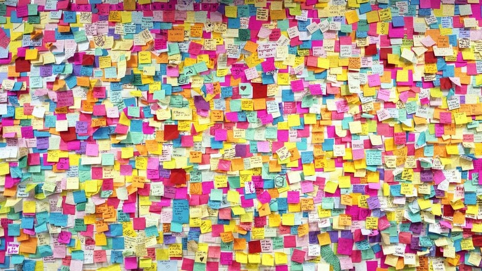
The humble Post-It note is a ubiquitous feature of the modern office but not everyone knows that the adhesive that keeps those colourful squares attached was originally designed to be super-strong. Spencer Silver, who was working for 3M in the late 60s on adhesives for aircraft construction, was crestfallen to discover that due to a mistake, the glue was weak and pressure-sensitive. The mistake however was a fortuitous one, the new adhesive could also be peeled away cleanly and reused.
For many years it was not obvious how to market this new type of adhesive but Arthur Fry, also working with Spencer in 3M, believed that applying the adhesive to paper would result in more successful products. Reportedly he had the idea while in choir practice, wishing he had sticky bookmark that wouldn’t damage his book. In 1978, his sticky reusable Post-It suddenly became a huge success.
Design rarely proceeds in a straight line. The story of the Post-It shows how important it is to stay alert to the potential of unintended findings in your process. Weaknesses, if we are able to transform our thinking, can often become strengths. So keep an eye on the periphery 👀
🟨Watch this short youtube documentary on the Post-It note.
5. Draw upside down.
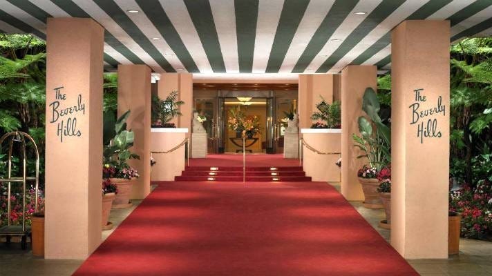
Paul Revere Williams worked prolifically on over 2500 buildings in the Los Angeles area between 1923 and 1980. He was the first Black architect to become a member of the American Institute of Architects, and in 1957, its first Black fellow. His candid account of becoming an architect against the odds is called I am an architect and well worth your time. In this account Williams describes a curious drafting skill he cultivated:
…I spent hours learning to draw upside down. Then with a client seated across from me, I would rapidly begin to sketch the living room of his house. Invariably his interest would be excited by the trick.
But it was more than a trick, for, as the room developed before his eyes, I would ask for suggestions and for approval of my own ideas. He became a full partner in the birth of that room as I filled in the details of the drawing.
By turning the drawing around, Williams gave his clients the impression that they were leading the design. More than just a client, in his words they became a partner in his design process.
Of course, his adoption of this technique came from a place of brutal necessity – as a way to counter his clients’ racism. We should lament that this was the reason he had to draw this way. Nevertheless, I think in this practice there is something to learn about how to make participants in any design process feel more included and in control. The design process can be intimidating, especially to disadvantaged groups, and it is part of our responsibilities as designers to try and find ways to make it less so. How could you find a way to “draw upside down” in your next project?
👨🏾🦳Listen to a podcast about Paul Revere William’s work in Hollywood
Thanks for reading through this new type of Design Lobster. Have a great week!
Ben 🦞
Enjoyed this week’s issue? Let me know by clicking the heart button.
👇


Enjoyed this read. Thank you
Is there an Audubon Field guide to Victorian flatware? Because I need one now.