#127 Sick of design 🤢
Buildings that heal + anti-nausea glasses
Welcome! This week’s Design Lobster is sick, literally. We’re exploring how buildings can be designed to heal patients faster and examining some funky-looking glasses that solve travel sickness. Just what the doctor ordered! 👩⚕️
Question: Can a building make us healthier?

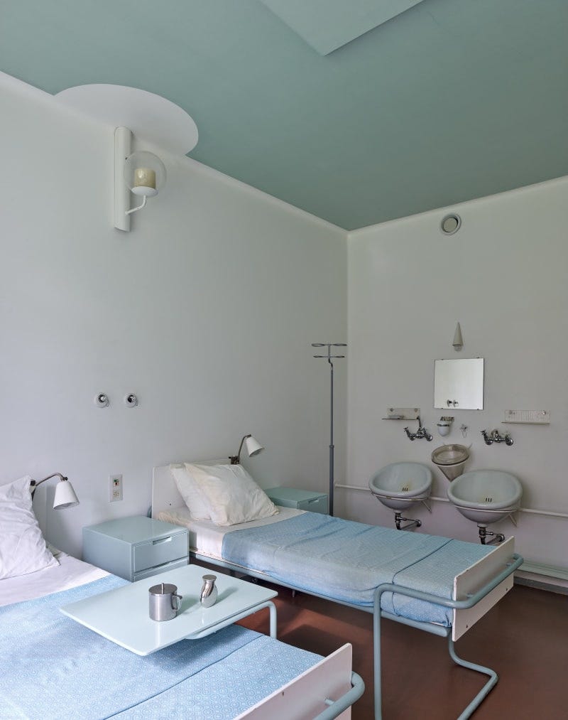
In the pine woods near Paimio in the south-west of Finland, the architect Alvar Aalto designed a radical new kind of sanatorium in the 1930s for tuberculosis patients. Before the discovery of antibiotics in the following decade, TB remained a deadly killer and the sanatorium movement, of which Paimio is one example, aimed to provide the best conditions for recovery, in the absence of a cure.
To that end, Aalto’s building at Paimio was conceived as a kind of medical instrument, whose careful orientation in the landscape would aid a patient’s convalescence with plenty of sunlight and fresh air. Every room had a south-facing private balcony and there was a large roof terrace overlooking the forest where patients could relax whilst enjoying the view.
Many details also reinforced the mission to make residents healthier by design. Aalto designed bedside lights that were carefully shaded to prevent glare and sinks that were angled to minimise splashing. The bent plywood Paimio chair, which was especially created for this project, had a backrest that was deigned to open up the chest and make breathing easier.
Aalto even worked with the artist Eino Kauria to devise the colour scheme of the sanatorium. They chose sunny yellow lino for the corridors and a restful green colour for the ceilings of patient room – gentler on the eyes of patients confined to their beds.
This week Daniel Ek, the founder of Spotify, announced a foray into preventative healthcare with the launch of a new body-scanner product. It’s a move in the right direction, but perhaps we could reap even larger health benefits by starting prevention even earlier – with more intentional design of the environments we live in.
Design takeaway: How could your design promote the health of the people who use it?
💡 In Design Lobster #43 we learned about some surreal roof lights designed by Alvar Aalto
Enjoying Design Lobster? Share it with a friend, colleague or fellow designer 🤲🦞
Object: SEETROËN glasses
For me, childhood car journeys could be somewhat of an ordeal… let’s just say my parents made sure there were plenty of bags to hand somewhere in the family car. Even now when Google or Waze decides to direct me down a winding country lane I can feel my stomach beginning to heave once more…
Well fortunately for all of us cursed with travel sickness, Citroën (in collaboration with Paris design agency Studio 5.5) has developed an unusual kind of wearable device called Seetroën. The glasses feature four rings that are filled with blue liquid, creating a visual horizon line both in front of you and to each side. Travel sickness is caused by the conflicting signals between your eyes and inner ear, leading to confusion in your brain about the body's movement, but the position of the liquid helps bring everything back into alignment.
Judging by reviews the glasses seem to work, though every reviewer also mentions how foolish they feel wearing them in public because of the looks they attract. It’s a shame that the design forces people to choose between feeling comfortable and looking normal! I can’t help but wonder whether there’s a more subtle way to implement the technology.
Thanks to reader Rupert for telling me about them!
Design takeaway: Is the look of your design putting people off?
🤓 Watch Citroën’s rather eccentric video about how the glasses work
Quote: “The life of a designer is a life of fight. Fight against the ugliness. Just like a doctor fights against disease. For us, the visual disease is what we have around, and what we try to do is cure it somehow with design.”
– Massimo Vignelli
An appropriate, if rather pugnacious quote this week from the designer of the New York City subway map and American Airlines logo. Not all of us may go about our calling in such feisty manner, but we can hopefully all agree that better design is the cure for so many problems.
Hope you have a healthy week,
Ben 🦞
Enjoyed this week’s Design Lobster? Let me know by clicking the heart button ❤️
👇


Interesting. But I regard the venture of the founder of Spotify into Medicine to be about as auspicious as the venture of Amazon into medicine. It seems synonymous to me with the advent of biotechnology, of increased surveillance and storage of our personal information, of the ideas of the World economic Forum and their 15 minute cities, table top virus exercises, mass vaccinations and all the rest. They can have their Brave New World.