Hello and happy holidays! To round out the year I’ve got a special edition for you with ten interesting ideas about design we heard in 2022. Curl up in your comfiest chair and get inspired for the year to come 🪄
You can read the previous special editions here and here. Enjoy! 🎅
Enjoying Design Lobster? Please share it with a friend, colleague or fellow designer.
1. Help, don’t hack, perception
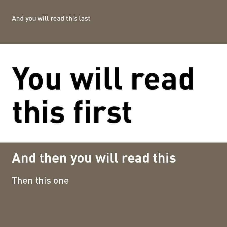
The concept of visual salience refers to how designers use size, contrast, and layout to guide a viewer's gaze on a page or screen. The image above demonstrates how this works by showing how the text with the highest salience (due to its size and contrast) attracts the viewer's gaze first, followed by text with decreasing size and position below it. As shown above, the very last piece of text you notice can counter-intuitively be the highest up, if its size and contrast are low enough.
As designers, it is important to be mindful of how we use visual elements to influence perception and ensure that we are aiding, rather than manipulating, the viewer's understanding of the content. Let’s be good Jedis in 2023.
🤨 Explore how perception works in more detail in Design Lobster #110
2. Connect the ordinary, to the cosmic
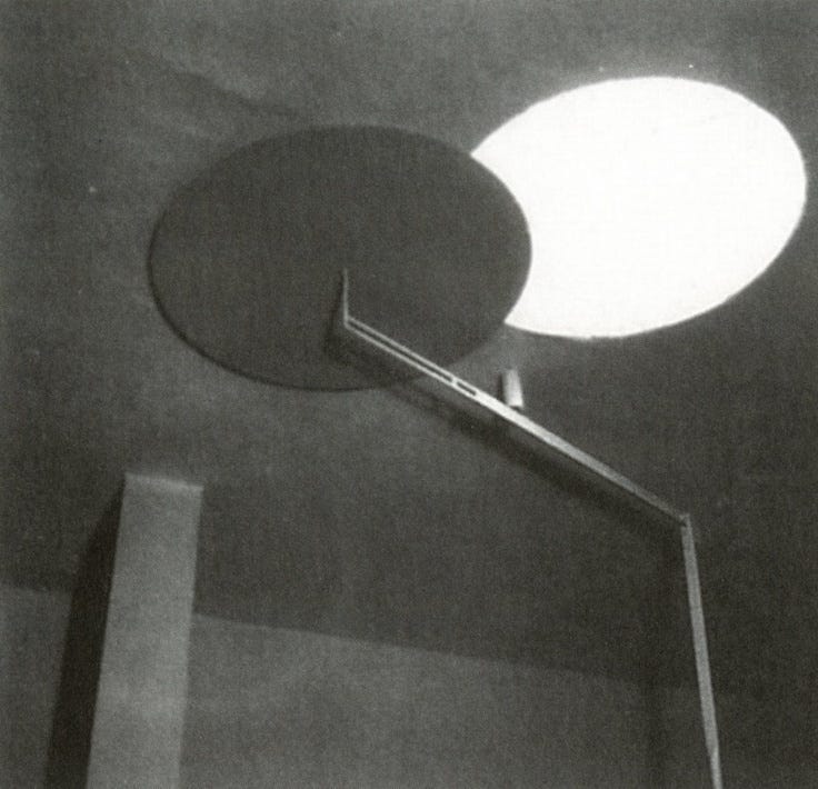
Tempe à Pailla is a villa in Menton, France that was designed and built by Eileen Gray in the 1930s as her private residence. It is known for its white modernist design and its careful orientation to the sun – characteristic of Gray's architecture. Like other buildings Gray designed, the villa features a wide range of expressive shutters, louvres, and sliding doors that allow the occupant to control the amount of light and privacy in each room.
In the bedroom, the villa features a unique circular roof-light that rotates over the opening like the moon over the sun during an eclipse. It’s a simple design choice that nevertheless brings symbolic significance to the mundane domestic act of drawing the blinds. What other ways could the design of artificial environments connect us back to the natural world?
🌞 Learn more about designing with sunlight in Design Lobster #114
3. Consider social codes
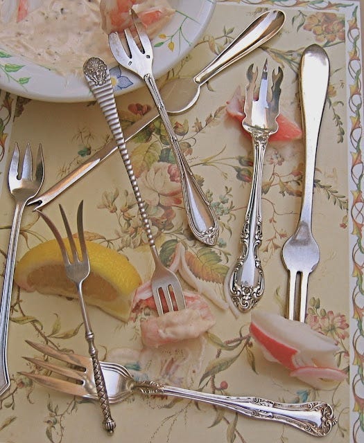
The lobster pick, also known as a lobster fork, was a utensil used during the Victorian era at upper middle-class dining tables. It had elongated tines that were useful to extract reluctant lobster meat from its shell. In the 19th century etiquette dictated that diners should not touch their food with their hands, which resulted in a veritable explosion of specialised utensils including fish knives, oyster spoons, and terrapin forks to prevent the possibility of embarrassment at the dinner table.
Correct usage of these utensils served as indicators of social status and helped reinforce class distinctions in the 19th century, but we can take a different lesson in our more egalitarian age. Design is never divorced from the social reality it inhabits, and we should be mindful of the ways it reinforces or undermines it.
🦞 More submarine design in Design Lobster #100
4. Play with scale
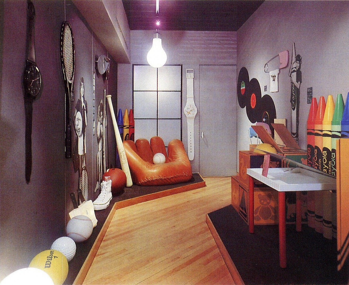
In the 1980s and 1990s, Phyllis Prinz and Bob Malkin opened Think Big! – a store in New York City that sold oversized replicas of everyday objects like crayons, pencils, and baseballs. The store was inspired by Pop Art and its success reflected the commercialisation of the artistic movement in the 1980s. The store was popular until it closed in 1994, but recently, there has been a resurgence of interest in this type of design, with giant matchboxes and baseball gloves becoming highly collectible.
Whilst we might blanche at the environmental impact of these oversized objects, only the most churlish would deny the riotous sense of fun they have. I challenge us all to let loose and mess around with scale in 2023.
🎾 More oversize objects in Design Lobster #111
5. Remember the “off” state
The Danish designer Poul Henningsen was commissioned to create light fittings for a new restaurant in the Langelinie Pavilion in Denmark in 1958. The many-petalled design he came up with was based on an earlier creation called the PH Septima, which also featured rows of delicate metal leaves that hid the bulb within and emitted a gentle, rosy glow when lit.
The so-called “Artichoke” light, resembling a globe artichoke and weighing about 25kg, succeeds as a daring piece of modern design, but is also not afraid of laughing at itself. Even when turned off it brings character to a room, transforming a vegetal silhouette into a kind of sculpture.
💡 More illuminating design in Design Lobster #102
6. Make two become one
A kotatsu (炬燵)) is a type of low dining table that has an inbuilt blanket and electric heater. It is used to keep people warm while eating and reduces the need to heat an entire room. The kotatsu originated from the irori (囲炉裏) or sunken hearth, which was used in traditional Japanese houses to provide warmth.
So many good ideas await us when we smush together categories. In Alice in Wonderland, the Mad Hatter asks ‘Why is a raven like a writing desk?’ and we should not be afraid of asking other seemingly absurd questions in the design process to uncover new and useful ideas.
🔥 Get (into) your comfort zone in Design Lobster #107
7. Embrace uncertainty

Certainty theatrics is a term coined by Shreyas Doshi to describe the tendency for people to present facts, figures, and data in a way that creates an illusion of certainty, especially in high-stakes meetings. It is a common behaviour in large organisations and can be counterproductive, as it can create a culture that is intolerant of uncertainty and hard on creative thinking.
It is important to be rigorous and consider data, but it is equally critical to show humility in the face of an unpredictable universe. Some degree of uncertainty will always exist in any new enterprise and any quest to eliminate it entirely will hurt our ability to do our best work.
🤔 Dive into uncertainty in Design Lobster #118
8. Connect with a myth
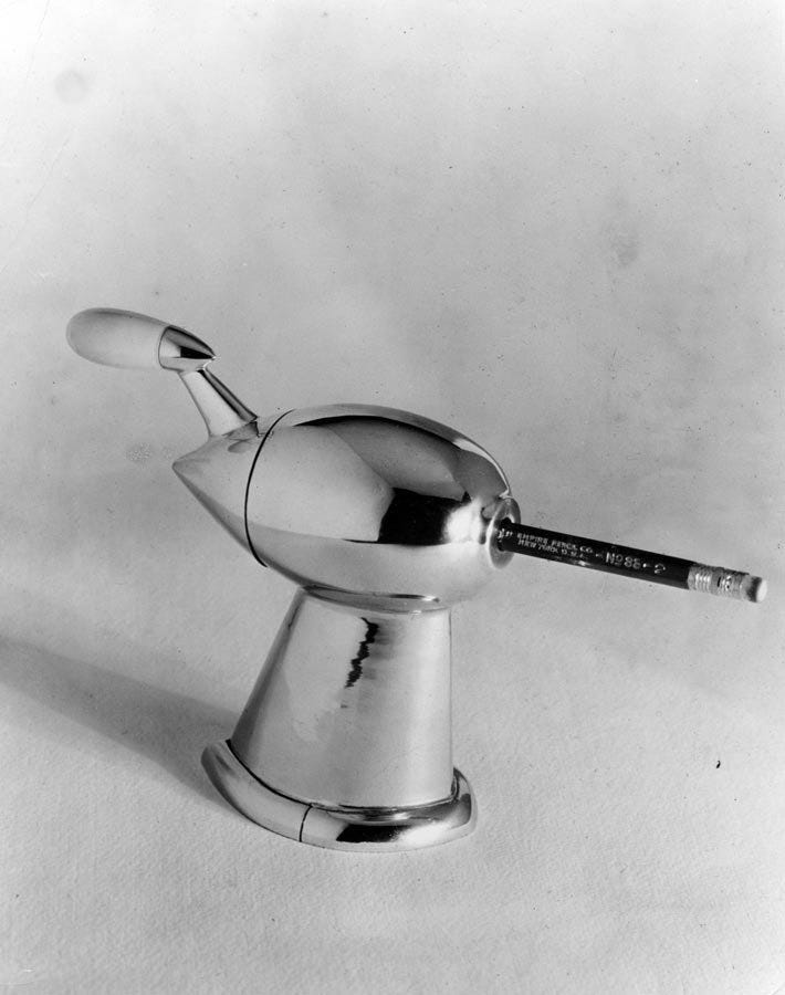
20th century industrial designer Raymond Loewy was famous for streamlining forms, often borrowing the visual language of powered flight to give products a modern, jet-age look. One example of this is a pencil sharpener patented by Loewy in 1933, which has a teardrop-shaped chrome design that looks as if it could fly through the sky or even outer space.
While some may see these design choices as superficial, I’m inclined to see them as a form of modern myth-making that helped American consumers orient themselves in a new technological society. What myths can you invoke in your design in 2023?
🚀Take flight in Design Lobster #104
9. Tweak a detail (that’s hidden in plain sight)
In 2000, designer Kenya Hara held an exhibition in which he challenged other designers and artists to redesign everyday objects. One of the tasks – given to Japanese architect Shigeru Ban – was to redesign the humble roll of toilet paper.
Ban responded with a square-cored design that allows for more efficient transport and encourages more sparing use. Unlike a round toilet roll, the square roll turns in segments, making it easy for people to take only the sheets they need. This extremely simple change produces a remarkably clever outcome. What other small tweaks could we make to familiar things in 2023?
💩 Even more crap in Design Lobster #116
10. Think with your tools

This year has seen the sudden appearance of sophisticated generative AI models, such as DALL-E, Imagen, and of course ChatGPT. These models allow users to write or visualise almost anything they can imagine, from Nefertiti doom-scrolling her iPhone to bible verses about peanut butter sandwiches. Debate continues about whether prompting tools like these has genuine artistic or intellectual merit, with some disappointed by the inherently derivative nature of what they produce and others believing that they democratise creativity.
We certainly live in unsettling times, but I take a lot of consolation from the ambition of Doug Engelbart, the inventor of the computer mouse. His great hope was that by making computers easier to use you could allow the human mind to go further than it ever could before and solve even more difficult problems. I’m excited to see the new kinds of thinking that we’ll be able to do with AI tools helping us out.
🤖 Preview the future in Design Lobster #113
Thanks for reading this special edition of Design Lobster. Have a great festive break and see you in 2023!
Ben 🦞
Enjoyed this special edition? Let me know by clicking the heart button.
👇





What a great post! Sharing on Gab. Thank you for your work!