#102 Let there be light
Pancake lenses & artichoke lights
Design Lobster #102 is bringing some light into these grey winter months. From the weird optical technologies powering virtual reality experiences, to a classic of 20th century lighting design. Hope you find it illuminating! 💡😉
I’m also pleased to announce that this week Design Lobster is sponsored by Wynter!
Want to give back to the community while having a low-key side hustle to fund your habit? Wynter is looking for people to join its research panel.
Participate in messaging research and get paid for your feedback. It’s a super low-key commitment, with most surveys taking just 15 minutes.
Question: What is a pancake lens?

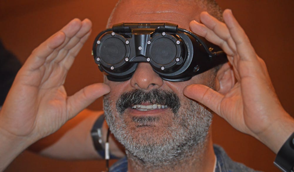
The “reality” of a virtual reality headset is actually an illusion created by magnifying two very small and high-resolution screens through lenses in front of your eyes. Traditionally this magnification has been achieved by so-called “Fresnel” lenses – a type of lens originally designed for use in lighthouses in the 19th century and which help reduce motion sickness (particularly a phenomenon called pupil-swim) in a headset-wearer.
However, Fresnel lenses are thick and cannot be placed too close to the screen, which limits how small and light a headset can be. Much investment is therefore piling into new types of lenses that might be able to provide a more comfortable viewing experience. One promising contender – known as the “pancake” due to its short flat shape – places two lens elements much closer to the screen, reflecting light back and forth between them to achieve magnification. In theory at least, this results in a far lighter and thinner headset (and thus a less achey neck). Apple – ever in the business of making objects thinner, lighter and more desirable – is rumoured to be using lenses like this in its upcoming headset 👀
Design takeaway: What’s preventing your design from being more comfortable?
🧿🧿 Take a look at the Sensorama - a wacky VR device from the 1950s
Object: PH Artichoke light
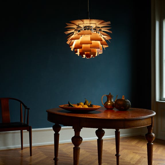
After the Second World War, some architect friends of designer Poul Henningsen were rebuilding the Langelinie Pavilion, a once-beloved waterfront destination that had been bombed out during the conflict. They had a vision for a modern light-filled restaurant on one of the floors and wanted Poul’s help lighting the space. Their brief, for light fittings that looked as good when off as on, led Poul to elaborate on a design he had created decades earlier called the PH Septima.
He reimagined this older design with twelve (rather than seven) rows of copper leaves that entirely concealed the bulb within. The inside of each leaf was painted a pale pink, diffusing a gentle, rosy glow over the diners below. When not in use each light was a sculpture in itself, bearing of course a distinct resemblance to a globe artichoke – hence the name.
Each Artichoke light weighed about 25kg and had to be hung using special wiring normally used in aircraft. I admire them for their thoughtful handling of electric light and sense of humour. Who would have believed a metal vegetable could look so beautiful?
Design takeaway: What does your design look like when it’s “off”?
💡 In Design Lobster #31 we admired another of Poul’s PH Lamps
Quote: “Light is more than watts and footcandles. Light is metaphor. Light is knowledge, light is life, light is light.”
– Diane Frolov
Diane Frolov, one of the TV writers behind legendary series The Sopranos delivers a quote here that has lots of relevance for designers. So often we find ourselves the guardians of the qualitative aspects of a project. Our ability to imagine how things come together as an experience is one of the most important contributions we can make.
Have a radiant week,
Ben 🦞
Enjoyed this week’s Design Lobster? Let me know by clicking the heart button ❤️
👇


