This week’s Design Lobster is sitting up and paying attention. We’re exploring some of the quirks of visual hierarchy, and looking at a project by Google that investigates how notifications might be delivered in a less intrusive way.
✨Enjoying Design Lobster? Please share it with a friend, colleague or fellow designer.
Question: What is visual salience?
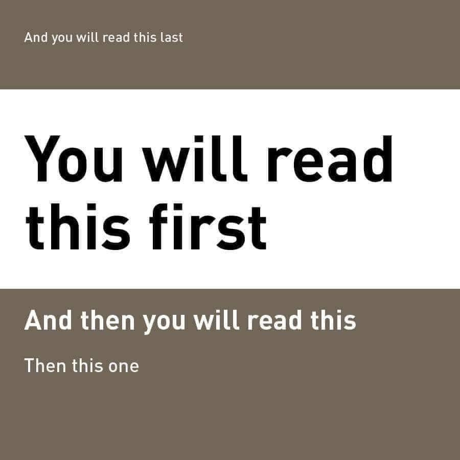
The image above makes occasional rounds on Twitter and Instagram after breaking out as a meme in 2019. It neatly (and almost spookily) demonstrates they way that size, contrast and layout can be controlled by designers to precisely guide our gaze across a page or screen.
The key concept is something called visual salience. In the example above You will read this first has the highest salience due it’s size and significantly higher contrast than the other text. Our gaze then goes to And then you will read this and Then this one because of their descending size and position below the most dominant text. Even though humans normally scan a page in a Z-pattern from top to bottom, the dramatic salience of You will read this first means that our gaze only goes to the tiny And you will read this last at the very top after having considered all of the other text.
It’s tough being a brain. They have to process enormous amounts of visual data to determine what is an isn’t important about a scene, relying on things like size and contrast as shortcuts. As designers we should be responsible in the way we deploy these visual qualities so that we are aiding, rather than merely hacking people’s perception.
Design takeaway: Are you in control of the salience of elements in your design?
✍️ In Design Lobster #76 we looked at the evolutionary psychology of red notification dots
Object: Google Little Signals
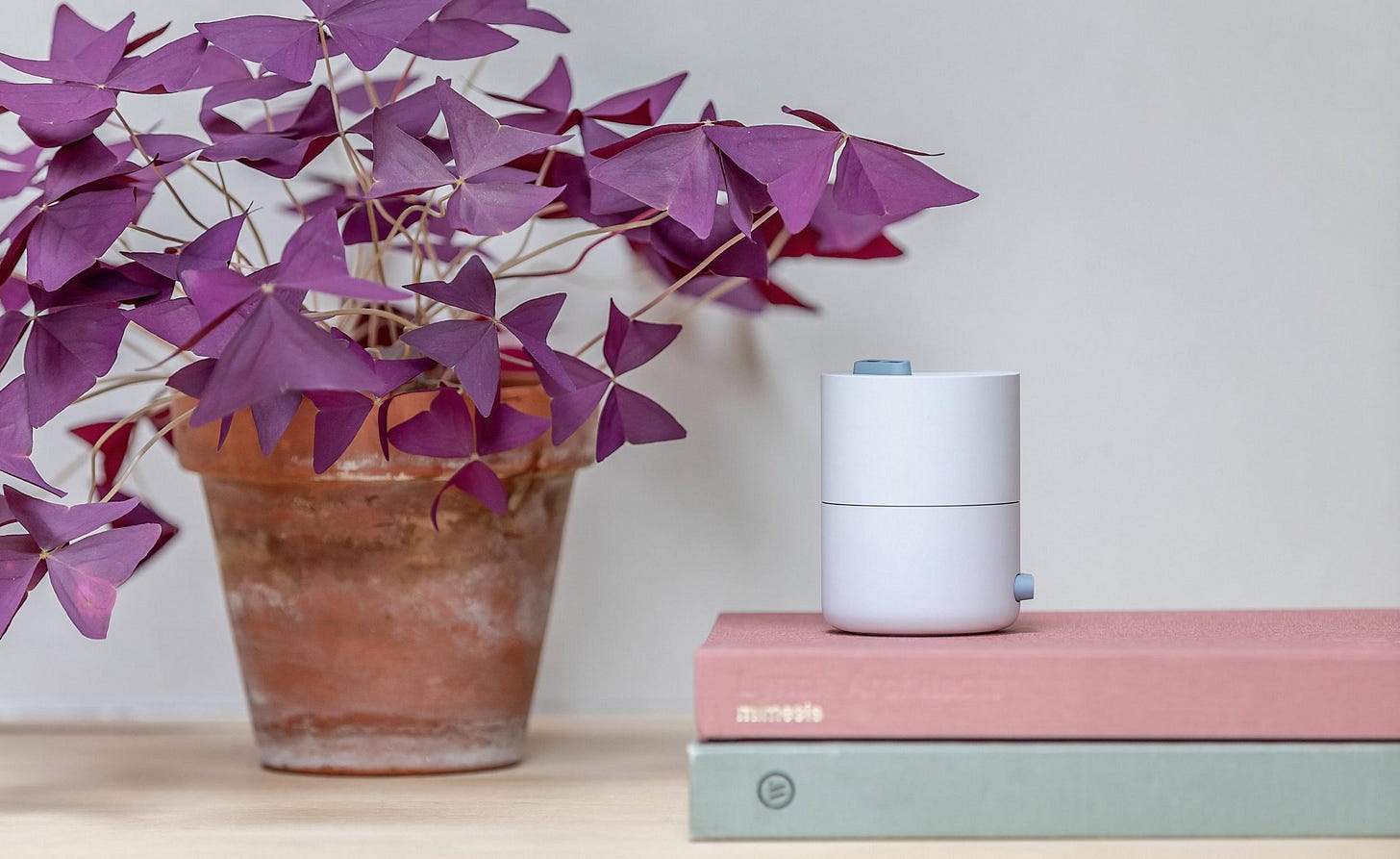
Last month, Google’s Seed Studio shared a project called Little Signals that explored subtler types of interaction than the buzzes, beeps and chimes that our phones emit throughout the day. Working with Map Project Office and inspired by phenomena like the whistle of a kettle and the tick of an analogue clock, the design team built six experiments that used gentle taps, puffs of air and even changing shadows to communicate that something has happened.
I’m always interested in calm technology like this – devices that recede into the background and don’t force us straight to a screen. Most ‘smart home’ concepts these days seem to rely on huge grids of controls that flash up on your tv or phone. I would love to see this subtler approach brought into that space.
Design takeaway: How could your design be more sparing with people’s attention?
▶️ Watch a video showing the experiments in action
Quote: ‘Attention must be paid’ is the cardinal rule of design discipline, for the designer is above all someone who pays attention to the situation at hand.
– Ralph Caplan, design critic
We’ve heard some of Ralph’s thoughts in a previous issue of Design Lobster. I like the emphasis he puts here on being receptive to the situation you find yourself in. It’s this close observation combined with a little creativity and boldness that leads to the best design.
What will you be paying attention to this week?
Ben 🦞
Enjoyed this week’s Design Lobster? Let me know by clicking the heart button ❤️
👇


Some great concepts here. The marketing, I had read all the lines without even thinking about what I was doing. The new ideas from Google sound a little spooky, but I love where they are going.
so glad i signed up for this newsletter, i rarely have time to read newsletters but when I do, I end up reading this one and its been so refreshing