This issue of Design Lobster is pushing boundaries of all kinds. From the curious case of the oversized label on the Angostura Bitters bottle, to the jumbo stock of an early 90’s NYC retail institution. Let’s see what we can squeeze in this week… 🍋
✨Enjoying Design Lobster? Please share it with a friend, colleague or fellow designer.
Question: What was the Think Big! store?

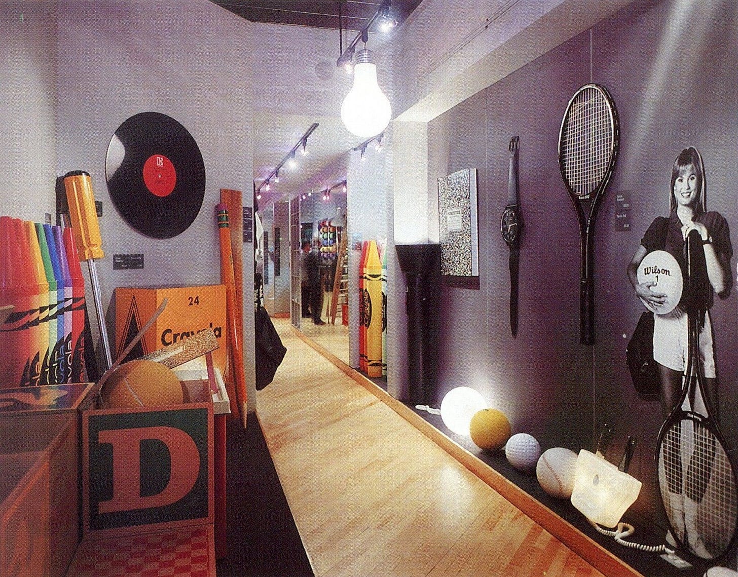
In 80’s and early 90’s New York City, two friends – Phyllis Prinz and Bob Malkin – gave up their day jobs to fulfil a decidedly niche retail fantasy. The Think Big! store opened in 1979 in a small premises in SoHo stocking exclusively oversized replicas of everyday items like crayons, pencils and baseballs. You can see some of their characteristic stock in the photo above. It’s all chunky AF and splendidly surreal.
The pair had been inspired by Pop Art to set up the shop and the gigantic objects they sold chart how this 60’s artistic movement became 80’s big business. At once edgy and infantilising, it was the perfect Yuppie bachelor pad decor and sales boomed until 1994, when they were finally wound up.
Reportedly, this kind of design has been experiencing a resurgence in interest of late, with giant matchboxes and such like now collector’s items. I can’t deny the design choices sit rather uneasily with our own time’s environmental concerns, but in a world so troubled, the madcap delight of a humungous hand mirror or safety pin might be just the distraction we need.
Design takeaway: What impact would changing the scale of your design have?
🫵 The dream of Think Big! lives on today at greatbigstuff.com
Object: Angostura Bitters
Have you ever, in the mist of pouring yourself an Old Fashioned or Gin Sling, wondered why the label on your Angostura Bitters is so much taller than the bottle itself? The story behind this goes back to the late 19th century, when the brand’s founder Dr. Johann Siegert died. He left the business to his three sons Carlos, Luis, and Alfredo and they decided to enter a branding competition together to bring a new audience to their fifty-year-old product.
One brother took responsibility for the bottle, and the other for the label, only for them to realise too late that they had been working to entirely different sizes. Nevertheless, they decided to enter the competition with the mismatched label and bottle, and though they didn’t win, they were advised to continue using it because it was so distinctive. This kind of oversized label has becomes so synonymous with Bitters that new brands still come out now with similar designs.
I’ve written before about the importance of listening carefully for the opportunities that apparent mistakes contain. The creative process rarely moves in a straight line and it’s in the deviations and detours that the most interesting ideas often lurk.
Design takeaway: How could you turn a mistake into a distinctive part of your design?
🔖 The origin story of the Post-it note also involved a fortuitous accident or two
Quote: “Here's to the crazy ones. The misfits. The rebels. The troublemakers. The round pegs in the square holes. The ones who see things differently. They're not fond of rules. And they have no respect for the status quo. You can quote them, disagree with them, glorify or vilify them. About the only thing you can't do is ignore them. Because they change things. They push the human race forward. And while some may see them as the crazy ones, we see genius. Because the people who are crazy enough to think they can change the world, are the ones who do.”
– Rob Siltanen and Ken Segall
I couldn’t resist providing the entirety of this long quote for this week’s issue. Some of you might recognise it as the narration from Apples’ iconic 1997 television commercial, which was made by TBWA/Chiat/Day. You can read the full, and rather gripping account of its creation here.
Try not fit in this week 😉
Ben 🦞
Enjoyed this week’s Design Lobster? Let me know by clicking the heart button ❤️
👇


Always wondered about that label on the Angostura bottle, and now I know. Thanks! Reminds me of this Brian Eno quote: "Honor thy error as hidden intention."