It’s Design Lobster #43 and with winter sweeping in across the UK, we’re getting cosy with a special roof-light that shortens winter nights. Plus the story of the designer’s favourite - the Post-It note. Light the fire and get your slippers on… 🛋
✨Enjoying Design Lobster? Please share it with a friend, colleague or fellow designer.
Question: How might a building help us through a long winter?
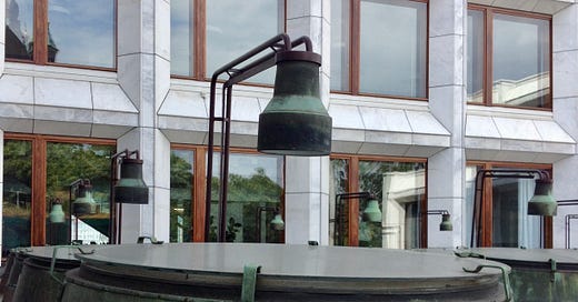
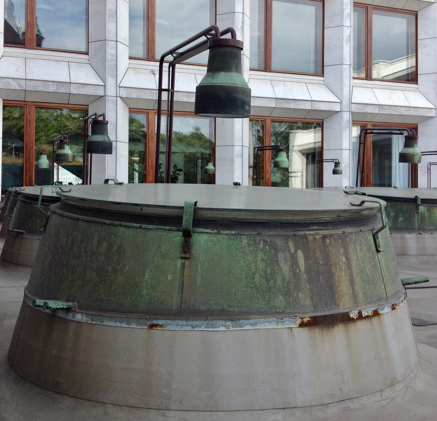
This photo, which I took on a trip to Helsinki in 2015 shows some rather unusual roof lights at the back of an office building on Helsinki harbour. The building is the headquarters of Enzo-Gutzeit – one of Finland’s largest wood-pulp manufacturers –and they commissioned Alvar Aalto to design it in 1962, replacing an older building. The result was an impressive modernist Palazzo with a white Carrara marble facade overlooking the bay.
Round the back of this building however, things get a bit more surreal. To get light down to the conference rooms on the north side, Aalto cut out a courtyard and peppered it with these drum-like lanterns. Most unusually, each lantern has its own lamp pointed down into the building. But why go to the expense of putting all these lamps outside when they could perfectly easily hang within?
To answer this question we need to think about the climate. Being at such a northerly latitude, the winters in Helsinki are long and dark. By locating the lamp outside, Aalto transforms it into a kind of artificial sun. Whereas no one would mistake an indoor light for a longer day, these unusual roof lights can sustain such an illusion. The occupants get the benefit of the winter nights feeling not quite as long.
Though they look more than a little absurd, their design is nonetheless focussed squarely on the psychological wellbeing of the occupants of the building.
Design takeaway: What absurd solutions could you reach if you focussed more on your user’s wellbeing?
🏢There’s a new film out about Aalto which is showing at various festivals. Watch the trailer here.
Object: Post-it Note
The humble Post-It note is a ubiquitous feature of the modern office but not everyone knows that the adhesive that keeps those colourful squares attached was originally designed to be super-strong. Spencer Silver, who was working for 3M in the late 60s on adhesives for aircraft construction, was crestfallen to discover that due to a mistake, the glue was weak and pressure-sensitive. The mistake however was a fortuitous one, the new adhesive – acrylate co-polymer microspheres – could also be peeled away without leaving residue and reused.
For many years it was not obvious how to market this new type of adhesive. 3M tried using it in reusable bulletin boards in 1973, but sales were low. Arthur Fry, also working with Spencer in 3M, believed that applying the adhesive to paper would result in more successful products. Reportedly he had the idea while in choir practice, wishing he had sticky bookmark that wouldn’t damage his book. Developing this took another four years. It was only in 1978 with a huge mail-out of free samples to offices in the US, that Post-It notes finally became a commercial success.
For me, this story illustrates two things. Firstly, the roundabout manner in which design so often proceeds – it’s so important to stay alert to the potential of unintended findings in your process. Weaknesses, if we are able to transform our thinking, can often become strengths.
Secondly, the value of patience. It took Spencer Silver and Arthur Fry ten years to see their vision come into being. Sometimes you just have to keep the faith.
Design takeaway: How could you turn a weakness of your design into a strength?
🟨Watch this short youtube documentary on the Post-It note.
Quote: “…the designer of today re-establishes the long lost contact between art and the public, between living people and art as a living thing… If what we use everyday is made with art, and not thrown together by chance or caprice, then we shall have nothing to hide..”
– Bruno Munari, author of Design as Art
I last included a quote from Bruno Munari in Design Lobster #31. Back then he was describing the way a designer remains present in their work long after the act of design is over.
This quote, from the same book, makes a different point. He sees designers as a bridge between the world of art and the lives of everyday people. In contrast to artworks whose audience was the rarefied few, Bruno was excited by the universality of design – the way it allowed everyone, no matter what their background, to participate.
The amazing reach of design is something that excites me too, a huge responsibility as well as a privilege.
Keep reaching out,
Ben 🦞
Enjoyed this week’s Design Lobster? Let me know by clicking the heart button.
👇


