#12 Rounded buttons, lighters & design intent
It’s Design Lobster #12 and this week we’re zooming on on the very small (and the slightly bigger). Let’s get micro. 🔬
Question: Why give a button round corners?
There is truly no question too small for a designer – including the optimal corner radius for an on-screen button. As we browse the internet or our phone the size and colour of these ubiquitous elements change a lot – but also, more subtly, so does their their roundedness.
To understand why it might be important to specify a detail this small it helps to go back to some psychology experiments carried about the Wolfgang Kohler in 1929. Known as the Bouba/kiki effect, when participants in this study were asked to call one of two shapes (shown above) a Bouba and the other one a Kiki, they found that nearly everyone answered the same. Go ahead and try it yourself. Did you call the sharper one the Kiki and the softer one the Bouba? Then you’re just like everyone else I’m afraid.
It’s an example of the way the human brain makes connections between sounds and shapes. But this tendency goes further. Importantly for designers, the shape qualities of a thing also imply personality. Thus we will be inclined to find straight-edged objects more formal and serious, and rounded things friendlier. So watch out the next time you see an exceptionally rounded button, the designer might just be trying to seduce you…
For the designers reading, there is an ethical dimension to this choice too. Are you deploying this shape psychology in the true interests of your user?
Design takeaway: Could you soften or sharpen the edges of your design to affect how people perceive it? More importantly, should you be?
Much more on ‘ideasthesia’.
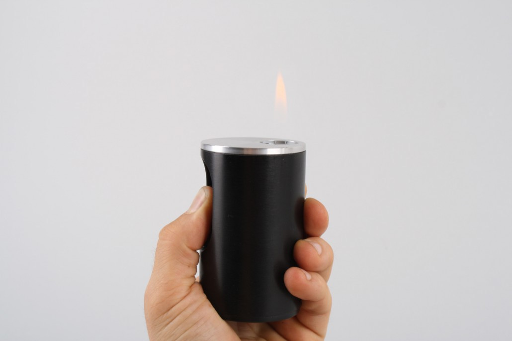
Object: Braun T2 Table Lighter
Dieter Rams is a titan of industrial design who grew to fame leading the reinvention of Braun as a consumer electronics company designing products such as the T3 Pocket Transistor Radio and the ET66 Calculator. This table lighter, which went into production in 1968 is reportedly one of his own favourite designs. It consists of a 5cm diameter cylinder that is 10cm tall. A long thumb-button on the side depresses to ignite the flame, which emerges from a hole at the top. Different versions were made in moulded plastic and stainless steel.
Rams reportedly spent much time establishing where exactly on the lighter the thumb-button should sit for the most comfortable and effective strike action on the magnetic ignition pad – at that time a recent invention. But he also saw table lighters as a kind of minimalist sculpture for the table, needing to stand alone as well as be handled.
I like the way the scale is perfectly tuned to these two modes. When picked up, the lighter fits snugly in the hand and when it set down it has presence on the table as an objet. Too heavy to be held for a long time and too large to be pocketable it gently encourages you to place it back down on to the table where it will look best.
Design takeaway: Could adjusting the scale improve your design?
Read Ram’s Ten Principles of Good Design
Quote: “The opposite of design, then, is the failure to develop and employ intent in making creative decisions.”
– John R. Moran
This quote comes from the blog of John R. Moran – Rampant Innovation – where he describes how Apple’s approach to design differs from many other companies. In some ways it sounds almost embarrassingly obvious. Of course design has got to be intentional, it can’t be just random. But maintaining clear intent for the hundreds of tiny decisions that have to be made in any design project is far easier contemplated than done. The temptation to fall back to existing solutions or to pass on decisions to the user can be intense.
Keep fighting for intent. 🦞
Has this email been forwarded to you? Sign up below.


