In this week’s Design Lobster we’re thinking about how to surprise people in the right way with our designs. Plus some strangely sheepish 70s French furniture… 🐑
…and in the spirit of surprise, this week I’m trialling a new AI-powered segment, Design Remixes 🤔
I’ve plucked two designs from the Design Lobster archives and combined them to make something new yet oddly familiar. Scroll to the bottom of the email to see this week’s creation 👀
Question: How surprising should a new design be?
In design, getting the balance right between familiarity and surprise is a delicate art. Using established and familiar patterns is essential to help people understand what something is and how to use it, but at the same time, as a species, we constantly seek out new things and if your product is too familiar it is unlikely to stand out.
So things always need to feel fresh, but not too much so. New and unfamiliar things are exciting but also cognitively draining, and if you deviate too far with your design and you might find people just give up on you.
In his 2016 book Hitmakers, Derek Thompson describes an experience he calls the Aesthetic Aha! Moment where somebody confronted by something unexpected suddenly sees how it is connected to something familiar. It’s a pleasant sensation of going from confusion to clarity. Think of the moment at the start of the film Inception where you suddenly realise you’re in a dream sequence, or the first time you used Slide to Unlock on an iPhone.
The best art, music and design choreograph this journey from confusion to familiarity again, leaving the viewer, listener or user feeling excited but still comfortable. It sounds simple in theory, but requires skill, imagination and a little bit of luck to achieve in practice.
Design takeaway: Are you combining surprising and familiar elements in the right way in your design?
Enjoying Design Lobster? Share it with a friend, colleague or fellow designer 🤲🦞
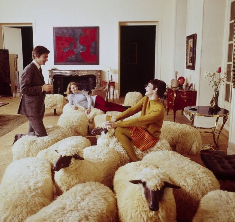
Object: Moutons de Laine (Woolly Sheep)
Sculptor François-Xavier Lalanne shocked attendees at the 1965 Salon de la Jeune Peinture in Paris with his Moutons de Laine – a collection of realistic depictions of sheep made of cast bronze and genuine sheepskin. The Moutons come in two types, one with a bronze face and another without. When gathered together, the impression is of a realistic flock, with the headless ones seeming to be grazing on the carpet of the room they’re in.
I thought that it would be funny to invade that big living room with a flock of sheep. It is, after all, easier to have a sculpture in an apartment than to have a real sheep. And, it’s even better if you can sit on them.
—François-Xavier Lalanne
With the design, Francois and his wife Claude brought a surreal rural element to elegant urban salons, whilst also poking fun at the ‘herd mentality’ of the establishment. The sheep found their way into the collections of Yves Saint-Laurent, Karl Lagerfeld and other celebrities and were spotted regularly in magazine pages. To my eye, they don’t look especially natural to sit in (or on), but for pure surprise they get top marks.
Design takeaway: Where could you introduce a little whimsy to your design?
Quote: “To sell something familiar, make it surprising. To sell something surprising, make it familiar.”
– Raymond Loewy, industrial designer
Raymond Loewy’s MAYA principle (Most Advanced Yet Acceptable) articulated his view of how to strike a balance between novelty and familiarity when designing products. We last heard from him in Design Lobster #104, which featured an unexpectedly aerodynamic pencil sharpener.
Hope you get some good surprises this week,
Ben 🦞
And lastly, a design remix…

Enjoyed this week’s Design Lobster? Let me know by clicking the heart button ❤️
👇


The sheep were especially surprising.