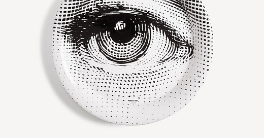
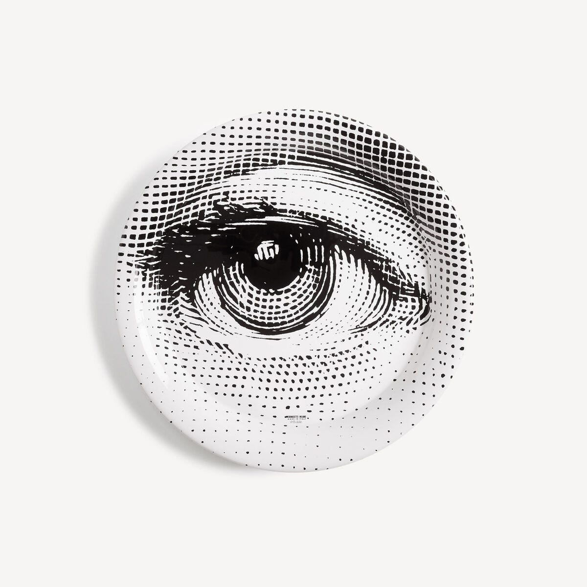
For Design Lobster #78 we’ve got an ocular theme. We’re exploring what we mean by the term eye for design, and examining a very wide-eyed tray by designer Piero Fornasetti. 👁
✨Enjoying Design Lobster? Please share it with a friend, colleague or fellow designer.
Question: What is an “eye” for design?
Some of you reading this will probably have had the experience of looking at a piece of design and seeing that something is not quite right with it. Initially we might not be able to articulate verbally what the problem is, the impression arrives like an instinct or sixth sense that we then have to find a way of communicating in terms that others, especially non-designers, can understand. This pre-conscious reaction to something visual (and the accompanying instinct for how to make it look better) is often called an “eye” for design.
I think one aspect of “eye” is a sensitivity to inconsistencies in the composition or alignment, or a lack of clearly applied visual rules. But it can also manifests as a sensitivity to the communicative properties of something – where a piece of design might be lacking focus or putting the wrong emphasis on what it is all about. Designers are good at looking at things holistically – seeing where the story is and isn’t coming through in the choices that have been made.
Sportsmen and women learn to catch hit or catch balls without the involvement of their conscious brain and I think something similar occurs with designers after enough exposure to visual stimuli. Our “eye” is our brain somehow internalising the rules of communication and visual order. So like athletes, this “eye” is something we can train with practice.
Design takeaway: How are you training up your design “eye”?
🎮 Test your design eye with this game
Object: Fornasetti Occhio Tray
One of my recent obsessions is the work of the designer and artist Piero Fornasetti whose curious oeuvre is a treasure trove of inspiration. Besides furniture, tableware and screens, in the 1950s he made a nearly endless range of plates and trays decorated with prints of the face of the Opera singer Lina Cavalieri. This project which he called Tema e Variazioni or Themes and Variations found ever more inventive ways of collaging her face onto a circular porcelain or iron surface. The example above is currently on sale on the Fornasetti website (for a cool £365) – and you can get a sense of just how many variations there have been in the second photo below.
"The public explained to me that what I was doing was something more than decoration. It was an invitation to imagine, to think, to escape from the things that surround us, which are too mechanised and inhuman. They were a passport to the realm of imagination."
– Piero Fornasetti
I enjoy the theatricality of these plates and trays, adding a note of poetry and surrealism to domestic life. I think there could be a little more escapism in everyday objects.
Design takeaway: Could your design be a little more escapist?
👁 A tour of Casa Fornasetti with Piero’s son Barnaba
Quote: “Look at things with unusual eyes.”
– Vico Magistretti
Vico was an Italian industrial designer and architect, probably most famous for his elegant Carimate chair for the manufacturer Cassina. I’m always going on about the need to keep our vision fresh and I think he communicates that sentiment beautifully in this short quote.
This week, keep your eyes unusual,
Ben 🦞
Enjoyed this week’s Design Lobster? Let me know by clicking the heart button.
👇


