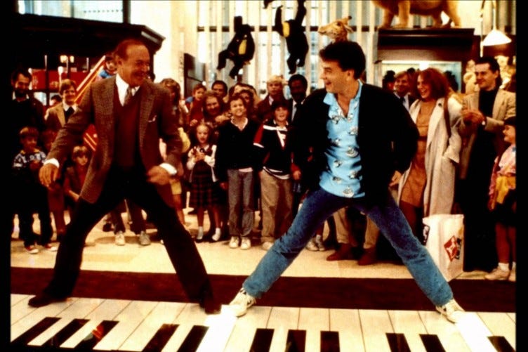
This week’s Design Lobster has a rather pedestrian theme. We’re examining some unusual foot-controlled interfaces and basking in the Californian glow of a mid-century dresser with uncommonly well-designed feet 👞
Question: Why don’t we control computers with our feet?

Douglas Engelbart is well-known for inventing the computer mouse, but I recently learned that his early experiments into human-computer interaction also explored various kinds of foot-controlled interfaces too. Inspired by this, there were a flurry of products in the 1980s that used foot input for navigation and control, including the Versatron Foot Mouse and the Mole (because the animal is situated under-foot).
These products typically consisted of a pressure-sensitive and slideable mat, which a user could nudge or press with their foot to move around a graphical user interface. However, except for some niche accessibility use cases, these products never became widely adopted.
Basic pedal-controlled devices will of course be very familiar to many of us, either from driving a car, or perhaps playing a piano or guitar looper. These kinds of interactions however are comparatively simple and easy to learn. Much more training is required to master more complex pedal interfaces like those of a church organ. This research paper puts the failure of products like the Mole down to a similarly steep learning curve compared to already-familiar hand-controlled interfaces. In this sense, hand-controlled interfaces are just another example of path dependency.
The same paper does note though that feet remain good at performing simple actions whilst the hands are busy and speculates they may find greater use in augmented and virtual reality applications. I’ll be interested to see if Apple includes a kick or stamp gesture with their upcoming headset!
Design takeaway: How could your design engage more of your user’s body?
🖐 Design Lobster #120 asked if we can think with our hands
Enjoying Design Lobster? Share it with a friend, colleague or fellow designer 🤲🦞
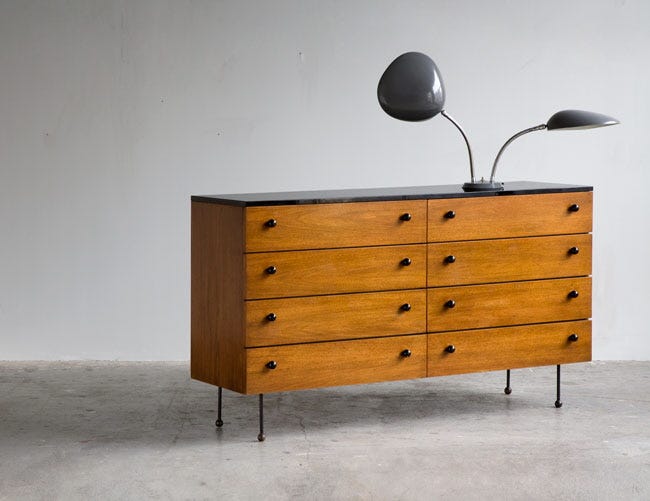
Object: 62-series dresser

Greta Magnusson-Grossman’s design philospophy blended Swedish rigour with the laid-back Californian lifestyle, creating a light-hearted functionalism that was well-suited to mid-century West Coast tastes. After moving to Los Angeles in 1940 from Sweden, she established her own studio in Rodeo Drive, Beverly Hills, where she designed everything from furniture to light fixtures and entire buildings. For the next twenty years she was one of precious few female-run studios in the city, making her somewhat of a forgotten icon.
The 62-series dresser shown above is characteristic of her work, clean modernist lines softened by warm and luxurious hardwood surfaces. What I especially love about this piece though are the ball-shaped feet. They bring a sense of whimsy and lightness to the dresser, making the drawers appear to float slightly above the ground.
Design takeaway: What small change could you make to your design to make it sit more lightly?
🪑More elegant mid-century furniture by Isamu Noguchi in Design Lobster #86
Quote: “For me, a computer has always been like a bicycle for the mind. Something that takes us far beyond our inherent abilities.”
– Steve Jobs
It’s easy to forget that this much-repeated interview quote uses the metaphor of a foot-controlled device to make its point, making it the perfect accompaniment to this week’s theme.
Have a great week,
Ben 🦞
Enjoyed this week’s Design Lobster? Let me know by clicking the heart button ❤️
👇


