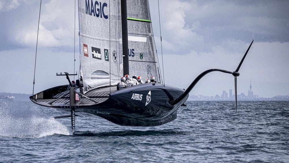
Design Lobster #86 brings you a balanced diet of 21st century nautical engineering and century furniture design. From the physics-defying AC75 yacht to an elegant living-room coffee table, this week we’re keeping things on an even keel 🧘♀️
✨Enjoying Design Lobster? Please share it with a friend, colleague or fellow designer.
Question: How do some boats fly?
The Americas Cup is a long-running yacht race that takes place in the Hauraki Gulf off the coast of New Zealand. As much a design competition as a race, national teams compete each year to further optimise the design of their yacht to gain that crucial edge.
In 2012 the nature of yacht racing changed dramatically when the New Zealand team introduced a catamaran that floated above the water. Rather than a keel, it used two blade-like appendages called foils to lift the body of the yacht entirely clear of the sea, resulting in top speeds of up to 50 knots (57.5mph). This technique, known as foiling has more in common with aviation than conventional sailing and relies on the motion of the water around each foil generating lift in the same way was as an aircraft wing.
Because water is so much denser than air thrust generated is significant and requires special composite materials with enough strength to resist the extra force. Sophisticated computer modelling is also needed to help design elements that have the right balance of qualities for different types of sailing. Extra weight for example helps stabilise the ships when tacking and performing manoeuvres, but becomes a (literal) drag when cruising in a straight line.
Since 2017, this type of sailing has been formally recognised as a new class – with ships that sail (or fly) in this way being known as AC75s. Aside from their sheer awe-inspiring spectacle, I appreciate the way these flying ships dramatically illustrate the hard trade-offs that are present in all design work. Getting the balance right is the job of design.
Design takeaway: What trade-offs are you making in your design to keep everything in balance?
Object: I-N 50 Table
This iconic coffee table was designed by Japanese-American designer and sculptor Isamu Noguchi and first released in 1948 by Herman Miller. The I-N 50 design came about when Isamu discovered that a sketch for a three-legged table that he’d made for an English furniture designer called T.H. Robsjohn-Gibbings had been been shamelessly plagiarised and put on sale. In frustration, the designer resolved to create something even better – succeeding overwhelmingly with a design that stayed in production for twenty-five years.
Like all of Noguchi’s creative output the table has an organic, abstract quality but it’s the composition of its parts that I find most pleasing. The two identical (typically cherry-wood) legs are rotated and meet at a point, producing a well-balanced form of asymmetry that is also an extremely stable base for the heavy 19mm-thick glass top.
Everything is sculpture. I consider every material, every free idea created in the room, as a sculpture.
–Isamu Noguchi
Herman Miller sold the table as an example of what they called sculpture for use – a concept that I really like. Nowadays originals sell for silly prices, but you can find quite faithful imitations that are much more affordable if you want to experience this concept in your home.
Design takeaway: How could your design be more sculptural in use?
🧑🎨 Learn more about Noguchi’s rather extraordinary life.
Quote: “Any time one or more things are consciously put together in a way that they can accomplish something better than they could have accomplished individually, this is an act of design.”
– Ray and Charles Eames
Oh we do love an Eames quote here at Design Lobster. This week we have a lovely definition of design from the couple that frames it as an art of bringing different things together well. They key to doing that? A sense of balance.
Have a great week,
Ben 🦞
Enjoyed this week’s Design Lobster? Let me know by clicking the heart button.
👇


