This week’s Design lobster is feeling fancy 💅 We’re learning how to make your type choice feel more premium and examining a ludicrously over-engineered luxury watch. Dive in and see how the other half live 💸
Question: What is a Didone?
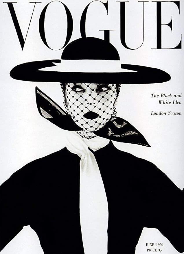
The crisp, slender verticals of VOGUE on the cover of the namesake magazine instantly conjure a world of sophistication and luxury. This textual magic is a property of the Didone family of typefaces, which first emerged in the 18th century from the type workshops of Firmin Didot and Giambattista Bodoni.
These typefaces take things to extremes with extremely high contrast between thick and thin strokes and a powerful vertical emphasis. They feature abrupt hairline serifs and small apertures in letterforms which have an opening (like e’s). These choices make the type feel statuesque and unhurried, somehow demanding to be looked at as much as read.
Because of these same choices however, they aren’t great for long stretches of text. They lack the flowing quality of Renaissance typefaces like Garamond that helps lead the eye across the page. Nevertheless, they continue to de rigueur for any self-respecting fashion magazine, where are an ideal typographic accompaniment to supermodels and designer handbags.
Design takeaway: How could you use type choices to emphasise the distinctive qualities of your design?
🔠 Want more font content? Design Lobster #53 covered the world’s most loathed typeface
Enjoying Design Lobster? Share it with a friend, colleague or fellow designer 🤲🦞
Object: Jacob & Co Astronomia Solar watch
Hold on to your hats, things are getting flashy in here. I give you the Astronomia Solar watch by jeweller and watchmaker Jacob & Co. It’s perhaps the most expensive object we’ve ever covered on Design Lobster, retailing at prices in excess of $300,000.
There’s a lot to talk about here. Do we begin with the 18 karat rose gold zodiac dial? Or perhaps the hand-assembled flying tourbillon? This isn’t even to get started on the rotating collection of semi-precious planets (Red Jasper for Mars and Lapis Lazuli for Neptune) that orbit a Citrine Quartz Sun. Collectively these elements recreate a miniature wrist-worn solar system of which the wearer can feel the master. I genuinely have no idea how you tell the time with it 🤷
But the excessiveness is the point. Jacob Arobo – an Uzebk emigré and the founder of Jacob & Co – rose to prominence in 80s and 90s New York when his OTT designs caught the attention of hip hop stars like Notorious BIG and Jay Z. Entertainers and celebrities understood the attention-grabbing power of these watches and were willing to pay millions to flaunt one on their wrist. Truly putting the costly in costly signalling.
I typically use the digital pages of this newsletter to argue for simplicity, restraint and consideration, but I think it’s good to challenge ourselves now and again and put the case for the opposition. Every now and again it doesn’t hurt to imagine what the most souped-up version of your design might be. These watches are good reference for an exercise like that!
Design takeaway: What’s the more extravagant version of your design?
Quote: “Luxury lies not in the richness of things, but in the absence of vulgarity.”
– Coco Chanel
Coco Chanel arguing for quite a different definition of luxury to that we find in a Jacob & Co watch. It’s a definition much more in sync with how I approach design. I like the idea that even the most humble project can become luxurious through a considered process of editing and paring back.
Have a luxe week ✨
Ben 🦞
Enjoyed this week’s Design Lobster? Let me know by clicking the heart button ❤️
👇


Recently found this substack and loving it. Probably my favourite design newsletter. Keep em coming!