#65 Details that tell a story
Skeleton clocks, swiss architecture & more
It’s Design Lobster #65 and this week we’re exploring the theme of detail in the context of design. From an exquisite moment in an early building by Swiss architect Peter Zumthor, to the elaborate mechanism of an 18th century clock. Let’s zoom in 🔎
✨Enjoying Design Lobster? Please share it with a friend, colleague or fellow designer.
Question: How can design details tell a story?
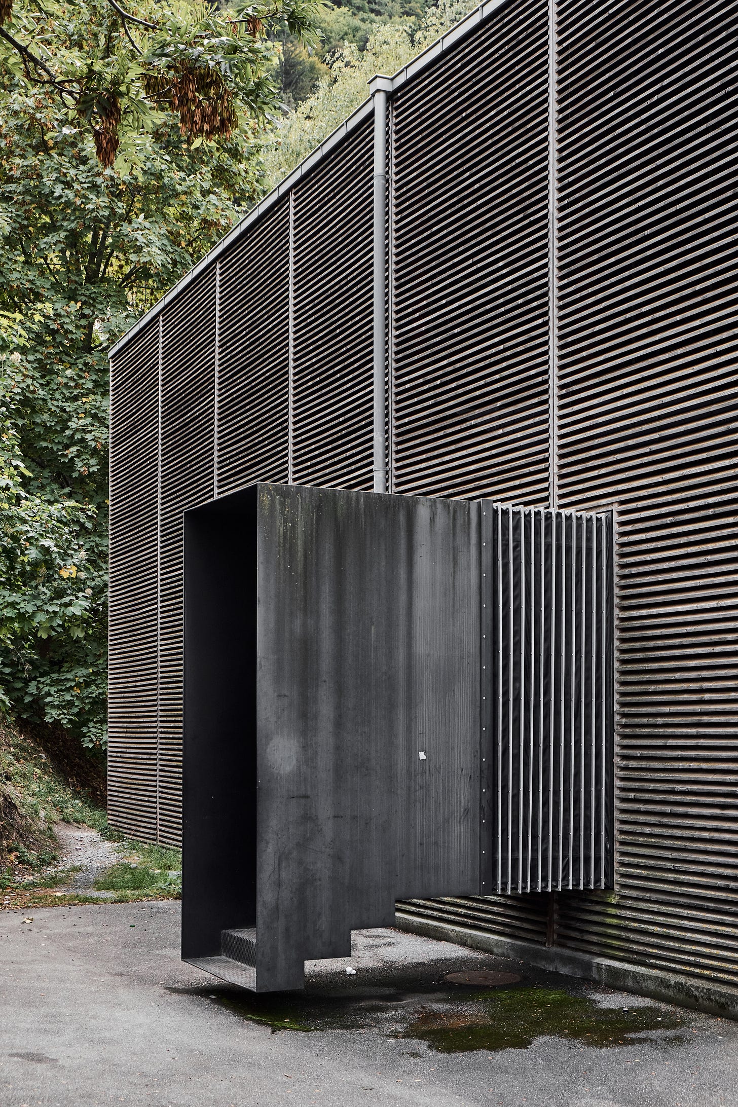
Peter Zumthor is a Pritzker-Prize-winning architect who is renowned for his highly atmospheric buildings. One of his earliest projects was built in the mid 80s in the Swiss town of Chur. The brief was for a structure that would protect some ancient Roman building remains and also act a a museum for people to learn more about their history. Zumthor enclosed the remains in two volumes with a wall made of timber slats making the internal spaces feel dark and cloistered, but still connected acoustically to the sounds of the town beyond.
The entrance to these volumes, as shown in the picture above, is made in a curious way. A metal sheet is bent into several steps that descend to, but do not quite touch the ground. The entrance appears suspended somehow, mysterious and dark. Inside, the set of steps leads to a walkway that also hovers slightly above the level of the remains.
For Zumthor, this step detail communicates how he thinks about the overlapping historical eras present on the site. A visitor steps away from the present day onto the raised walkway, from which they can observe fragments of the past. By not permitting the junctions to (quite) touch, Zumthor’s architecture emphasises the distinctness of our historical period and that of the Romans.
Design takeaway: Do the details of your design tell a story?
🧱 Watch an interview with Peter Zumthor in 2013.
Object: Skeleton clock
In the 18th century French clockmakers began to expose the inner workings of their mechanisms with a style of timepiece that became known the skeleton clock. Rather than concealing gears and weights within a case, these clocks displayed their mechanism under a glass shade. This “transparency” was a kind of advert for the skills of the clockmakers, whose technical sophistication was literally on display.
In our own century, as technology has become more digital, its actual operations have become ever more abstract. We cannot see the way electrons move around a silicon circuit board so instead we have to represent the inner workings of a computer through abstractions that are shown on a screen. Indeed the whole premise of the user experience movement is that individual users shouldn’t have to contend with the actual technical basis of computing. All of that stuff should remain out of sight and mind.
There are very good reasons for this, but I also am struck by how satisfying it feels to be able to see precisely how these clocks work. I wonder if we should allow people to peek behind the curtain a bit more.
Design takeaway: Could your design reveal more of its inner workings?
🕰 This video of an (insanely complex) contemporary skeleton clock is very satisfying to watch.
Quote: “What we’re overly familiar with, what becomes common, we stop seeing. One function of design is to restore our perception, renew our understanding, and invite us to be more alert.”
– Brian Collins
Brian Collins is chief creative officer of COLLINS, a design and communications agency. This quote comes from his 101 design rules that I highly recommend. I think we’ve all probably encountered pieces of design that made us see the world afresh or restored us somehow. It’s the best feeling when it happens.
Whatever you do, keep discovering.
Ben 🦞
PS. For those of you interested in what I’ve been up to in my day job, there’s a few details in this tweet thread!
Enjoyed this week’s Design Lobster? Let me know by clicking the heart button.
👇


