

In this week’s Design Lobster we’re lining things up. From the 17th century architectural technique of enfilade, to Donald Judd’s crisp 20th century furniture, this is design in total alignment ⬜️ 📐
Plus, scroll to the bottom for this week’s MEMPHIS inspired Design Remix..
Question: Why did European palaces line up their doors?
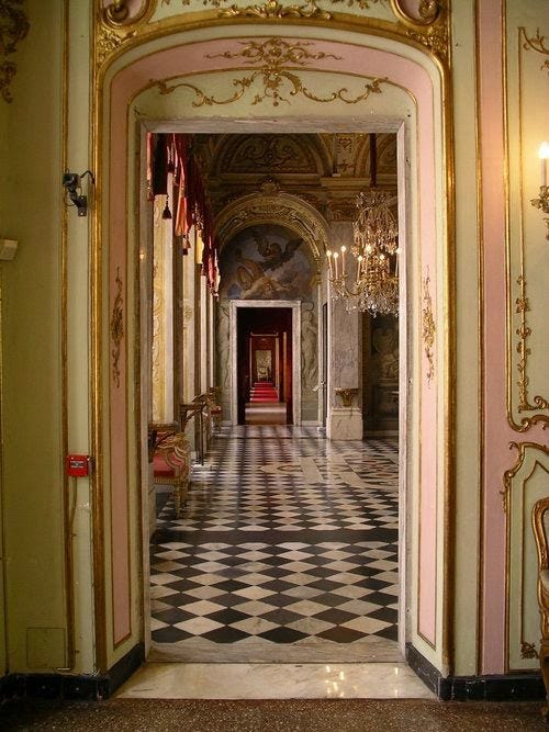
Any self-respecting Baroque period drama will have a shot or two of a bewigged character striding through a series of elegant rooms, footmen swinging open each door in turn to reveal an architectural matryoshka doll of increasingly intimate surroundings. This type of plan is known as enfilade – from the French word enfiler ‘to thread’ – and became a core feature of European Baroque palaces such as Versailles
An enfilade plan put into architectural form the hierarchy of status within a Court. At one end of the enfilade would be the most public reception rooms, and admittance in to the rooms beyond was a privilege accorded only to those with adequate noble status or favour with the presiding monarch.
The perspectival nesting from the alignment of an enfilade draws the eye in like an Escher painting, making the far reaches (normally a study or bedchamber) almost mesmerising. In this way, the architecture serves to intensify the curiosity of those of lesser status far out in the public rooms, who might scarcely be able to tear their eyes away in the hope of catching a glimpse of their king or queen.
Design takeaway: How are you inciting people’s curiosity with your design?
🏢 Design Lobster #56 explored the later 19th century invention of the corridor
Enjoying Design Lobster? Share it with a friend, colleague or fellow designer 🤲🦞
Object: Center Divider Chair No. 84
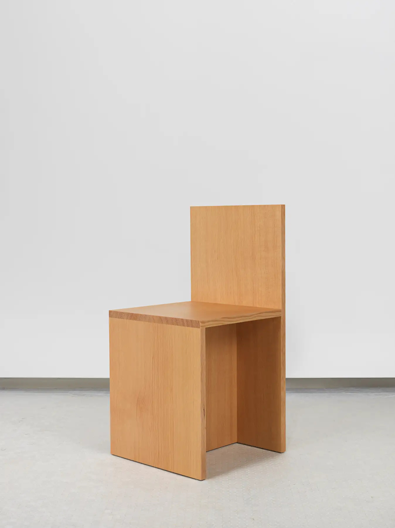
It’s hard to imagine furniture that’s reduced to much less. Just 4 crisply-cut Douglas Fir boards arranged like a child’s drawing of a chair. Donald Judd, who became celebrated for his minimal geometric sculpture in the 1960s, began to explore furniture design in the 70s prompted by his frustration at how difficult it was to buy any furniture at that time that wasn’t festooned with all manner of kitschy curlicues.
The clean-lined aesthetic comes from his desire to be honest about the materials that form the chair. When Judd wrote about his furniture he always emphasised how few cuts were needed and the simplicity of the joins. His was an approach to design that aimed to interfere as little as possible with the factory-made materials that compose it. To treat those materials with almost a kind of reverence.
Judd made about twenty variants of Chair No. 84, playing with the position of central support to sometimes create a shelf or a diagonal to allow space for feet to be tucked in. The hard angles and severe lack of detail make them all unmistakably part of the same family. Though Judd insisted that his furniture was designed to be used, what makes his chairs and beds so visually arresting also means they are rather brutally uncomfortable to spend time on. Judd, as a designer, sided more often with the material than the end-user.
Design takeaway: What could you reduce or remove in your design?
Quote: “Alignment is a universal cue of care. It signals that this is something a human being built. Care was put into it. We see this in UI design, we see it in interior design, we see it everywhere.”
– Eric D Kennedy, Product Designer
Designers get a bad rep for being pernickety about alignment, so I really love the way this quote puts our OCD in a wider philosophical context. Simply put, alignment is how we show we give a damn to the people who will use our creation in the future. We don’t need to go full Donald Judd, but visual order of some kind is what makes design, design.
Have a great week,
Ben 🦞
And lastly, a design remix…

Enjoyed this week’s Design Lobster? Let me know by clicking the heart button ❤️
👇
Being aligned is a slippery slope. We need anarchy too.
Love the explaination behind alignment. I share that OCD need to have everything align, but could never explain why.... Makes perfect sense!