It’s Design Lobster #26. This week we’re in an ironic mood 🙃. Rugs that look like receipts and anti-functional clocks. Let’s “go”.
Enjoying Design Lobster? Please share it with a friend, colleague or loved one. ✨
Question: Can design be ironic?
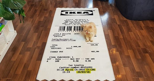
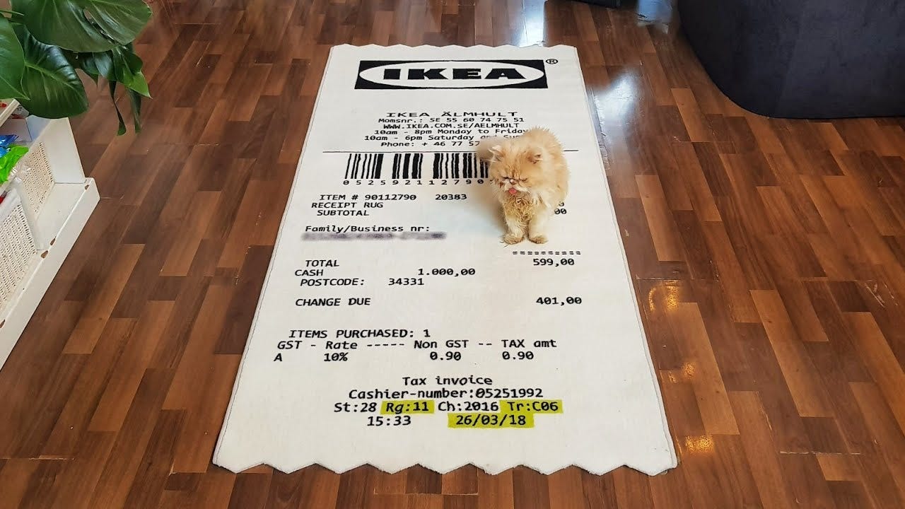
Last year the fashion designer Virgil Abloh collaborated with Swedish furniture-maker IKEA on a range of homewares under the name MARKERAD – which is Swedish for marked or signed. The range included odd products such as the above rug designed to look like a radically overscaled receipt (for the purchase of itself 🥴), a backlit scale copy of the Mona Lisa, chairs with one leg ending mysteriously in a doorstop and the designer’s trademark air quotes “” around everything.
Though Abloh talks about how this project began with a giant set of interviews with customers, it’s hard to see on first inspection what problem any of these designs solve. It would be easy to dismiss them as simply fashion, which to be fair, is what they are to some extent. I think they deserve more attention than that though. I’m particularly interested in this quote:
It’s about elevating the anonymous, everyday icons that we use without noticing. When we put a doorstop on one of the legs of an ordinary chair we create something unexpected – an interruption.
- Virgil Abloh
What Abloh seems to be describing here is an attempt, through these designs, to change the way we see things. The weird changes in scale and ubiquitous quote marks invite us to break out of our usual way of seeing and refresh our vision of the world. The problem these designs solve is not an immediate one, like staying warm or having a comfortable place to sit, but one of perception. When a receipt can be soft and the size of a rug, the world feels (perhaps) like a place with more potential than it did before. To change how people see is a goal more commonly associated with art rather than design, but I for one, am glad Abloh is bringing this kind of thinking to the world of mass-market design.
Design takeaway: How could your design change the way people perceive the world?
A MARKERAD “Receipt” Rug - yours for £157. 💸
Object: Metropole Clock
This funky clock was designed by George J. Sowden who was the only British member of MEMPHIS, the post-modern design collective founded by Ettore Sottsass in Milan in 1980. Also no strangers to irony, the designers in this group reacted against the tasteful minimalism of the previous decade with furniture in bright colours and odd shapes. They wanted to make work that was more playful and less serious, believing design should be understood as a means of communication and not as an expression of elite taste.
The Metropole Clock is polemically “anti-functional”– it consists of a series of boxes stacked from small to big making the design top-heavy and rather unsteady looking. The top box is far bigger than the small clock movement inside, and the numbers are represented only by yellow squares. Characteristic of the MEMPHIS movement, there is liberal use of textured laminate, making it hard to tell what the object is really made of.
Like many people, I have a bit of a love/hate relationship with PoMo design of this kind. Sometimes it can get a bit too clever for its own good and I long for the design to show some positive convictions about the world it is building. But it’s certainly good for the design profession to be loosened up every now again and I can’t deny this particular clock has personality…
Design takeaway: Could you make your design more playful?
Explore the Memphis catalogue here - ironically it’s all now rather expensive. 🙃
Quote: “Design is a conscious and intuitive effort to impose meaningful order. Design is both the underlying matrix of order and the tool that creates it.”
– Victor Papanek, author of Design for the Real World.
I’ve included this quote this week as a counterpoint to the rest of this week’s content. I suspect Abloh would contend that “meaningful order” is not always the goal of design (and that Papanek would be faintly horrified by the former’s receipt rug). But whether you’re trying to impose order or interrupt it, we should be consistent and intentional in the design choices that we make.
Keep discovering. 🦞
Has this email been forwarded? Sign up below to get the weekly emails delivered to you. ✏️


