It’s Design Lobster #56. This week we’re talking about the way the design of environments affects us – from something as commonplace as a corridor to a one of a kind clock. Architecture lovers, this one’s for you. 🏛
✨Enjoying Design Lobster? Please share it with a friend, colleague or fellow designer.
Question: Where did corridors come from?
Ordinary things contain the deepest mysteries – begins Figures, Doors and Passages, probably my favourite essay by the late architectural historian Robin Evans.
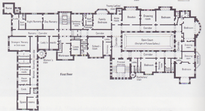
In this essay he examines the emergence of the corridor as an organising component of country house plans in England. You might think that something as banal and familiar as a corridor wouldn’t deserve such prolonged scrutiny, but through it, Robin traces a surprising social history.
“If anything is described by the architectural plan, it is the nature of human relationships…”
— Robin Evans
For him, the transition from houses designed with interconnected rooms to those with individual rooms connected by corridors reflects changes in the way we thought about the individual and their place within society. Thus the architect of a 17th century house was at ease with a gregarious way of living that offered little solitude, but the architect of a 19th century house (like Bearwood shown above) was at pains to provide individuals as much privacy as possible, by forcing all circulation into corridors.
The questions raised here about the relationship between architecture and social relationships live on in the contemporary debate about social media. Like corridors, some of the basic design choices made by social networks I believe deserve more of our attention.
Design takeaway: What ordinary things can you think of that need closer scrutiny?
✍️ If you have the time, I really recommend reading Robin’s full essay.
Object: Water Street Digital Clock
Rudolph de Harak designed this enormous clock in 1972 for a site in Manhattan’s Financial District. It consists of a 12x6 grid of numbers –each square 4ft x 4ft – that collectively form a perfect double-square field that is 48 feet long and 24 feet high. The hours of the day are lined up on the top row and the minutes and seconds in the five rows below. As you would expect from a designer trained in the Swiss Style, all the numerals are Helvetica Medium.
What the photo above doesn’t capture is the dynamism of the clock, with the passage of time dramatised by lights racing across each row second by second. Together with the colourful chairs you can see in the foreground and a phone kiosk, the ensemble becomes a piece of urban sculpture and a great place to gather.
There can be a tendency to romanticise the analogue in the design world, so I like the counterpoint this clock provides. Rudolph’s design here shows how much fun and spirit can be found in the operations of a wholly digital mechanism.
Design takeaway: How could you bring out more spirit in your design?
⏰These Cornell students built their own miniature laser-cut version of the clock.
Quote: “When you're forced to be simple, you're forced to face the real problem. When you can't deliver ornament, you have to deliver substance.”
– Paul Graham
Paul Graham is an investor and technologist who was one of the founding partners of Y-Combinator. Reading essays from his excellent and long-running blog has become a recent obsession of mine. This quote of his isolates why simplicity is so important. Far from being just an aesthetic goal it’s a way of forcing focus on the problems that really matter.
Whatever you do, keep it simple.
Ben 🦞
Enjoyed this week’s Design Lobster? Let me know by clicking the heart button.
👇


