It’s Design Lobster #50. A half-century of newsletters! Thank you to all of you who’ve stuck with me to this milestone. 🙏
To celebrate I’ve prepared you a bumper issue. How we could redesign social media to make it more respectful, and an iconic but flawed 30’s baby monitor. Don’t you just love design?
✨Enjoying Design Lobster? Please share it with a friend, colleague or fellow designer.
Question: How might we redesign social media to make it kinder?
Events of the last week in the US Capitol Building have provided a disturbing demonstration of how incivility in social media discourse can spill over into the real world. Much of the discussion of these platforms has focussed around the power they give to bad faith actors like Trump to incite hatred and violence. However, beyond this, there is also a general discussion to be had about how design choices on Twitter and Facebook tend to escalate conflict rather than help resolve it.
The designer Nick Punt wrote an essay earlier this year, outlining an approach to de-escalation on Twitter that I think is especially interesting to revisit now. In it, he looks at the common issue of a user making a mistake that results in a viral pile-on. Currently these situations tend to get out of hand because either an individual simply can’t reach the same people with a separate apology tweet, or they garble the words of such an apology in the heat of the moment leading to people dismissing its authenticity. Nick proposes instead a simple ‘I made a mistake’ button that flags the tweet with carefully chosen language and locks the ability for it to be amplified any further.
Even more interesting is his idea that those who had replied to the original tweet would then have the ability to click a ‘forgive’ button once a mistake had been admitted. Allowing both parties to walk away from an interaction feeling that they had been acknowledged and creating a safer space for other mistakes to be admitted in the future.
This project highlights for me the incomplete way that we have so far translated our social lives onto the internet. Admitting mistakes and offering forgiveness are key features of how societies function so it stands to reason we need some kind of digital equivalent. Of course, such design changes may not save us from a character like Trump, but they could contribute to making the general standard of online discourse much more respectful.
Design takeaway: Does your design promote respectful behaviour between those that use it?
✍️ I really recommend reading Nick’s original essay.
Object: Zenith Radio Nurse
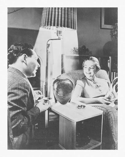
I was delighted to discover this extraordinary baby monitor by designer and sculptor Isamu Noguchi. The 1937 Radio Nurse was in fact the first product of its kind - reportedly the manufacturer Zenith were prompted to begin work on it following the infamous Lindbergh baby kidnapping that took place in 1932. Consisting of two components, a Guardian Ear Transmitter and a sculptural brown Bakelite Radio Nurse Receiver (shown above), the product blended radio technology with Noguchi’s anthropomorphic form-making. Attractive enough to sit in the living room, the receiver’s design has a strangely watchful quality that presumably was intended to reassure the parents that all was well with their little one.
Unfortunately, despite winning awards for its design, it interfered with garage doors and car radios due to the radio frequency it used. Ironically given the event that had prompted the product in the first place, this even meant that passing cars could pick up the cries of a baby inside – potentially making them even less safe from a kidnapping attempt.
For all its loveliness, the product strikes me as a case of mixed up priorities. As much emphasis should have been put on keeping the transmission safe, as was clearly put on making the receiver beautiful. 🤦♂️
Design takeaway: Is your design process putting emphasis on the right part of the problem?
👶 Read about the CryAnalzyer Auto – a contemporary AI-driven take on this product category from Design Lobster #4
Quote: …things don’t change the world. People change the world by using things. The focus must be on the “using” not the “thing”.
– Bret Victor
🐦click to tweet this
Bret Victor is a designer and technologist with a star-studded CV and many interesting things to say about the present and future of interfaces. This quote might have helped out the designers of the Radio Nurse. If only they’d focussed more on what it was like to use it rather than how it looked, then perhaps the product would not have launched with such a critical radio frequency issue. There’s a lesson there for all of us.
Keep discovering,
Ben 🦞
PS. If you haven’t yet spent some time ogling these AI-designed avocado lamps, then what are you waiting for?
Enjoyed this week’s Design Lobster? Let me know by clicking the heart button.
👇


