


💡7 interesting design ideas
Because design should *always* be interesting
Hello! It’s starting to feel a little like Spring here in New York. For this week’s issue I’ve gathered together seven of the most interesting ideas about design I’ve shared over the past six months for your reading pleasure.
Wherever season it is for you, I hope these ideas spark inspiration and take your work in fresh directions over the coming weeks 🌸✨
👀 See my 2024 ideas roundup here
1. Find depth in simplicity
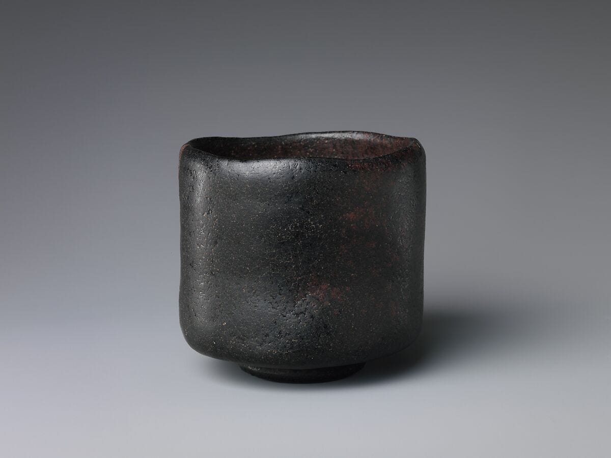
The term shibui (しぶい) is used in Japan to describe a quietly refined quality in design. It originated in the Muromachi Period (1336-1573) and originally referred to the sour taste of an unripe persimmon. Shibusa, that is objects with shibui qualities, present an alternative to the flashy and fleeting, celebrating understated elegance and depth. They don’t draw attention to themselves, but when you do look closer you are richly rewarded by their details.
When designing, the temptation to throw more ideas in the pot to spice things up can be acute. But there is another way to add richness by simply refining the essential details.
🔎 Design Lobster #157 also featured a cigarette lighter by Dieter Rams with a subtle detail
2. Design for the margins
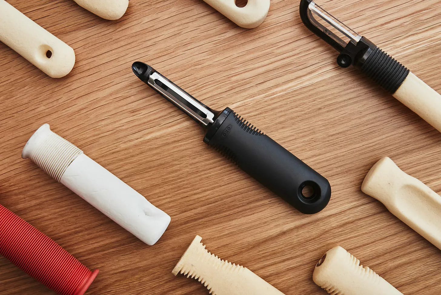
In the summer of 1990 Sam Farber was in the kitchen whilst on holiday in France with his wife, Betsey. Struggling with arthritis, Betsey complained about the discomfort caused by the metal peelers she was using to prepare their meal. Moved by her suffering he began work on a new range of more comfortable kitchen utensils that used Santoprene, a soft, tactile rubber that had only been used in gaskets and dishwasher seals up to that point.
Sales of the Good Grips range were initially slow, but in-store demonstrations where customers could feel the difference firsthand eventually won OXO hordes of loyal customers of all kinds, not just those who suffered from arthritis. An inspiring example of how designing for those with more acute needs can help us design something that works better for everyone else too.
✊ More tactile design in Design Lobster #152
3. Make something useless
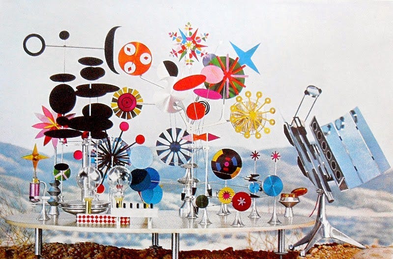
This visually captivating kinetic sculpture—created by Charles and Ray Eames in 1957—serves no practical purpose beyond delighting the senses and exploring the potential of solar power. Commissioned by the Aluminum Company of America (Alcoa) for a marketing campaign, the toy was intended to demonstrate the versatility and aesthetic appeal of aluminium.
“Toys are really not as innocent as they look. Toys and games are the preludes to serious ideas.”
—Charles Eames
The Eames knew more than anyone the power of curiosity and the Do-Nothing Machine was a testbed for material processes and formal explorations that you see emerging in other later Eames projects from furniture to card decks. Design moves so rarely in a straight line so don’t be afraid of making something that seems useless. You may find it has surprising utility down the line.
🌞Explore the surprising value of useless things in Design Lobster #151
Enjoying Design Lobster? Share it with a friend, colleague or fellow designer 🤲🦞
4. Hide an easter egg
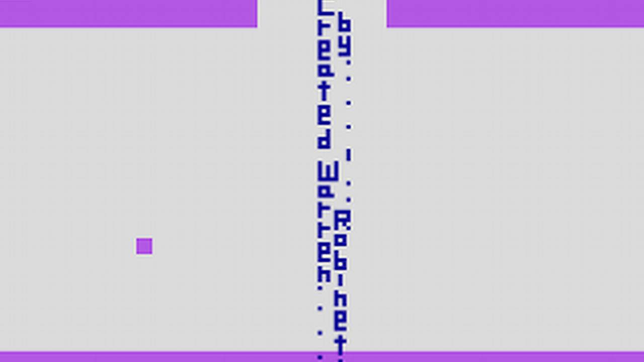
Back in the 80s, a programmer called Warren Robinett who was working at Atari was unhappy with the company’s decision to not credit any individual software engineer in their games. He got his own back by coding an obscure series of steps that once completed unlocked a room containing the words Created by Warren Robinett. Initially furious, Atari management quickly came round to the concept as it turned out planting hidden secrets in a game was great for engagement.
We could all be putting the power of curiosity to greater use in our designs. Rather than forcing everyone to sit through boring onboarding video, why not casually let slip that there are some easter eggs hidden in your app and challenge them to find them all?
🥷 Design Lobster #153 we also learned about the curious design of the ‘Assassin’s teapot’
5. Give people something to push against
Until fairly recently the future looked like touchscreen-everything, but recently the vibe has shifted towards the tangible. The last two generations of iPhone for example have added rather than removed physical buttons and this shift is as much psychological as it is about adding extra features:
“The kids are joining running clubs, buying “dumb” phones, woodworking, rocking Walkmans, joining supper clubs, etc because their lives have been swallowed by digital black boxes, and in this moment of uncertainty (tension re: war, AI, climate), they crave tangibility. It’s simple.”
Whatever kind of design you practice it’s worth thinking about how you can accentuate the embodied and tactile parts of the experience. Now more than ever we need design that grounds us.
☎️ We went button-crazy in Design Lobster #154
6. Add the texture back
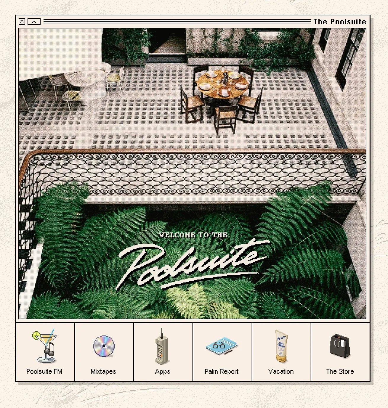
When you survey the evermore identikit websites and apps the tech industry has collectively converged upon over the past ten years, some kind of aesthetic counter-reaction was always going to be inevitable.
Enter the Digital Antiquarians; of whom an early trendsetter was Poolsuite FM—its painstakingly recreated Mac Classic interface was the perfect complement to the laid-back roster of Chillwave and Disco music it broadcast during the pandemic. Following in its footsteps is a growing breed of trendy consumer social apps like Drumroll and Lapse whose unashamedly pixellated icons and heavyset border treatments evoke a sense of a shared cultural history and human connection that feels refreshingly different from most of the digital spaces we inhabit.
If you’re working on a digital design project in 2025, take note. This is not just an aesthetic trend. Beneath the textures, drop shadows, and bezels something deep and important about what we all want from technology is straining to express itself.
📱 Read ‘Bring back the bezels’ my essay on the return of skeuomorphism
7. Make the kids version
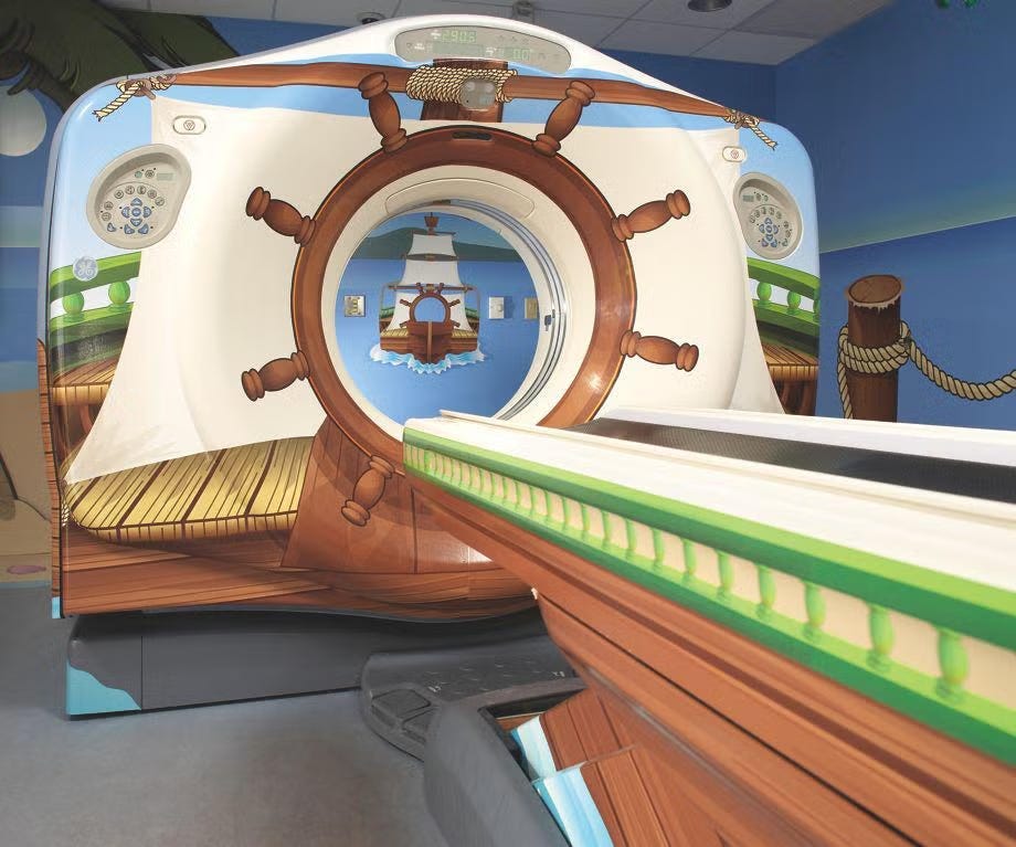
A horrifying 80% of children require sedation during an MRI scan because of how frightening they find going into the machine, prompting a fascinating 2013 IDEO project that you can see above that reimagined a scan as a pirate-themed ride.
Adults are not children, and I don’t want us to get carried away here, but I am intrigued by the idea that designing the ‘kids version’ helps us create something that works better for everyone else too. After all, why should adults have to put up with the scary or difficult version? Designing for a child might be just the thought experiment you need to bust open a difficult problem and find a more creative solution.
🧸 Design Lobster #156 also featured some unusual toys by Uruguayan artist Joaquín Torres-García
Thanks for reading this special edition of Design Lobster. Hope you have some great ideas this week,
Ben 🦞
Enjoyed this special edition? Let me know by clicking the heart button.
👇
The MRI scan for children is my favourite ⚓️
"Hide an easter egg" remembers me Marathon from bungie