Happy Monday! This week’s Design Lobster is an especially tactile one. We’re admiring some ingenious feats of graspability via the medieval German prunt and a 20th century accessible design icon from OXO. Grab it with both hands 🙌
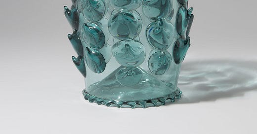
Question: What is a prunt?
In 14th century Europe, forks had yet to be invented and so your average medieval diner would have to make do with a sharp knife and a hand to manoeuvre their food into their mouth. Efficient arguably, but also rather greasy, which meant when it came to swigging some beer to wash down the roasted game, the receptacle was prone to fly out your hand and smash on the flagstones.
In the 14th century, German glassmakers living along the river Rhine came up with a clever solution to this problem, by taking the freshly blown and still hot stein and splodging gobbets of glass on to it to provide a rough textured surface with more grip for a greasy hand. These lumps were known as prunts and evolved over time into a highly decorative language of stars, rosettes and shells.
Nowadays we solve the problem of grip at the dinner table rather differently. For starters, a more comprehensive system of cutlery means our hands normally don’t get as greasy in the first place. Larger and heavier glasses now normally come with that most ordinary but magical of inventions, the handle. Nonetheless I think it’s time to bring back the prunt, fast food means modern hands get slippery too, and to my eye their aesthetic is eerily contemporary—as perfect for a contemporary dinner table in Brooklyn as a banqueting hall in medieval Mannheim.
Design takeaway: How well is your design accommodating the hands that touch it?
🥂 Design Lobster #85 told the fragile story of Murano glass goblets
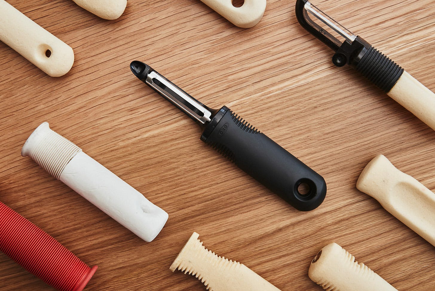
Object: OXO Good Grips Swivel Peeler
In the summer of 1990 Sam Farber was in the kitchen whilst on holiday in France with his wife, Betsey. Struggling with arthritis, Betsey complained about the discomfort caused by the metal peelers she was using to prepare their meal. Farber had sold his housewares company a few years prior but was itching to create something new. Suddenly he realised how uncomfortable most kitchen utensils were, especially for those with arthritis and began work on a new range that would be drastically more comfortable—both for those with disabilities and everyone else.
The design process took in a number of twists and turns. Early on Farber realised the handle needed to be larger than average to be more comfortable but it took a long time to find a right material with a texture that was easy to grip, even when wet. Eventually they happened upon Santoprene, a soft, tactile rubber that had only been used in gaskets and dishwasher seals up to that point.
Early prototypes also featured depressions for the thumb and forefingers but Farber’s savvy marketing brain hit on an unusual fin-shaped design borrowed from bicycle handle grips. He believed it was important to signal visually to prospective customers that this was a different kind of product.
Sales initially were slow, but in-store demonstrations where customers could feel the difference firsthand eventually won OXO hordes of loyal customers. The Good Grips line became a hallmark of inclusive design— products that are easier to use for everyone, without singling out or stigmatising any specific group.
Design takeaway: Could you focus on the needs of a specific group to improve your design for everyone else?
▶️ An excerpt from Gary Hustwit’s 2009 documentary Objectified that tells the OXO Good Grips story
Enjoying Design Lobster? Share it with a friend, colleague or fellow designer 🤲🦞
Quote: “Designers stand between revolutions and everyday life. They're able to grasp momentous changes in technology, science, and society and convert those changes into objects and ideas that people can understand.”
– Paola Antonelli, Senior Architecture and Design Curator, MoMA
I like this definition of designer as a mediator—bridging technological and cultural changes and the ordinary objects of everyday life. It’s our job to translate these raw and often bewildering currents into useful and meaningful things and experiences.
Have a momentous week,
Ben 🦞
Elsewhere…
👂Rory Sutherland is always good for contrarian facts about everything from the Veuve Clicquot label to the interiors of Jaguar cars. Here he is on Lenny’s podcast.
🍽️ Strongly approve of these psychedelic interpretations of porcelain dinner plates. Classics on Acid by Seletti with Diesel.
📱 If people hate technology and think it clashes with nature, I find it hard to blame technology. We have careless technology because we are careless in evaluating it. We demand too little of it, or we are willing to sacrifice too much for too little in return. Careful Technology by Simon Sarris
🏰 Could not be more delighted with design of Teenage Engineering’s Medieval Synth. Top marks for the unexpectedly Jodorowsky-esque product video 👏
And lastly, a design remix…
Enjoyed this week’s Design Lobster? Let me know by clicking the heart button ❤️
👇


