

Bring back the bezels
Towards a skeuomorphism of the soul
Happy Monday! This week I’m sharing a short essay on some visual trends in digital design. Beneath our feet, the way that software looks and feels is shifting and I’m pulling a few threads to see what these changes might mean.
Let me take you on a ride through some weird and wonderful corners of the software world. Why are risograph textures and condensed Garamonds spreading like a rash and what does it mean that people are making their iPhone home screens look like iPods? Most of all, beneath all these pretty gradients and haptics what are we really yearning for?

Strange things have been afoot in the world of software design for a while now. Jordan Singer has been showing off some exceptionally glossy buttons, Andy Allen’s Not Boring apps become ever more theatrical, every week it seems like X is ablaze with a new improbably example of this sort of thing. It’s increasingly clear that we are entering a more expressive period in digital design culture. For me, the luscious three-dimensional icons of Airbnb’s October 2024 design release were when this trend went mainstream. Here was one of the design pioneers of Silicon Valley mussing up the immaculate hallways of its much-imitated design system with actual 3D fireplaces, barbecues and hairdryers.
It’s a triumphal turnaround for the critical reputation of Scott Forstall, former Apple software lead. Cast as the villain at the time of his ignominious 2012 ouster from Apple by Jony Ive—his work quite literally scrubbed from the code with the launch of iOS 7—he’s now lived long enough to become a folk hero for a new generation of designers who look upon his high-texture oeuvre with curious interest rather than a straight-up grimace.

It’s not particularly difficult to see why. When you survey the evermore identikit websites and apps the tech industry has collectively converged upon over the past ten years some kind of reaction felt inevitable. Can you tell the difference between your banking/shopping/fitness apps? At a certain point the feeds all blur into one. Jony Ive may have had impeccable philosophical justification in his relentlessly flat and austere design choices, but just as man can only bear so much truth, so we have discovered there is a limit to how much flatness we can tolerate before we start to long for something richer. Jakob’s Law be damned.
I remember the aesthetic rush of opening iOS 7 for the first time and seeing how ruthlessly depth and detail had been rinsed out of every screen. Those impractically slender Helvetica Neue ascenders! The artfully frosted panels! The whitespace! It was a vision of clarity in a jungle you had not realised you had been hopelessly lost in. That was back in the halcyon days of 2012, but like all revolutions the years that followed did not proceed exactly to plan. As every design team across the world got on board and disciplined their own products into this new aesthetic language too it gradually became clear that something had been lost too. That we were cleaner and clearer yes, but also somehow empty.
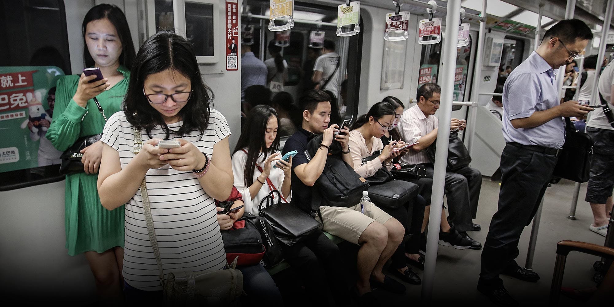
Of course, I need not remind you (as you read this from your smartphone screen) that in the thirteen years that have passed since then, screens and their attendant software have woven themselves ever more tightly around our lives. That same emptiness gnaws all the more insistently from proliferating digital surfaces, some of which have even begun to wrap tentatively around our face. With the average human being now spending upwards of 40% of their waking hours in front of an internet connected screen, the question of how these spaces should look and feel takes on an even more urgent dimension. Beyond tools, these devices are practically where we live.

Naturalists vs Antiquarians
Accordingly, the early years of the 2020s have seen software designers set out in various different directions to recover depth and texture to the screens that we now call home. Some—call them the Naturalists perhaps—believe that our software should be as vivid as the real three-dimensional Dingwelt beyond. They’ve sought particular inspiration from the richer environments and mechanics of video games and begun to bring game-like physics and textures (plus shaders galore) to more humdrum categories of software.
Just look at that Apple animation above, all that particle rendering just to show some money move from one phone to another! It’s baroque and excessive, but no-one could possibly look it and argue it doesn’t make you feel something. Go and mess around with Andy Allen’s Not Boring apps for another (strong) flavour of this point of view.
Not everyone is a Naturalist though. Others—call them the Antiquarians—have, like a modern-day Piranesi setting out to sketch the ruins of Rome, plundered design history for visual ideas. Specifically the early history of software design and computers. Early Internet culture, it’s condensed Garamonds, risographs, bitmaps and beiges have returned texture to our screens with added retro feels, along with a seductive note of nostalgia for a simpler kind of decade where the digital world was still rough-edged and full of possibility, rather than balding billionaires.
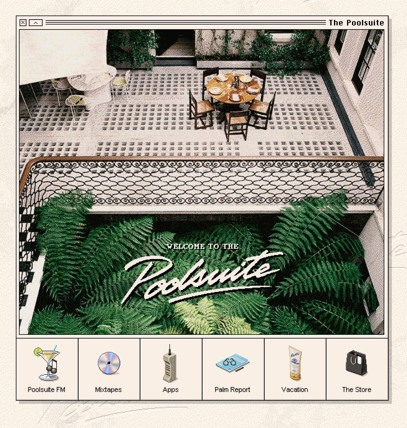
Early glimmers of this antiquarianism were visible in the breakout success of Poolsuite FM, whose painstakingly recreated Mac Classic interface was the perfect complement to the laid-back roster of Chillwave and Disco music it broadcast for homebound listeners in the early days of the pandemic. Since then a growing breed of trendy consumer social apps like Drumroll and Lapse have begun to sport unashamedly pixellated icons and heavyset border treatments that would make Jony Ive blush. At their best, these design choices evoke a sense of a shared cultural history and human connection that feels absent from most of the digital spaces we inhabit.
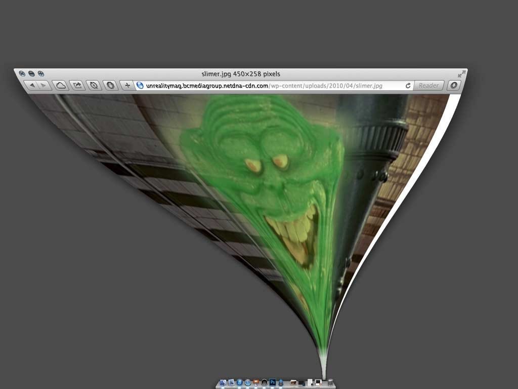
Indeed it’s against one example of these antiquarian design antics that my mind recently tripped up. That is to say, the curious return of the software bezel.

Bring back the bezels
You have to feel for Apple’s hardware engineers. They go to ever more elaborate lengths to shave off fractions of a millimeter from the actual hardware bezel of iPhones only to see that precious space freed up to introduce… software bezels. The images above show a clutch of recent-ish software projects that make no bones about drawing in pixels what advanced manufacturing techniques no longer require from atoms. It’s skeuomorphism of a different and fascinating kind— put there not to teach us how something works, but instead to help us feel a particular kind of way.
And yes, unmistakeably a lot of those feelings are nostalgic. For those heady days of 2004 when you had an iPod Mini full of Avril Lavigne in your jeans pocket, or even that mysterious and fascinating period just before many Gen-Z and Millennial adults were born when computers were heavy and had to be approached like a holy relic, requiring strange and cumbersome incantations to bring to life.
It feels significant to me that the bezel is the exact point where the digital stops and reality begins. In a world drowning in digital content—don’t worry YouTubers uploaded on average five hundred hours of content every minute last year—the extraordinary promise a bezel makes is to actually contain all that. Design that gets into rather than out of the way. As if we could actually draw a box around the digital maelstrom and put it down rather than slide through glassy-eyed forever.
Maybe it’s just me, but somehow these software bezels seem to promise a boundary that collectively we’re all exhausted from trying to enforce.
The Paradox of Flux
We don’t think enough about how weird screens are. One of my favourite essays by designer Frank Chimero—What Screens Want—provides a potted history of them that starts with Eadweard Muybridge’s flickering zoopraxiscope. In the essay, Chimero is seeking what he describes as their ‘grain’, that is, their essential nature. What he ultimately hits upon is their endless capacity to change:
I think the grain of screens has been there since the beginning. It’s not tied to an aesthetic. Screens don’t care what the horses look like. They just want them to move. They want the horses to change.
Designing for screens is managing that change. To put a finer head on it, the grain of screens is something I call flux.
—Frank Chimero
I often think about this essay when I think about that fateful period ten years ago when the design pendulum swung hard into ‘flat design’. Jony Ive’s hardware designs at Apple always sought to be true to themselves and the materials they were made out of, and in doing so achieve a kind of inevitability in their form. An iPhone seen this way is a kind of Ur handheld device, distilled and distilled again to an archetypal rounded rectangle.
All this talk is well and good when you have stubborn atoms and manufacturing processes to push against. However, it’s always struck me that to extend such a philosophy to the design of software creates a kind of paradox. If the essential truth of a screen is that is not really anything in itself, just a protean, shape-shifting grid of light, then how can you be true to that? Overly fixating on any one dimension, like for example that the screen is flat, seems a denial of flux, of changeability. Starships were meant to fly and screens are meant to be well, anything.
Is it possible that we got too hung up on the visual truth of a screen and lost sight of its deeper purpose? A screen is not just a surface—it’s a stage, a portal, a mirror. It doesn’t matter that it is flat; what matters is what it evokes. Instead of asking how to make software look true on the screen, the more urgent question how to make it feel meaningful to the human on the other side.
Towards a skeuomorphism of the soul
The word trend has a flimsy and superficial quality, but I think it would be a mistake to dismiss the visual trends I’ve covered in this essay as mere aesthetic restlessness, a pendulum swing back from minimalism, or a kind of 21st-century horror vacui that tells us only that the whitespace grew too big. Beneath the textures, drop shadows, and bezels I think something deeper is straining to express itself. If you listen closely, you can hear the murmur of something much more urgent. People are telling us they want more boundaries and more seams. That they want a human touch, and actual community. A bit more love and a bit less polish.
Traditionally, skeuomorphism has referred to digital elements that mimic real-world objects to make interfaces easier to understand and use. But recently I’ve been thinking about an extension of this concept that would speak to us as emotional rather than simply pattern-matching beings. If skeuomorphism once helped people navigate unfamiliar technology by means of references to some antecedent object, so might a skeuomorphism of the soul help people find their emotional bearings in an increasingly overwhelming digital landscape with references to our physical, embodied reality and shared culture and history.
As I see it, the experiments of both the Naturalists and the Antiquarians are varieties of this new kind of skeuomorphism. It’s different to the last time because it takes for granted that these screens are our new reality. The task at hand now is to somehow make ourselves at home here.
Right now, we’re only touching the surface of this shift, the design tweaks I’ve talked about are mostly aesthetic—a re-skin of the same old feeds and shopping carts that we’re used to. The deeper challenge is to rethink interaction models entirely—not just how things look, but how they work. Interfaces that prioritize depth over distraction, presence over passivity, and real relationships over engagement metrics.
I can’t deny it’s somewhat dispiriting to re-read Frank Chimero’s essay from twelve years ago and see him calling for the same revolution that I do here in 2025. For some reason though I’m feeling optimistic today. We stand on the precipice of another technological shift with AI and there is something about the underlying technology this time round: it’s sloppiness, flights of fancy and tendency to makes things up that feels inherently more human. Maybe, just maybe, we’ll find this a surer foundation for a more humane and soulful kind of software.
I’ll leave you with a quote from designer Bruce Sterling that has always inspired me in times of uncertainty:
[We need] a class of aware, well-informed, trained and educated people who can navigate their way through this field of complexity, negotiating the snaky process of technosocial change and guiding them towards the sustainable.
Who would that be then? Designers. Who else is there?
Cherish those bezels. I’ll see you in a couple of weeks.
Ben
Enjoyed this week’s Design Lobster? Let me know by clicking the heart button ❤️
👇
If there's one thing I'm optimistic about with the shifts we are seeing is a return to analog and more tangible design... design that has texture and feeling and weight. Hopefully Gen Z/Alpha will drive some of these trends... I mean, look at Barnes & Noble's triumphant return due to BookTok -- it's possible we could be looking at a similar shift in hardware and software, too.
Beautiful and inspiring words to a fellow designer 🙏🏼