#154 Pushing buttons 👉
To press or not to press...
Hello! There’s been a whole bunch of news about buttons recently and so I’ve pulled together my thoughts into this week’s issue.
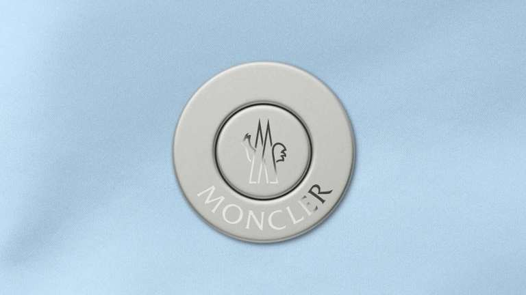
We’re asking what it means that Apple have begun to add back buttons to their famously buttonless devices. And examining a strange magnetic button that Jony Ive has designed for Moncler. Did you know the French word for button —bouton—also means ‘flower bud’? Now you do 🌹
Question: Why is Apple adding buttons back to their devices?
At the launch of the original iPhone in 2007 Steve Jobs famously compared the sleek touchscreen of the Apple smartphone with the chaotic mash of buttons that adorned the adjacent Blackberries and Motorolas. Ever since, the arc of mobile device design seemed to be bending towards ever fewer buttons, with Apple even removing their famous Home button with the launch of the iPhone X in 2017 in favour of a simple swipe up.
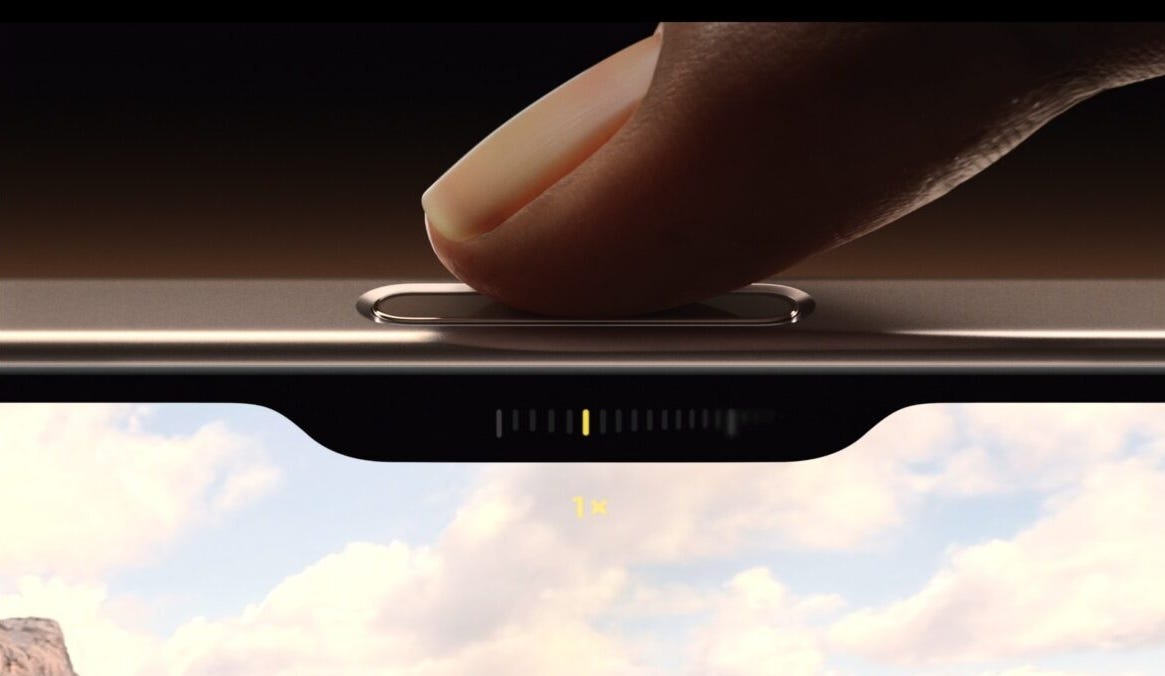
So it is notable that the last two generations of iPhone have added rather than removed buttons. Last year’s swapped out the ringer/silent switch for a customizable ‘Action button’ and this year’s adds a ‘Camera Control button’ on the lower-right hand side to give you quick access to camera controls when taking a picture. At the most obvious level, the design choice is a recognition of how central the camera experience is to the iPhone’s value, but I also have been mulling on this tweet from earlier in the summer in relation to this renewed interest in physical buttons:
“The kids are joining running clubs, buying “dumb” phones, woodworking, rocking Walkmans, joining supper clubs, etc because their lives have been swallowed by digital black boxes, and in this moment of uncertainty (tension re: war, AI, climate), they crave tangibility. It’s simple.”
Until fairly recently the future looked like touchscreen-everything, but I think the vibe has shifted towards the tangible—something to push up against in our slippery screen-dominated world. It’s IRL that we’re all craving now and I think that’s driving the retro interest in 80s and 90s computing aesthetics and also why skeuomorphism is resurgent (see Jordan Singer’s latest contribution here). Digital designers are trying to fill all these yawning black boxes with something that has a bit more soul.
Now, I am not predicting that Apple are going to start swapping out their touchscreens for grids of buttons, but I do think we’re likely to see a few more funky button experiments from them going forward and continuing attempts to make touchscreen buttons feel as luscious and clickable as their IRL counterparts. I’m here for it.
Design takeaway: How could you make the buttons in your design feel more delightful to press?
Object: Moncler Duo button by LoveFrom

And now for an entirely different type of button. Jony Ive’s design firm, LoveFrom, has recently announced a collaboration with luxury skiwear brand Moncler that reinvents the traditional button for a new shell jacket collection. Shell jackets consist of an inner down vest and an external layer that can take different forms (poncho, jacket, parka etc). The trouble with them is that attaching and reattaching the inner and outer layers often entails fiddly zips and buttons that lead to frustration and sometimes even tears and rips.
Jony Ive’s team devised a solution to this problem that uses a two-part Duo button that is sewn into the upper and lower layers of the shell. The lower part of the button is cylindrical, with a separate central section that is pulled up by strong magnets into the hole of the doughnut-shaped upper part when they approach each other. This connection is strong enough to keep the outer layer attached until you push the central section down to make a change.
The result is an experience that feels ‘mindless’, you don’t have to invest much thought or effort into the connection process, the magnets just find each other and lock with a satisfying click. The project reminds me a bit of the accessible magnetic shirts by Singaporean designers Will & Well.
As always with a Jony Ive design the details have been laboured over. Notably in this project they developed a custom alloy of bronze, aluminum, and steel to ensure the sound of the button was just right when the segments came together. Treating something as ordinary as a button with such reverence fills me simultaneously with joy and mild vertigo 😅
Design takeaway: How could you make the most ordinary part of your design more special?
Enjoying Design Lobster? Share it with a friend, colleague or fellow designer 🤲🦞
Quote: “We made the buttons on the screen look so good you'll want to lick them.”
– Steve Jobs
Steve Jobs didn't hate all buttons. In this quote he’s describing the bubbly blue “Aqua” buttons that some of you might remember (and miss?) from a previous era of Mac OSX. Let’s make buttons delicious again.
Have a wonderful week,
Ben 🦞
Elsewhere…
📖 Last week my friend and fellow-reader Scott Berkun released his book Why Design is Hard. Highly recommend checking it out, here’s a free extract to get you started: If your job title has the word design in it, what do you actually decide? What can you choose to do without having to convince someone else first?
Probably not many things, if any at all. While you’re free to conceive ideas, you’re often almost the opposite of free in how those ideas are manifested into the world.
📱 Button nostalgia on full-display with this wildly successful iPod-aping wallpaper
💅 ‘Scene’ cool vs '‘internet’ cool - Sean Monahan’s (of normcore fame) latest missive: My twentysomething friend Blair now clarifies whether something is “scene cool” or “internet cool”. The thing with tons of likes may be real, it may be not-farmed. It’s hard to say. The patterns you see every day in your city, at a house party, in a club. Those are a much safer bet.
🎨 Here’s a good essay by Anu Atluru on taste. I continue to be fascinated by the taste discourse of the last year or so, as much as a sociological phenomenon as anything else.
Enjoyed this week’s Design Lobster? Let me know by clicking the heart button ❤️
👇


