It’s Design Lobster #72 and we’re taking a trip to the bathroom, exploring the science and psychology of toothpaste and admiring an early design of Jony Ive. Don’t forget to wash your hands! 🚽
✨Enjoying Design Lobster? Please share it with a friend, colleague or fellow designer.
Question: How (and why) do they put stripes in toothpaste?
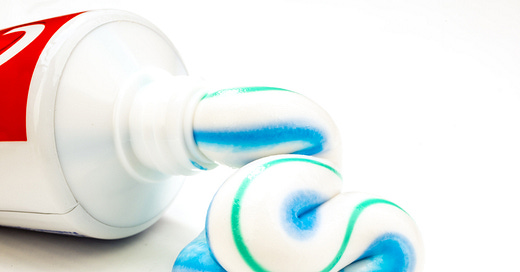
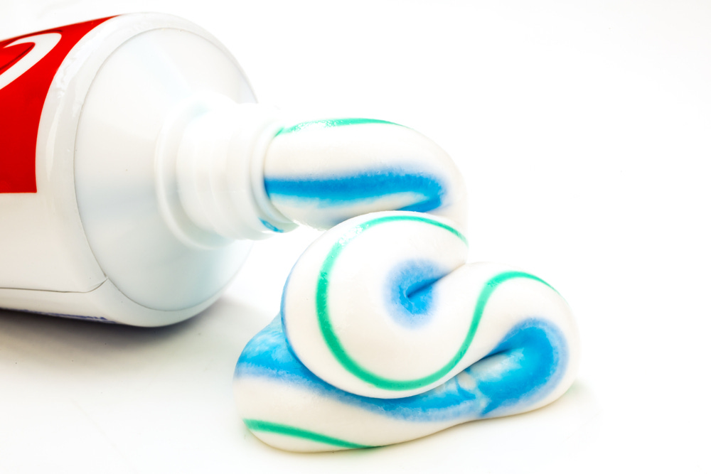
Have you ever wondered how your toothpaste emerges in such crisp stripes no matter how clumsily you squeeze the tube? The answer is due to the fact that the toothpaste gel has something called a thixotropic rheology. Rheology is the branch of physics the deals with the flow of matter – in the case of toothpaste the consistent viscosity of the different colours means that they flow out at the same speed and in the same position. The word thixotropic describes the way that once the toothpaste passes through the narrow nozzle, it regains its thickness when sat on your brush.
The methods for adding stripes differ slightly for single or multi-coloured striped toothpaste. As shown above, for a single-coloured stripe, the stripe colour is normally pushed out from a section near the front of the tube through separate channels, whereas for multi-coloured stripes, the colours can be found through the entire tube.
But why add stripes in the first place? Rory Sutherland addresses this question in his book Alchemy. When this innovation first appeared in a toothpaste called Stripe in the early 60s, marketers discovered that it reinforced the message that the toothpaste performed multiple functions. Though of course in reality the active ingredients were evenly spread through the entire tube, psychologically people considered the stripes as evidence it could, for example both fight cavities, tackle infections and freshen the breath, all at the same time.
Design takeaway: How could your design help to reinforce a message about what it does?
🦷 Watch a satisfying video of toothpaste being made.
Object: Raphael Basin
In the early 90’s, Jony Ive joined tangerine, a design studio founded in London in 1989 by Martin Darbyshire and Clive Grinyer. One of his early projects was for British manufacturer Ideal Standard, who were looking for a contemporary bathroom concept that would update their best-selling Michelangelo range.
Ceramics pose significant challenges for designers because during the firing process the material briefly becomes liquid before it hardens. If the design does not accommodate this it can sag and droop in the kiln. Undaunted however, Clive, Martin and Jony decamped to Somerset where they spent several weeks in a workshop creating physical prototypes of three concepts, named Raphael, Donatello and Leonardo after the Teenage Mutant Ninja Turtles.
Ive’s concept was called Raphael and the shape of the basin shown above took inspiration from the act of scooping water. Full of subtle curves, it nevertheless was designed with a flat back to facilitate firing. In spite of this, at a meeting where they presented it, they sadly couldn’t persuade the Ideal Standard leadership to commence manufacture.
Ideal Standard’s loss was Apple’s gain, not longer after that disappointing meeting Jony Ive left tangerine to join the Industrial Design team at Apple in California, where he would go on to design iconic products like the iMac, iPod and iPhone.
Design takeaway: Had a design rejected? Don’t lose heart, your next act, like Jony’s, might be the breakthrough you’ve been waiting for.
🚽 Read Jony Ive’s 2014 Time Magazine interview.
Quote: “Different' and 'new' is relatively easy. Doing something that's genuinely better is very hard.”
– Jony Ive, former Chief Design Officer at Apple
I thought it would be appropriate this week to share a quote from Jony. Here he reminds us to mistrust words like “new” and “different” when applied to design. Actually creating something better is another, far harder, challenge. Great design requires the courage and persistence to pursue better rather than just different.
Whatever you do, make sure it’s better 😉
Ben 🦞
Enjoyed this week’s Design Lobster? Let me know by clicking the heart button.
👇


Indeed, always try to be better.