
9 ideas about design 🔍
To make your next project more interesting
Hello! This week we’re stepping back to review some of the most interesting ideas about design that we’ve heard over the past few months.
I hope they'll spark ideas and make your next project a little richer and more interesting.
You can see the last roundup of ideas here and another one from 2022 here.
1. Take superstitions seriously
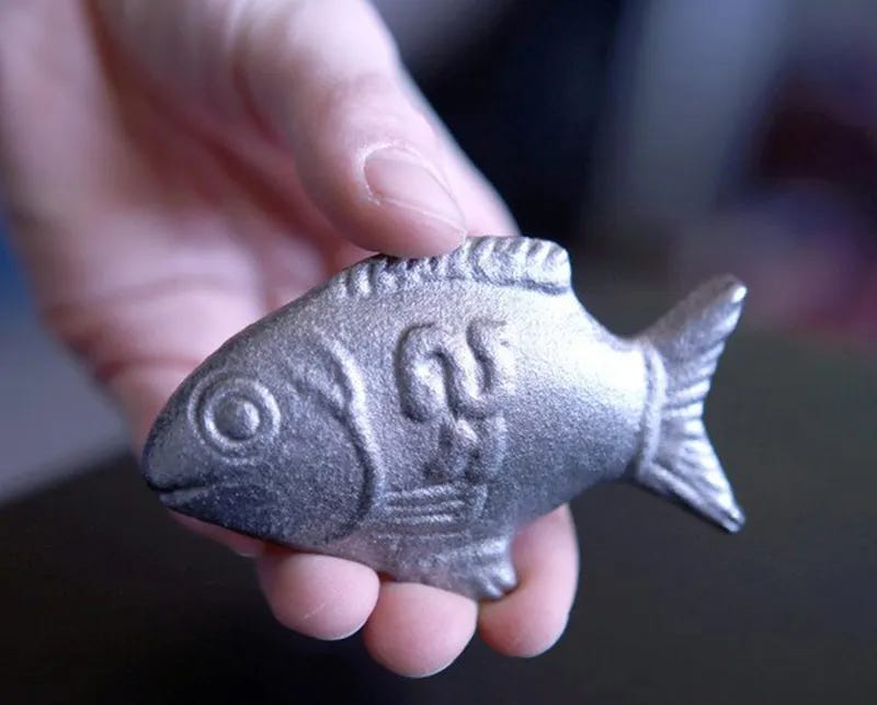
In 2008, Canadian epidemiologist Christopher Charles tried distributing iron ingots to Cambodian families, but they all too often ended up just used as doorstops. Charles then shaped the ingots like a local lucky fish—the try kantrop—this time resulting in enthusiastic adoption.
We humans are irrational creatures, behaving and making decisions for cultural and psychological reasons that on paper don’t make much sense. Much of the job of design involves navigating these often perplexing currents, so that we don’t miss the small, even silly seeming quirk that can be the difference between somebody using something every day and never even hearing about it. So, take the things that might seem silly, seriously.
🎏 Design Lobster #141 has you covered for more tales of the irrational
2. Use an em dash (correctly)
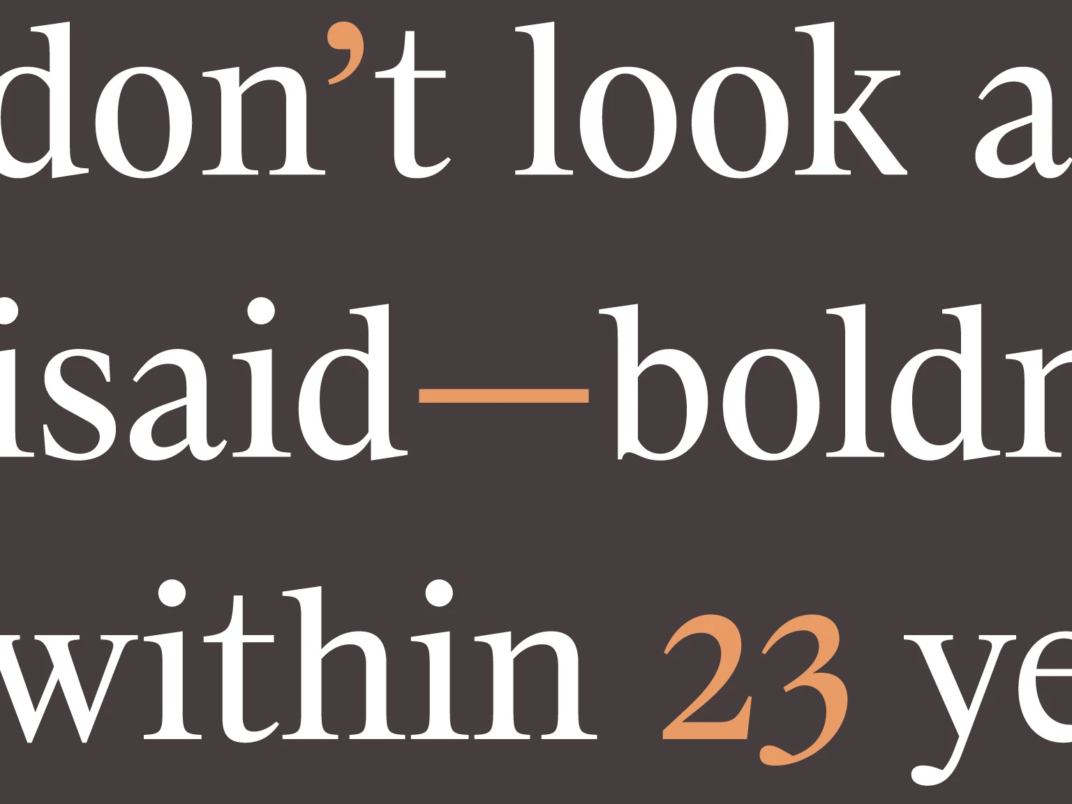
In our inaugural edition of 22 Questions, we asked legendary designer Hugo Cornejo 22 questions about design and learned about his journey, influences and advice for other designers. In one of his answers, Hugo reminded us of the importance of good orthotypography—that is the proper arrangement and styling of text.
Knowing the nuances of punctuation, spacing and figures gives you new and subtle powers to elevate a design. Sometimes all a design needs is the right approach to type to really sing.
👀 Read the rest of Hugo’s answers here
3. Make it a little uglier
In a world where everything is perfect and beautiful, the right way to counter-signal might be to be ugly, authentic, and real.
—Andrew Chen, How AI will reinvent marketing
We designers are trained to make things beautiful, but in a world dominated by templates and filters, where everything and everyone feels designed to within an inch of its life, we might need to check that tendency somewhat.
The Ugly Design instagram, and TikTok trends like Avant Basic, point to a future where design gives up on being quite so tasteful in order to better connect emotionally with the next generation. We’re talking wonky fonts, chonky or goopy shapes or an outré composition. Choices like these might, in a weird way, actually make your design feel more relatable.
One health warning though: Making something that looks a little homely is not the same as making something that doesn’t work. A Post-Taste world is not a Post-Usability world.
😱 Read more in my essay: Designing in a Post-Taste World
4. Chop things up
In 2008 Pentagram partner Michael Bierut led a project to redesign the visual identity of Saks, the famous Fifth Avenue department store. Rather boldly, they took a square crop of the store’s cursive 1973 logo and cut it into 64 smaller squares. By rearranging these smaller squares and playing with their scale they created forty different packages from jewellery boxes to shopping bags.
Chopping the logo up was daring, but maintained a visual connection to what had gone before—transforming a symbol of the brand’s heritage into a design that felt instantly fresh and contemporary. If you are feeling stuck with your work, I recommend taking a leaf out Pentagram’s book and taking a pair of scissors to your current iteration—it might lead you somewhere more interesting.
✂️ Design Lobster #143 was a riot of bold graphic design
Enjoying Design Lobster? Share it with a friend, colleague or fellow designer 🤲🦞
5. Frame your work
The design process is full of twists and turns and so moments where you create something that stands by itself, that feels ‘right’, are a clue that you’re heading the right direction. A crumb of gold that encourages you to keep chasing the rainbow.
Sometimes, if I find that things are not working out how I want in a design project, I will spend some time finding and “framing” these crumbs of gold as a way of better understanding where I’ve reached, and deciding what to do next. So if you’re in a rut, try putting a literal or metaphorical frame around some of the things you have created, and see what possibilities that opens up.
🖼️ Read my full essay: Framing Things
6. Question the question
After a mediocre brainstorming session we can often blame ourselves for ‘not being creative enough’ but Tina Seelig, an innovation professor at Stanford, argues that our problem is instead how we frame our questions—with subtle changes in language guiding us to very different solutions. To address this, Seelig advocates for ‘frame-storming’ where teams brainstorm various ways to frame a problem before generating ideas. For instance, changing ‘reducing traffic’ to ‘making commutes easy and enjoyable’ opens up new possibilities. The trick is finding a question that’s specific enough to the problem at hand whilst not being so specific that the solution is pre-ordained.
Being able to flip between different framings of a problem and explore the different solutions that each framing yields is, for me, the essence of creativity and guaranteed to take your next design project further.
❓Learn how to find the right question in Design Lobster #146
7. Combine the hand-made and machine-made

In 1928, Bauhaus designer Marcel Breuer was inspired by his Adler bicycle's steel tube structure to create the Cesca chair, combining a lightweight frame with a woven cane seat and backrest. Named after his daughter Francesca, the chair was initially manufactured by Thonet and later by Knoll.
There is something about the collision of the woven and steel elements in the chair that gives the design real energy. It seems to look both forward and back at the same time. You can bring some of the same dynamism to your design by combining the hand-made and hi-tech.
🛠️ Read Design Lobster #147: Makers vs Machines
8. Fiddle with your design

There is something inherently satisfying about some interactions, and in his 2023 essay Design Engineer Rauno Freiberg documents the invisible details that contribute to some feeling just so damn good. One of my favourite sections introduces a concept that Rauno calls “fidgetability”.
Wonderful interactions don't have to be entirely practical. We've all been in math class, either biting our lips or repetitively clicking a pencil while crunching numbers. Behaviors like this are considered fidgeting—in other words, repetitive movements that help release situational stress or enhance concentration. Although there is no scientific research that supports this claim, fidgeting does feel like a part of intentional interaction design.
—Rauno Freiburg • Invisible Details of Interaction Design
There’s just something reassuring about things which slot, click or snap together nicely—and interactions like these can create a surprisingly powerful emotional connection. Lavishing some care on one or two of these in your design is sure-fire way to make it more interesting.
🤏 Design Lobster #149 has even more for you to fiddle with
9. Get people talking
Especially when it comes to digital products being conversation-worthy or not can be life or death. There is a whole science to making digital design easier or more natural to share but this way of thinking extends far beyond referral codes. The truth is that people talk about what they didn’t expect and this creates all sorts of interesting opportunities for designers that I don’t think we pursue well enough.
“To sell something familiar, make it surprising. To sell something surprising, make it familiar.”
—Raymond Loewy
From Apple’s emergency features to my own company’s Monzo’s brightly coloured cards, there are design choices that can be made that somehow demand attention or curiosity. Exploring what these could be in your design might be the difference between breaking out and sinking without a trace.
👀 Read the other 3 questions I ask myself when designing
Thanks for reading this special edition of Design Lobster. See you in a couple of weeks.
Ben 🦞
But before you go, a design remix…

Enjoyed this special edition? Let me know by clicking the heart button.
👇
I love me an em dash!! Use 'em all the time.