Hi 👋
This week I’m interrupting our regular schedule with a short essay about framing things.
In a previous essay I argued that collecting nice things helps us to become better designers. Well, you can think of today’s essay as the sequel. I want to convince you that we should become better collectors of our own work too. If that doesn’t quite make sense to you yet, don’t worry—let’s dive in.
At the end of my first year of architecture school, my tutor Ingrid, who now runs the Architectural Association in London, was explaining how we should approach composing our portfolios for the end-of-year reviews.
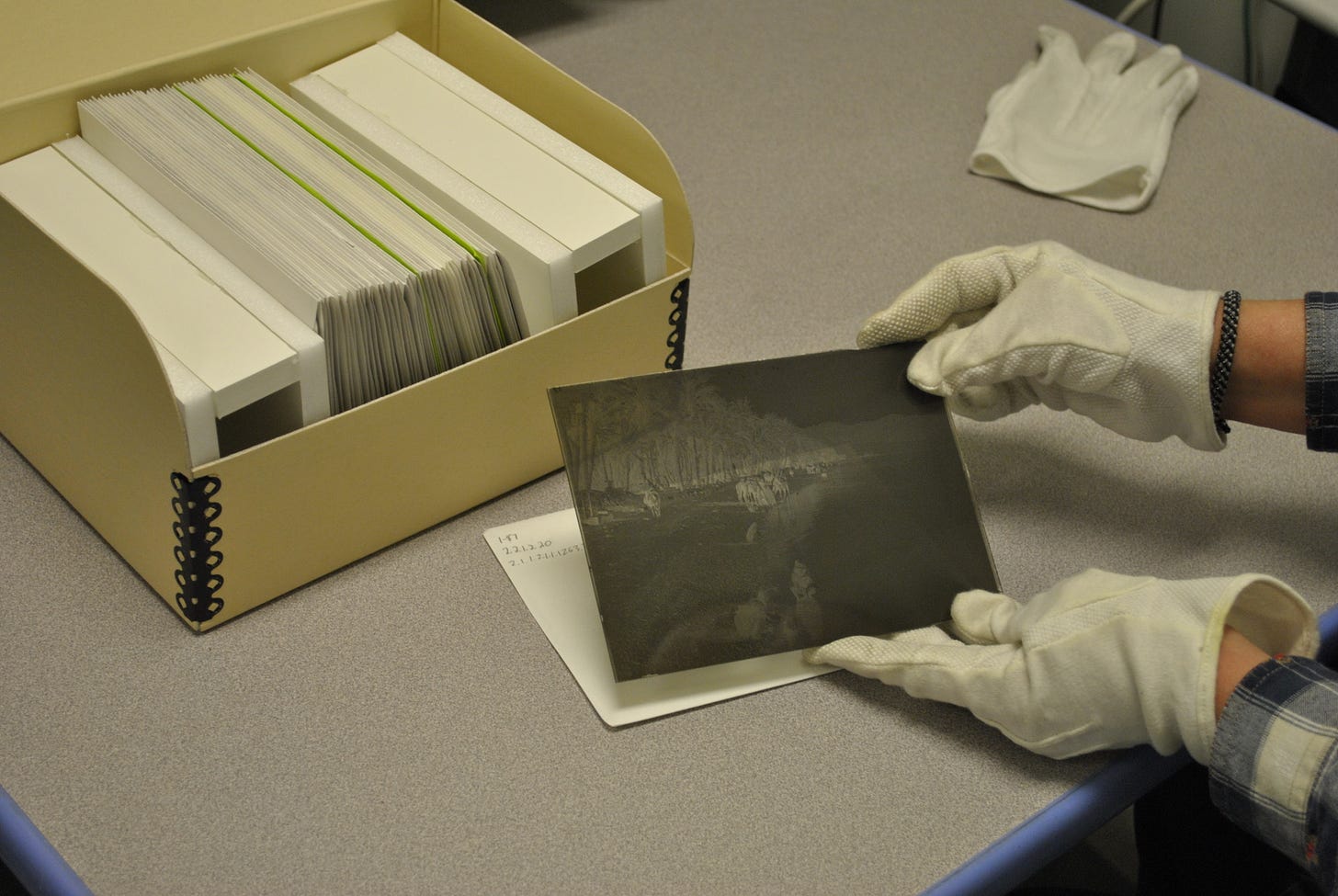
She asked us to imagine putting on white cotton gloves to handle each of the pages, referring to each one as a ‘plate’ as if it was a sumptuously-printed spread in an art book or catalogue raisonné. She wanted us to feel that each page was deeply considered and precious, whether the contents were a simple photocopy of some sketches, or a detailed render of an interior. It was not just the culmination of our work, the final renders that were to be treated as important, but every single one, each step of the process we had taken given its own space and special treatment.
Architecture portfolios are big, A1 or even A0—expensive and time-consuming to print. Due to their size they are cumbersome to handle and transport, and corners frequently get scuffed or bent as they are hauled around. If they were genuine ‘plates’ they would probably not survive very long.
But I think what Ingrid was seeking was not that we become literal archivists, but instead to adopt some of the reverence an archivist has for the work that they handle. The donning of white gloves a symbolic gesture of attention and care. A mindset to bring to the job of designing our portfolio.
Later, when I was working for an architect in London in my early twenties, there was one day when the Principal Architect picked up a detail drawing from the printer that showed some of the envelope of a large residential building the practice was working on at that time. It was just an ordinary construction drawing, used to plan how the windows and balconies should be set out by the contractor, but he had noticed how beautiful it was as an image, resembling sheet music for a staccato passage of orchestral music.
It was put on the wall and we all admired it for several minutes and it ended up staying pasted up there for many months. An unexpected moment of poetry in the frequently humdrum work of specifying architectural construction details.
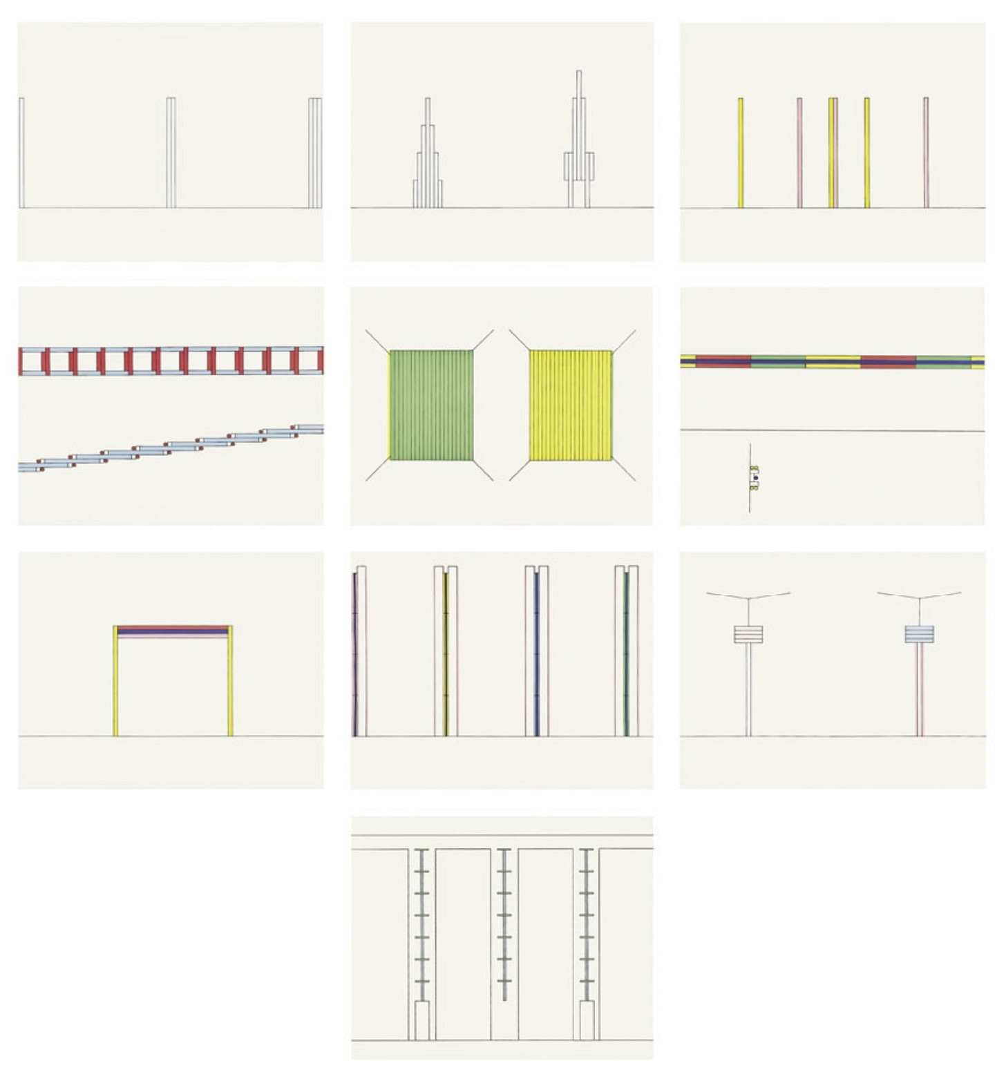
I was reminded of these two memories recently when I visited the Donald Judd Foundation here in New York. In the staircase on one of the floors there are some drawings by the artist Dan Flavin. Flavin’s room-length installation untitled provides a neon crescendo to the tour of the building and in comparison these simple drawings are pretty innocuous. Each shows him working out the elements of a different sculpture and they have a technical quality even though they are just made with coloured pencil and pen on graph paper. But as you look at them you sense their significance. It’s as though you can feel him thinking through something and maybe finally making a breakthrough.
Unfortunately, you’re not allowed to take photographs on the tour, but the aquatints pictured above give a decent sense of what the drawings I’m referring to are like.
I saw in these drawings by Flavin a similar kind of reverence towards the artefacts of the design process that I’d witnessed at the end of my first year at architecture school, and again in the office as we stood around the detail drawing on the wall. A commitment to concentration and patience, a willingness to try and really see what you are doing, as you are doing it. I’m pretty sure Donald Judd must have seen something similar in them too, as he was famously particular about what was permitted to go on the walls at Spring Street (and indeed everywhere else he lived).
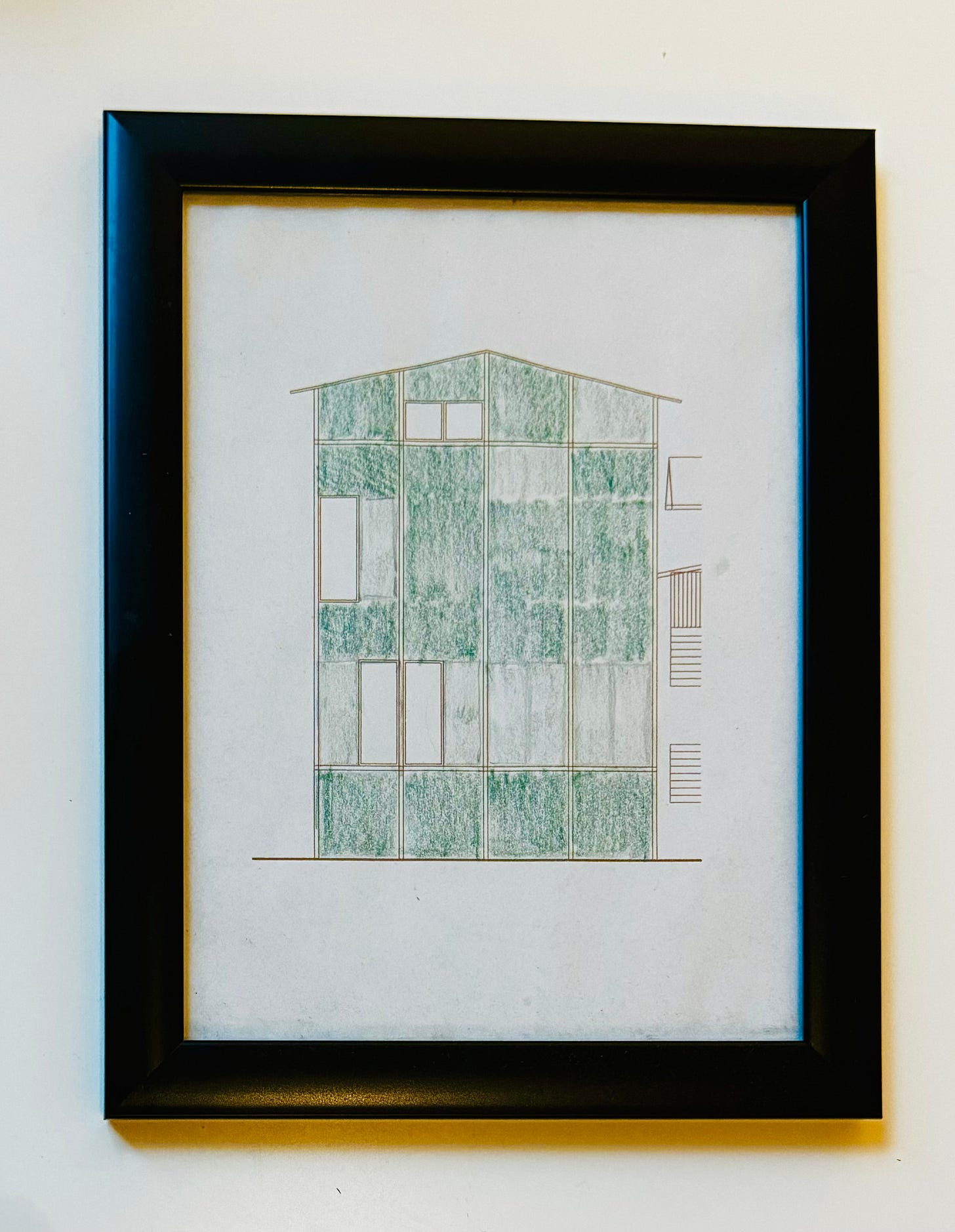
I tell you all these stories as a way of explaining how I became sensitive to the aesthetic power of certain working drawings. The design process is full of twists and turns and so moments where you create something that stands by itself, that feels ‘right’, are a clue that you’re heading the right direction. A crumb of gold that encourages you to keep chasing the rainbow.
And so sometimes, if I find that things are not working out the way I expect, or I feel lost, I will metaphorically put on some white gloves and spend some time finding and framing these crumbs. In fact, as in the example above from a Masters project, the framing part is quite literal.
In an essay last year I wrote about the importance of cultivating a collection of “nice things” as a way of navigating the vagaries of the design process:
Examples of well-made, self-contained things can guide us towards what we need to do to achieve something similar in our own work, even if we can’t full articulate exactly what we’ve learned from them. If I’m feeling stuck or lost, sometimes just being in the presence of some of the things I’ve collected can feel like finding a compass, and knowing which way is north again.
—from Nice things
The post-script that I want to add today is that we should not be limited in this process to the work of others. Combing through and framing the ‘nice things’ that we have created is just as important. This is what I mean by becoming better collectors of our own work. Perhaps in this activity more than any other, our taste as a designer develops.
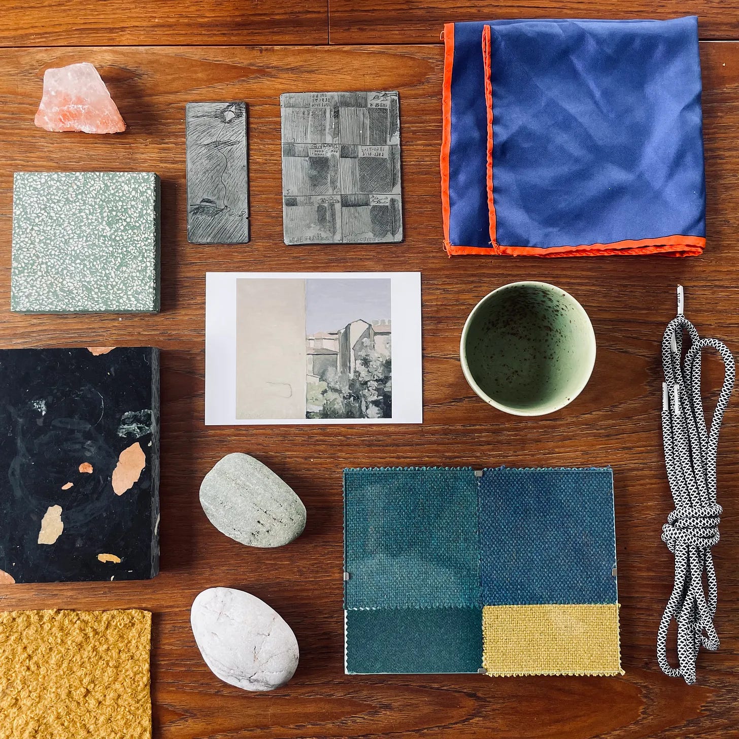
Because as good as it feels to put a frame around something—to give ourselves the gift of validation that a frame affords—the more powerful gift by far is to help us notice what are actually doing.
It is easy to forget, or get distracted from the fact, that design is a form of research. We do not know in advance what will work and how exactly. We can prepare ourselves with all manner of frameworks and heuristics and references but at a certain point we just have to sit in the presence of the thing we are making and see what is and isn’t working. In my mind at least, ‘trusting the process’ isn’t so much the business of sticking to an approved sequence of activities but instead this steady and regular act of contemplation. The cultivation and practice of learning from what you’re doing, as you’re doing it.
I am frequently struck when mentoring junior designers by how headlong a rush the work feels. One thing after the other and no pause to consider what has been discovered before the next activity has already begun. Work in other words, that would benefit from stepping back and framing things for a little while, before beginning again.
I think activity of framing is perhaps more challenging in digital design work because our canvases stretch out infinitely and there is no obvious place to store the kind of fragments I’m describing. I have a folder or two on my desktop and in my phone but it is not quite satisfying in the way a physical artefact is.
To some extent, I think that the decks that we make for people not directly involved in the design process (that ominous word ‘stakeholders’) act imperfectly as a kind of frame, though the contemplation that they receive is often of quite a different kind. Other artefacts like prototypes that we create to share our ideas with strangers perhaps work better, because in observing another person with no fore-knowledge or preconceptions encounter our work, we inevitably begin to notice what the work is in a different kind of way.
So far I have not really found a better method than screenshotting, firing up a wheezy Canon printer and buying a cheap IKEA frame. Perhaps this is a call for a better digital tool (or maybe one exists already I do not know about). Contemplation mode in Figma? I think for many people a social media post works a bit like a frame. Though the very public-facing (and rather capricious) quality of attention you find there isn’t quite my cup of tea.
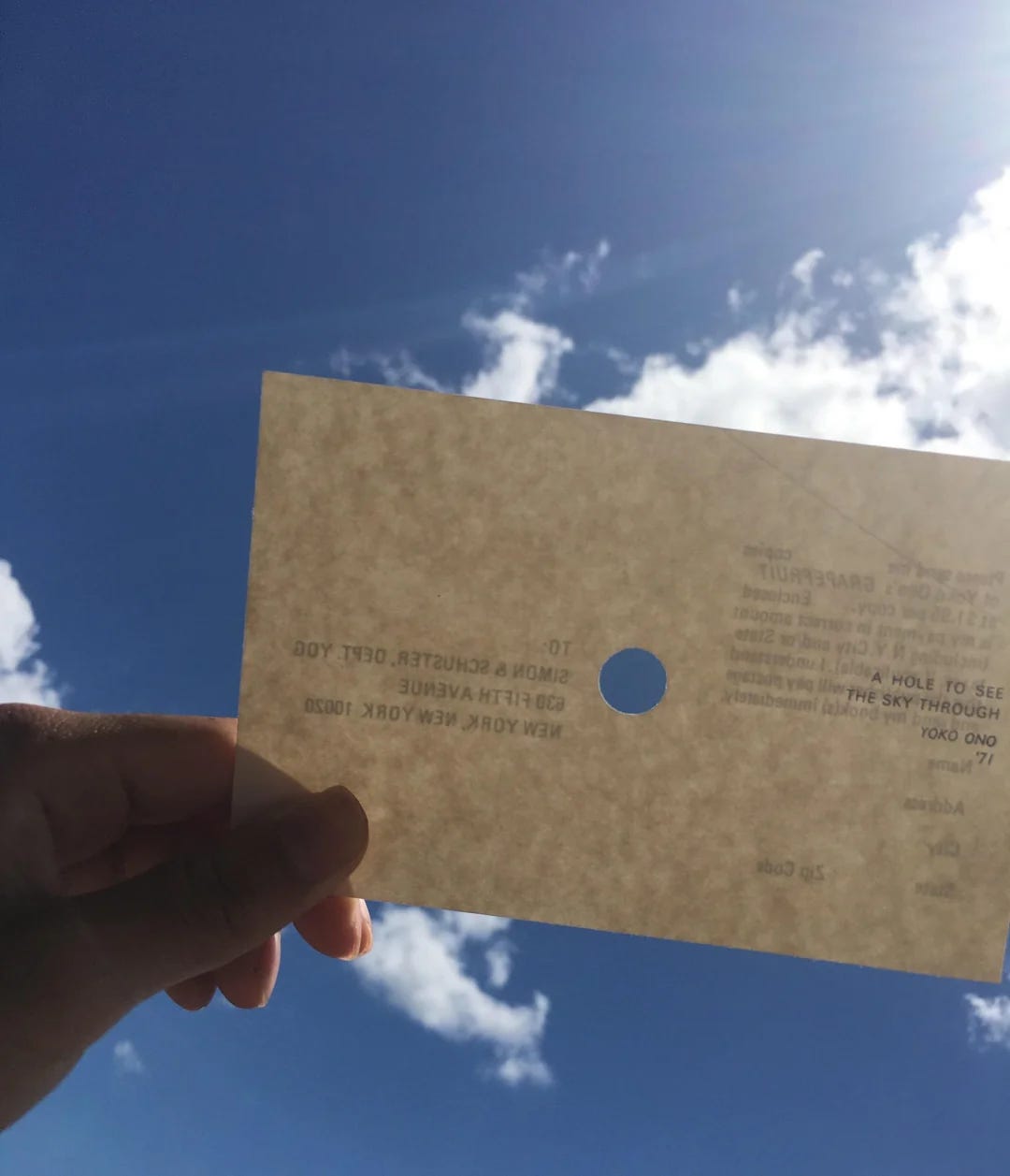
There’s a slightly obscure 1971 conceptual art project by Yoko Ono called A Hole To See The Sky Through. In this project the artist printed and sent out postcards with a small hole cut out in the centre. The instruction to the receiver was to try holding it up to the sky in various different places, and in so doing see the world in a slightly different way.
I want to finish with this project because it helps us visualise a frame as not just a boundary, but also as an opening. Something that allows you to see through to something else. Because, paradoxically, in the seemingly limiting act of drawing a line around something, you enable it to become a window or a gateway to something even better.
Hope you can find something to frame this week 😉
Ben 🦞
Enjoyed this essay? Let me know by clicking the heart button ❤️
👇


Framing, in some strange way, gives me the strange sensation of actually listening to a drawing or other visual.
I agree on many levels. I recently framed a coveted academic certificate that had stayed rolled in a tube for many years. There's a certain sense of reflection-cum-satisfaction each time I catch a glimpse of it.
Yet as a design researcher, it can often be difficult to create an artifact to put a frame around. Lots of words and textual concepts, lacking in a visual representation.