This week’s Design Lobster is diving into the irrational side of design. Don’t worry we aren’t going to read your horoscope or your Tarot cards but we do have some thought-provoking design stories to explore around this theme, including one about a tiny iron fish that I think you’ll love…
Question: Why are designers so superstitious about alignment?
There’s a popular kind of Twitter (ahem, X) content that dunks on a new logo with a diagram like the one above that demonstrates how designers at your favourite big tech company are failing to observe the basics of visual order. I never cease to be fascinated by the passion and even vitriol these faux-pas generate online. There’s even a dedicated meme account that mocks these explosions of design condemnation by applying a fibonacci spiral to everything from pastries to Kim Kardashian.
On one level I can’t dispute the sloppiness that many of the logo examples exhibit. As designers we should always be striving to create a precise compositional order and be mindful of phenomena like optical balancing and negative space. On the other hand, the sheer emotion these infractions seem to generate suggests to me that there is something more fundamental at play in the designer hivemind’s collective response
Alignment is a universal cue of care. It signals that this is something a human being built. Care was put into it. We see this in UI design, we see it in interior design, we see it everywhere.
– Eric D Kennedy, Product Designer
I shared this quote a few newsletters back and I’m sharing it again this week as I think it gives a clue into what might be going on. It seems to me that these misalignments don’t just represent poor craft or taste to many, but a kind of ethical breach. If alignment is how we show we care, then misalignment is a disturbing show of indifference. The equivalent of a chef not washing their hands or a doctor not paying attention to test results until it’s too late. Of course, when a logo’s misaligned nobody gets ill or dies, but design is a profession too. And if a janky logo has slipped through, what other more serious oversights might also be lurking elsewhere?
Design takeaway: What superstitions are you haunted by when designing?
Enjoying Design Lobster? Share it with a friend, colleague or fellow designer 🤲🦞
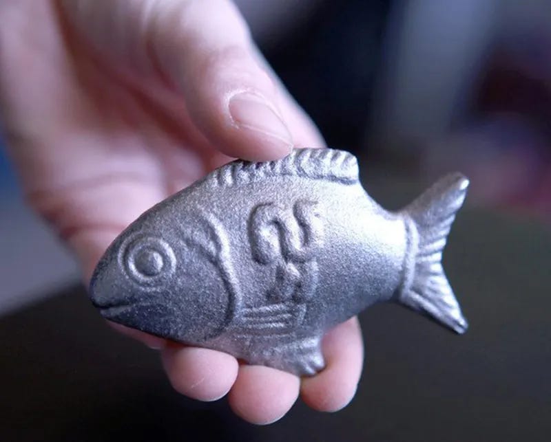
Object: Lucky Iron Fish

Iron deficiency is global health crisis, affecting by some estimates nearly half the world’s population. Cambodia, in South-East Asia suffers especially acutely as iron-rich foods are expensive or unavailable and even iron cookware, which can release iron into food through cooking, is unaffordable for most families.
Canadian epidemiologist Christopher Charles became aware of this problem whilst working there in 2008 and tried distributing cheap iron ingots to Cambodian families that could be placed in a typical aluminium cooking pot and slowly release iron as food was cooked and stirred. However when he checked back months later, he found most of these were just being used as doorstops. In a flash of insight, he had a new set of blocks created in the shape of a lucky local fish – the try kantrop. Returning a second time he was delighted to discover they had been enthusiastically adopted and later studies showed iron levels in families using the iron fish were as much as ten times higher than average.
As designers are all too aware, we humans are irrational creatures, behaving and making decisions for cultural and psychological reasons that on paper don’t make much sense. Much of the job of design involves navigating these often perplexing currents, so that we don’t miss the small, even silly seeming quirk that can be the difference between somebody using something every day and never even hearing about it.
Design takeaway: How are superstitions changing how people use your design?
🔮 In Design Lobster #8 we covered Co—Star, an app that spoke directly to Millennial superstitions
Quote: “Not everything that makes sense works, and not everything that works makes sense.”
– Rory Sutherland, Vice Chairman of Ogilvy
I am a huge fan of Rory Sutherland’s books, grab a copy of Alchemy if you haven’t already read it. This quote dovetails nicely with the theme – a healthy reminder that designing for human beings is not a formula, and the most interesting designs spring from the maddeningly surprising ways we actually think and behave.
Wishing you a lucky week,
Ben 🦞
And lastly, a design remix…
Enjoyed this week’s Design Lobster? Let me know by clicking the heart button ❤️
👇


Alignment is interesting isn't it? I always wondered why the Spotify logo is on an angle. Apparently one reason is so that it doesn't look like a WiFi icon. It also makes it slightly more interesting. To me it sort of expresses sound waves. It is also designed to make an easily recognisable app button on a small screen. I do wonder sometimes how much money and effort goes into the design of logos, and how much it really matters. Brand recognition clearly matters a lot in a competitive world. Is a logo better because someone paid tens of thousands for it, or it was designed by a top tier company?