#8 Star signs, snuffboxes & designers as doctors
Welcome to Design Lobster #8. Wherever you are; at home, in work or at the hospital, I’ve got some design-related distraction for you. ✏️
Question: How might we tell people their horoscope?
The explosion of interest in astrology by millenials has been a curious phenomenon of the last five years. Whether it’s simply because we’re hopeless narcissists or that the fixed orbits of the heavens seem to offer a refuge these days from the uncertainty of modern life, I will let you decide. Nevertheless the magazine horoscope has recently undergone a redesign for the smartphone era.
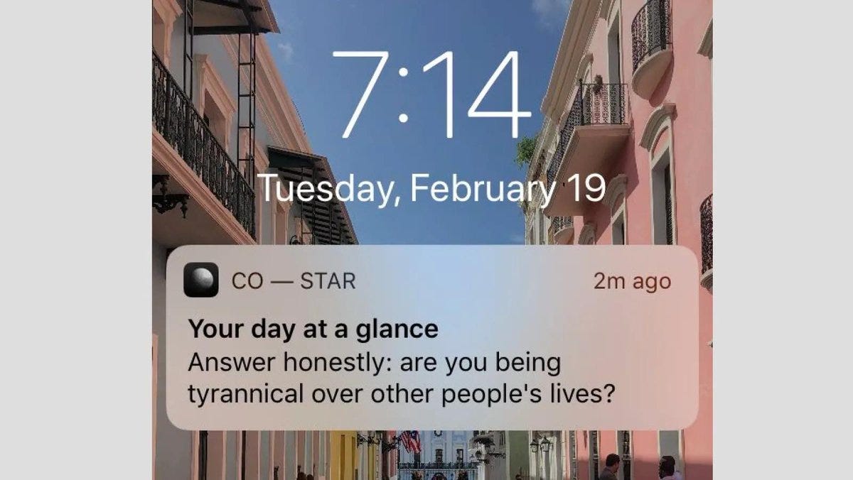
One company that has lead this resurgence is Co—Star. Their app claims to use NASA planetary data and a special algorithm to give you a horoscope based on your entire natal chart. At the core of the Co—Star experience is a daily push notification that doesn’t pull its punches. The example above is truly at the polite end of what they send their 5 million+ users every day.
I’m fascinated by the way that Co—Star get away with being often openly rude to their users. It helps that tone is often darkly humorous, but there aren't many companies that get away with telling their customers to get a grip. It seems that for many people, if the subject is themselves and the advice has the right ‘let’s get real for second’ tone, then there’s a surprising openness to being criticised by a machine. Maybe getting harsh truths from an algorithm feels more objective than from another human being?
Design takeaway: Would a bit of straight-talking work in your design?
An interview with Co—Star’s founder, Banu Guler.
…and a feast of rude push notifications here.
Object: Snuffbox shoe
I’m always intrigued by objects that disguise themselves as something else. There’s something deliciously surreal about it. But it makes sense too. In design we’re often reaching for metaphors to help explain to a user how something works or how they should approach it. By mimicking the appearance of something else you carry over the connotations of that thing to the new one – which they may know less about. We see this everywhere, from clock faces imitating sundials to skeuomorphism in software design.
This 18th century English snuff-box is disguised as a lady’s shoe, which whilst not the most obvious receptacle for something you put up your nose, is nevertheless a high fashion item that sets a certain kind of tone for the taking of snuff. A fancy shoe like this wouldn’t look out of place at parties, is a humorous talking point and perfect for sharing. Maybe one might even choose a snuff-shoe to match the rest of your outfit for that night. Faced with the problem of how to glamorising snuff-taking for an audience of women, the designer has (ethically or not) pulled out all the stops.
Design takeaway: How are you disguising your design? And to what ends?
Get lost in the Holbourne Museum archives here.
Quote: “I believe that designers should be seen in the same way as doctors. That is, to be seen to be continuously learning, expanding their knowledge and skills.”
– Yasushi Kusume, Innovation and Creative Manager at IKEA
The training for designers and doctors is quite different in most countries. The latter insists on the absorption of a baseline level of clinical knowledge whilst the former prioritises learning a process instead. As the remit of design work continues to creep outwards it seems uncontroversial to suggest that designers’ domain-specific knowledge should keep in step. And in a time when some of the most important public health interventions we can make are to do with habits, routines and lifestyle – the realm of design – this quote feels especially relevant.
Keep discovering. 🦞
Has this email been forwarded to you? Sign up below.


