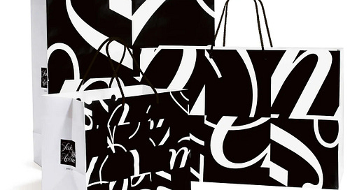
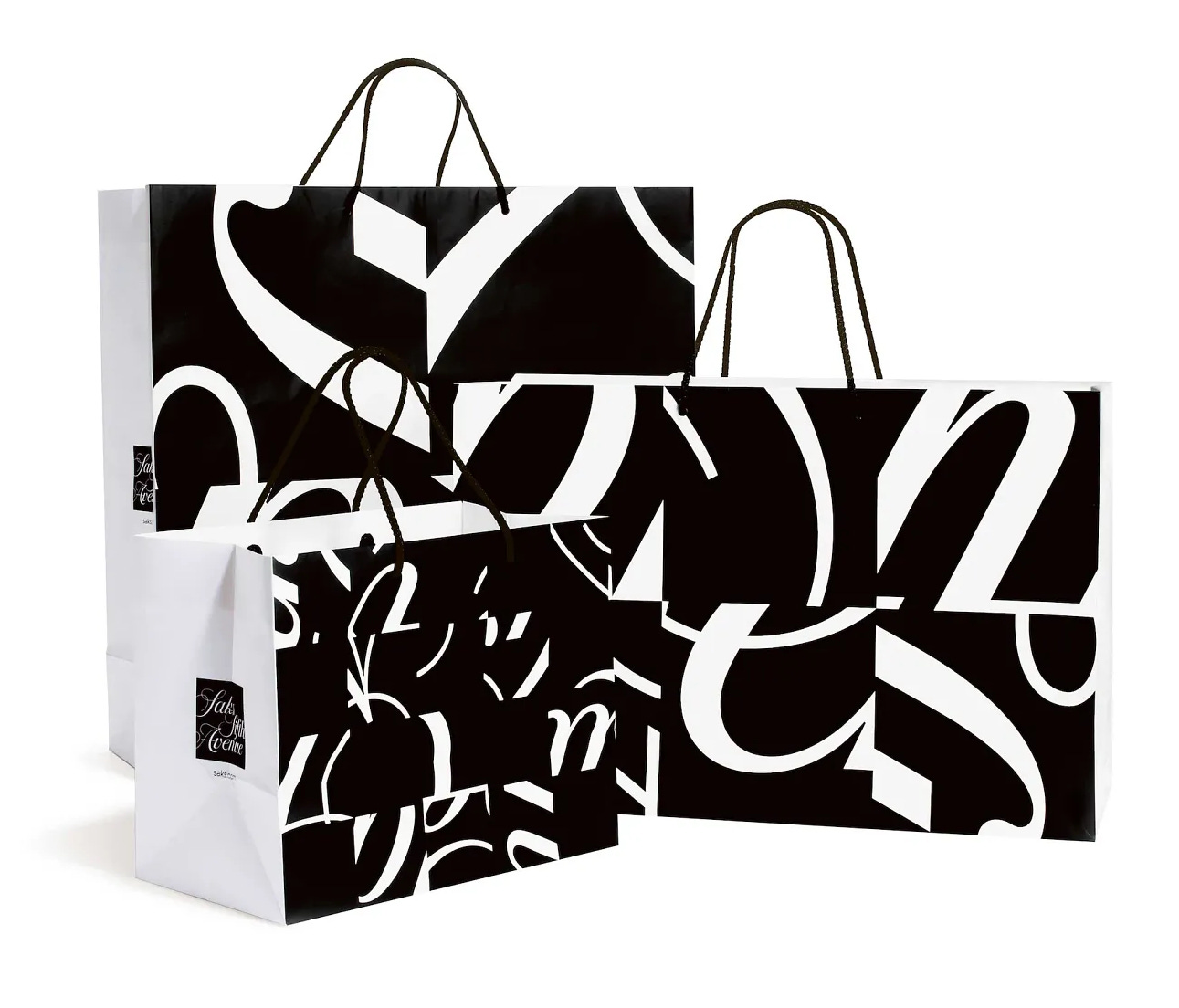
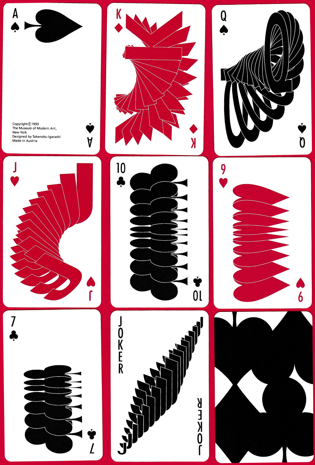
For this week’s Design Lobster I’ve chosen two bold pieces of graphic design. Some audacious work by Michal Bierut for the Fifth Avenue department store Saks and an eye-catching deck of cards by Takenobu Igarashi ♠️
This will be the final Design Lobster of 2023! Thanks for coming along for the ride and I’ll see you all again on the 1st January 2024 🎇
Question: Why would you cut up your own logo?
Rick Rubin recently interviewed design legend Paula Scher on his podcast Tetragrammaton and among the many interesting topics they covered was this striking 2008 branding project for the New York department store Saks Fifth Avenue.
Led by a fellow Pentagram partner Michael Bierut, this project took a square crop of the department store’s cursive 1973 logo and then further subdivided this into 64 smaller squares. By rearranging these smaller squares and playing with their scale they created forty different packages in a refreshed visual identity, from jewellery boxes to hat boxes, and four sizes of shopping bags.
The genius of the design is to create recognisable consistency whilst avoiding sameness, transforming a symbol of the brand’s heritage into a design that felt instantly fresh and contemporary.
It is however a pretty audacious move to cut a well-known logo up into bits and Paula talks in the podcast about how important Michael Bierut’s powers of persuasion were at getting the client on board with the idea. In a way, it’s the ultimate expression of confidence to treat core branding elements in this way. I’m reminded of the brief written by Coca Cola for “a bottle so distinct that you would recognise it by feel in the dark or lying broken on the ground.” The ultimate test of branding might be whether it remains distinctive and memorable after being literally broken apart!
Design takeaway: How would your design react to being broken up?
🟠 Pentagram have also been in the news recently for their controversial Reddit rebrand
Enjoying Design Lobster? Share it with a friend, colleague or fellow designer 🤲🦞
Object: Playing cards
In the early 90s the Museum of Modern Art in New York commissioned Japanese designer Takenobu Igarashi to design this striking deck of cards. He chose to array the numbers and suits in his distinctive three-dimensional style, transforming them from flat, conventional symbols into dynamic, sculptural forms.
Igarashi is especially famous for his axonometric alphabets, which stemmed from a childhood obsession with the letters of the Roman alphabet. These cards contain the same fascination with the traditional symbols of the 52-card deck, making a set of familiar forms feel surprisingly strange.
Design takeaway: How could you have some fun with the typography in your design?
🎨 In Design Lobster #55 we looked at some playing cards designed for work
Quote: “Words have meaning. Type has spirit”
– Paula Scher
I wanted to end with a quote from Paula Scher, who always speaks wonderfully about the power of good typography. In her hands, typographic choices are not merely functional, but an art form that breathes life and emotion into the text.
See you next year,
Ben 🦞
PS. I was on a podcast! Listen to me talk design, architecture and some favourite books…
And finally, a rather festive design remix…❄️
Enjoyed this week’s Design Lobster? Let me know by clicking the heart button ❤️
👇


Love the updated nutcracker. And the chopped up design logo.