#157 'Shibui' design
The unexpected richness of simplicity
Happy Monday! This week’s Design Lobster is exploring the nuanced Japanese design concept of Shibui (渋い)—a refreshing antidote to instant gratification and spectacle. Plus a 1971 pocket lighter that Dieter Rams helped to design with a subtle detail that is very much in the same spirit.
As always, you can scroll to the bottom for what I’ve been reading and admiring recently…
I also want to take a moment to welcome all the new readers who have signed up in the last few weeks—it’s very cool to now have more than 5,000 of you here to share my enthusiasm with 🦞🦞🦞
Question: What is ‘shibui’ (渋い) design?

If you were to glance at the tea bowl above you would be forgiven for finding it unremarkable. Its form is simple, even a little rough, and its muted colour hardly catches the eye. But as you spend time looking at it, the depth and quality of the glaze start to become apparent, as well as the elegance of the foot or ‘kodai’ that creates a pool of shadow at the base. Were we able to take it in our hands and drink from it in a tea ceremony, we might find it unexpectedly heavy or light, with a texture that makes it pleasant to hold in the hand.
This quietly refined quality that emerges over time is known in Japan as shibui (しぶい) and is used to describe certain kinds of design from antique lockboxes and retro cameras to quietly minimal interiors. The term originated in the Muromachi Period (1336-1573) and originally referred to the sour taste of an unripe persimmon. In fact it still maintains that literal meaning and is the antonym of amai (甘い) which means ‘sweet’.
Shibusa, that is objects with shibui qualities, present an alternative to the flashy and fleeting, celebrating understated elegance and depth. They don’t draw attention to themselves, but when you do look closer you are richly rewarded by their details.
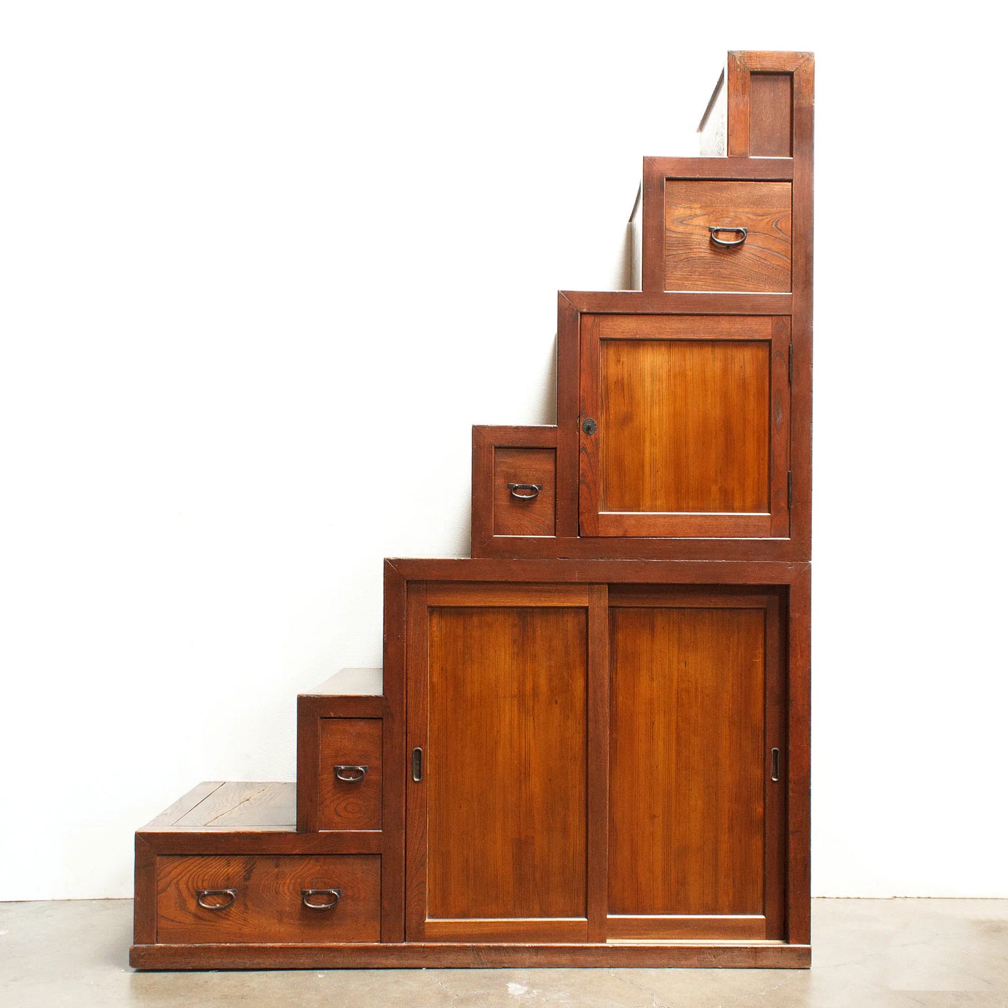
Shibusa are also balanced: whilst they avoid excess, they also don’t feel cold or sterile. This might mean they are made from natural materials that are treated simply but reverently, or have a functional form that unexpectedly offers some light personality like the Step Chest (Kaidan Dansu) you can see above.
In a world where we can feel a little numb from being so regularly shocked, outraged or hooked by the products we use or the media we consume, shibui feels like an approach to making things that we should all be channelling in 2025.
Design takeaway: How could you make your design a little more ‘shibui’?
🥢 In Design Lobster #150 we explored the related Japanese concept of Hodo-hodo (ほどほど)
Object: Braun Mach 2 Pocket Lighter
From 1971 to the early 80s, German manufacturer Braun released many different models of pocket lighters. The 70s of course was a smokers world and so lighters like the Mach 2 were a category of common everyday tool that were increasingly seen as markers of personal style. Braun saw an opportunity to bring its distinct aesthetic philosophy to bear on their design, standing out from more ornamental examples from competitors with its refined functionalism.
The Mach 2 was designed by Braun designer Florian Seiffert, clearly working within the company’s design language with the precise rectangular metal form and moulded black plastic ignition button. The lighter used then relatively novel piezo technology to light the fluid, where a crystal of PZT is struck by a tiny hammer under the button to create a spark. The subtle gridded indent on each side provided grip for the fingers and thumb.

Reportedly Dieter Rams key contribution to the design was the distinctive tail flick on the ignition button, which not only improves the ergonomics but gives the form of the lighter a subtle visual flourish by breaking up the severe rectangular volume. I just love a small detail like this that elevates a design—almost without you noticing.
Design takeaway: What subtle detail could bring your design to life?
▶️ Watch this iconic clip of Rams pointing at things he doesn’t like in the Vitra Design Museum
Enjoying Design Lobster? Share it with a friend, colleague or fellow designer 🤲🦞
Quote: “Less, but better.”
– Dieter Rams, Head of Design at Braun
We talk a lot about doing less here at Design Lobster, and so here is one of the 20th century’s design luminaries reinforcing the same message. Here are Rams’ Ten Principles of Good Design if you don’t already have them tattooed to your forearm 👅
Have a refined week,
Ben 🦞
Elsewhere…
🤖 Jordan Singer launches his latest AI project Mainframe with a sleek new landing page with some help from Marty Bell of Poolside FM fame. Neo-skeuomorphism strikes again.
🧶 Obsessed with Alex Khabbazi’s knitted animations I hope 2025 brings lots more analogue texture like this into our lives.
✍️ In Praise of Writing on the Internet - I loved this Celine Nguyen essay, she writes so well and there is this wonderful nugget of truth half-way through: Readers don’t have short attention spans—they have short enchantment spans.
🛋️ If you’re in the New York area I heartily recommend Jacqueline Sullivan Gallery’s current show In Praise of Shadows. Joe Columbo’s Spider Lamp is on my Christmas list if anyone is feeling generous 🙏
Enjoyed this week’s Design Lobster? Let me know by clicking the heart button ❤️
👇


I don't smoke and don't need a lighter...but I want that Braun!! Great post, as usual.
Oh that Dieter Rams video was so good – thank you