#153 Design tricks
Easter Eggs and Assassin's Teapots 🥷
👋 Hello and welcome to an especially tricksy edition of Design Lobster. This week we’re exploring the curious history of “Easter Eggs” in software, and examining a gravity-defying teapot that makes poisoning your enemies a breeze. Read on carefully, this week not all is as it seems… 🔍
Question: What's an “Easter Egg”?

In the last edition of Design Lobster I wrote about the power of putting an unreasonable amount of care into the things you design, and since then I’ve been hunting for examples from different design traditions. Among my discoveries was the delightfully nerdy history of software engineers hiding away hidden functionality or “Easter Eggs” in games and apps.
This tradition first emerged as a protest by a programmer called Warren Robinett who was working at Atari in the early 80s. He was unhappy with the company’s decision to not credit any individual engineer in their games to reduce their bargaining power and prevent poaching by competitors. So to get his own back he concealed an obscure series of steps that once completed unlocked a room containing the words Created by Warren Robinett.
The secret did not come out until a while after the game’s release, but when it did Atari management quickly came round to the concept as it turned out planting hidden secrets in a game was great for engagement. The practice then spread to other game and software companies and there are many famous examples in Google’s, Microsoft’s and Apple’s software, and even Tesla cars.
Given that the curiosity-inducing power of easter eggs has been known for so long it surprises me that more software teams don't use the technique more frequently to get people to explore a new app. Rather than forcing everyone to sit through boring onboarding video, provoke their curiosity by revealing there are some easter eggs hidden in your app and challenging them to find them all? Before you know it they’ll be experts.
Design takeaway: What surprises could you hide somewhere in your design?
😉 Now head over to Google and type “do a barrel roll”
Object: Assassin’s Teapot

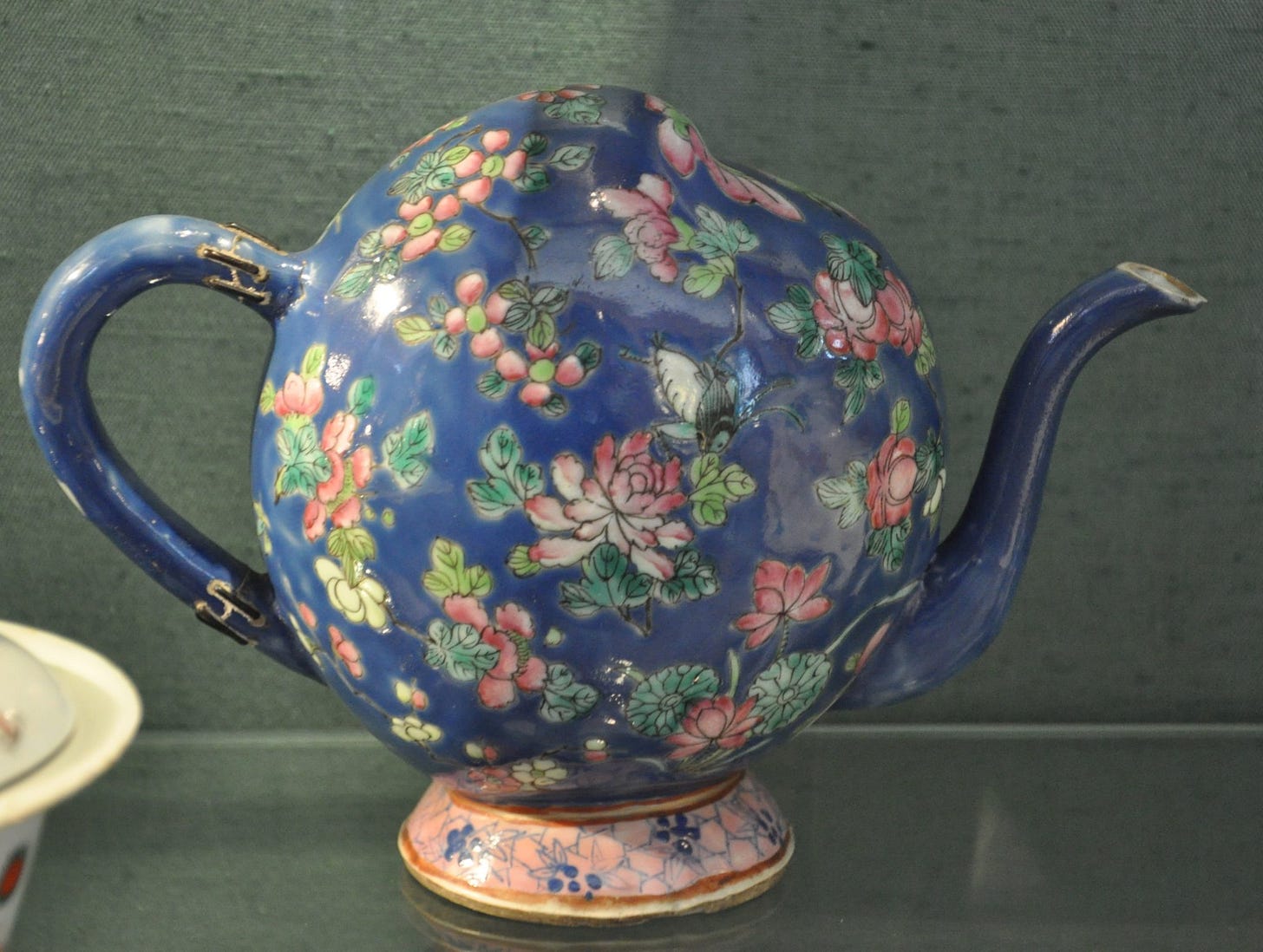
Long-term readers will recognise this newsletter’s (unhealthy?) obsession with niche historical tableware. So imagine my delight at coming across this lumpy peach-shaped teapot that, perplexingly, features no lid. Ugly centuries before ugly got cool and a regular feature of early 19th-century dinner tables during the craze for all things Asian that swept the West at that time. Known in England as “Cadogan” teapots due to a Lord with the same name having a famous collection, each pot needed to be tipped upside down to be filled. Much to the delight of tea party guests, they would not spill their contents after being righted because the entry hole is positioned in such a way that an air lock forms, preventing hot tea from escaping back out.
But that’s not all I have to share today. There is in fact an even stranger pot called the Assasssin’s teapot due to its ability to conceal a separate reservoir of liquid that is only released depending on the position of the pourer’s hand.
As shown in the diagram above, this secret chamber is filled in the same way as a regular trick teapot, but additionally can be controlled by covering or releasing one of two small holes. As shown below, when a hole is covered an airlock forms, but when released the liquid can flow freely. Thus can a would-be poisoner lull his victim into a false sense of security by pouring two cups from the same vessel that in fact contain entirely different contents. To see it in action I recommend this video by Steve Mould.
As designers, we generally talk about making things clearer and easier to understand and use, but I like the way these peculiar teapots challenge us to imagine how we might hide functionality away in plain sight. We all know about progressive disclosure, but these teapots have got me thinking about more imaginative ways we could be hiding things.
Design takeaway: What imaginative ways could you conceal advanced functionality in your design?
🫖 For more weird pot content I recommend the Tudor “thumb pot” in Design Lobster #55
Enjoying Design Lobster? Share it with a friend, colleague or fellow designer 🤲🦞
Quote: “Design is more than just a few tricks to the eye. It's a few tricks to the brain.”
– Neville Brody
Neville Brody is a British graphic and type designer celebrated for his album covers for Cabaret Voltaire and Depeche Mode. This quote is a reminder of the power designers hold to alter and manipulate how things seem to others. It’s a power we should use wisely!
Hope you can play some tricks this week,
Ben 🦞
Elsewhere…
🥐 The great croissant lamp controversy. This week, the internet discovered that a croissant-shaped lamp from Temu, was, in fact, made of a real croissant…
💣 The kitschiest nuclear bunker you’ve ever seen. I think I’ll take my chances above ground, thanks.
🫴 Our lost sense of touch. Senses aren’t just tools for survival. They are gateways to a deeper understanding of the world around us, ourselves, and life itself. Touch is not just a sense — it’s what literally grounds us. It’s a reminder that we’re still here, in the real world.
And lastly, a design remix…

Enjoyed this week’s Design Lobster? Let me know by clicking the heart button ❤️
👇


