This week’s Design Lobster is saturated with colourful design stories. We’re learning why the HSB colour model is better for choosing colours in your next design project and studying some unusual Disney-patented camouflage 🌈
And by the way, a warm welcome to all the new readers who found Design Lobster via the Recess 2024 Creative Playbook 👋
This week I’d also like to share another design newsletter you might find interesting. It’s called
and is written by designer . I’m really enjoying the combination of personal stories and practical resources he shares, and I think you might too.Question: What is the HSB colour model?
There are several different ways to model how all the colours in the world fit together. The most common are known as RGB (Red, Green, Blue) and CYMK (Cyan, Magenta, Yellow, Key). These models are based on the way that light mixes to produce colour, which makes them scientifically accurate but a bit disconnected from the way that humans actually perceive colour.
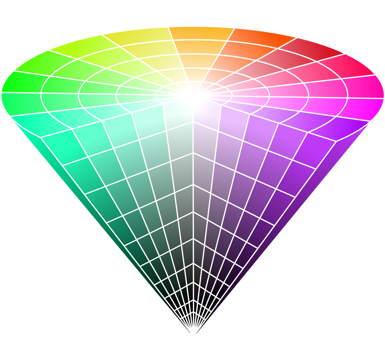
In 1978 Alvy Ray Smith, one of the founders of Pixar created an alternative model known as HSV (Hue, Saturation, Brightness1) that instead represents colour more intuitively. The HSB model can be visualised as a cone, as shown above. Colour hue varies as you wheel around the circular base, with less saturated colours closer to the centre. Then, as you dive down to the tip of the cone, the brightness of the colour decreases, fading eventually to black. In this model, you can precisely identify how much lighter or darker a given colour is, which connects to how we tend to talk about colours in the real world.
The HSV model can be especially useful when trying to build colour variations for a colour palette. Starting with your brand colour keep the Hue the same but decrease the Brightness and increase the Saturation to create a darker version. And for a lighter version do the opposite—increase Brightness and decrease the Saturation.
Design takeaway: Do all the colours in your design feel related to each other?
🔴 In Design Lobster #76 we explored the curious power of the colour red
Enjoying Design Lobster? Share it with a friend, colleague or fellow designer 🤲🦞
Object: Go-Away Green infrastructure
During your last visit to a Disney theme park you may (not) have noticed the unobtrusive shade of green that bins, railings and fences were painted. This neutral olive green is known as Go-Away Green and is used by Disney to camouflage unsightly but necessary elements of park infrastructure.
It’s a fascinating colour to look at because you can almost physically feel your attention bleed away as you behold it, your eyes desperate for something with more visual interest. Just as the colour red is theorised to hold our attention due to it’s connection to the colour of ripe fruits, I wouldn’t be surprised if there is something evolutionary at play here too. Our monkey brains subconsciously thinking “Nope, nothing to see here, next!”
Go-Away Green is just one colour of several that Disney use to keep your eye only on attractions in their parks. Others include a grey variant called No-See-Em-Grey for areas with less greenery, and Blending Blue to help tall structures blend with the sky (think the sky in The Truman Show). Collectively these colours conspire to keep you in the fantasy for the duration of your visit – a shiny world where trash, electric cabling and sweaty workmen don’t exist.
Design takeaway: How could you use colour to de-emphasise less important parts of your design?
🎨 In Design Lobster #41 we looked at some artfully camouflaged power stations from WW2
Quote: “I found I could say things with color and shapes that I couldn't say any other way; things I had no words for.”
– Georgia O’Keeffe, Artist
Many designers will recognise the sentiments O’Keeffe expresses here. The beauty of a visual medium like design is the additional channels of communication it opens to people. Without needing to write any words at all we can say so much through colour, illustration, scale and layout choices.
Have a great week,
Ben 🦞
And lastly, a design remix…

Enjoyed this week’s Design Lobster? Let me know by clicking the heart button ❤️
👇
Sometimes Brightness is substituted for Value to create the acronym HSV, but they refer to the same thing.


Thanks for sharing Better by Design, Ben! 🙏