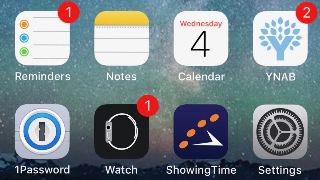
For Design Lobster #76 we’re going deep on red. From the evolutionary biology underpinning the colour of notification dots to a typewriter by Ettore Sotsass. Ready, steady, red 🔴
✨Enjoying Design Lobster? Please share it with a friend, colleague or fellow designer.
Question: Why are notification dots red?
Human vision is known as trichromatic because it is made up of three types of photoreceptor. One that is sensitive to light at short wavelengths (blue), one at medium wavelengths (green), and one at long wavelengths (red). By comparing the relative strengths of different wavelengths, our eyes can determine the true wavelength of an object – a sensation we experience as colour.
However, the sensitivity of these photoreceptors is not spread evenly across the spectrum. As shown in the graph below, both the red and green colours overlap a lot. This means that we can distinguish variation in red and green hues really well – at the expense of being able to see as many colours as we possibly might.
There are a number of theories about why this is, with perhaps the most intriguing that it helped our hominid ancestors to more precisely determine the edibility of fruits as they ripened from green to red. In any case, this quirk of our vision has given us a particular sensitivity to red and green colours, that software designers have exploited many millions of years later to attract our attention. In a way, you could think of a red notification dot as a ripe digital fruit, which our prehistoric eyes can’t help but immediately notice.
Design takeaway: Does your design take into account how human colour vision works?
🚦 Want more red content? Design Lobster #47 explored why traffic stop lights are red
Object: Olivetti Valentine
Perry King and Ettore Sotsass – the latter who would become one of the leading lights of the post-modern Memphis group – were hired by Olivetti to design a new typewriter – the Valentine. It was to be marketed as a consumer rather than office product as a response to a flood of cheaper typewriters coming out of Japan in the late sixties.
The form it took was a simple rounded rectangle, sliced diagonally to reveal the keyboard and the front bar, which appears to float before the keys. The most striking aspect of the typewriter however was its colour. The shiny ABS plastic casing came in white, egg yellow, blue and pea green as well the the bright red shown above.
The typewriter went on sale on Valentine’s day 1969 but was a commercial flop, mainly due to its high price. In spite of this, the typewriter occupies a special place in design history. Sotsass’ bold use of colour creates a more emotional relationship with the object, inviting us to see it as part of our self-expression. This presaged the innovations of the 1980s when companies like Apple suddenly transformed other hitherto dull machines like desktop computers into brightly coloured objects of desire.
Design takeaway: What emotions do the colours of your design evoke?
▶️ Watch the Olivetti Valentine in action
Quote: “Color is the place where our brain and the universe meet.”
– Paul Klee
Another quote from an artist this week, this time from one of my personal favourites, Paul Klee. Paul highlights the special power that colours have to reach into us, directing our attention and shifting our mood. Using colour with sensitivity (and a bit of wit) is for me one of the great joys of being a designer.
Hope you have a colourful week,
Ben 🦞
Enjoyed this week’s Design Lobster? Let me know by clicking the heart button.
👇


