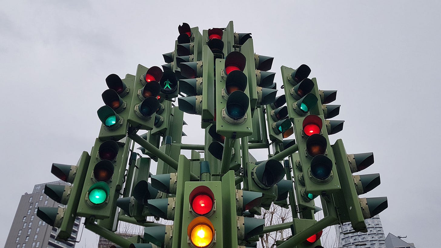
#47 Why does red mean stop? 🚦
...and a funky 80's vacuum cleaner
Hello! Join me for this week’s Design Lobster as we explore the history of traffic lights and vacuum cleaners. A colourful start to the week 🎨
…plus one of my favourite ever design quotes. 🎉
✨Enjoying Design Lobster? Please share it with a friend, colleague or fellow designer.
Question: Why does red mean stop?
In Design Lobster #40 we looked at the UK road signs of 60’s designer Margaret Calvert. The question this week also has a motoring theme: just why are traffic lights the colour that they are?
To answer this we have to go back to the establishment of the rail network in Great Britain. In the early 19th century gas lights began to be used on railways, replacing an earlier system of semaphore signals. In the old system, semaphore arms were lifted into different positions to indicate stop, go or caution. The arm was always coloured red as this was easiest to pick out from a long distance (due to red light having the longest wavelength in the visible spectrum).
In the transition to gas lights, red was inherited from the semaphore to mean stop and at first white meant go. Green just meaning caution. However after several serious accidents where red filters slipped off, it was decided to eliminate white lights and switch green to mean go.
The very first road traffic system installed on Parliament Square in London in 1868 and consisted of a policeman using semaphore during the day and coloured lights at night. This experiment sadly ended in disaster when a gas leak lead to an explosion and the officer’s death.
Policeman and inventor William L. Potts updated the colours in early 20th century Detroit, adding a third amber coloured light (between red and green on the colour spectrum) to give drivers warning of the transition and time to stop. The successful example of Detroit proved to the US Federal Highway Administration that this was the right system to standardise around in 1935. From there the system fanned out across most of the world.
Despite the scientific basis in colour wavelengths, the design isn’t perfect. Those living with Deuteranomaly or other types of colour vision deficiency will know that red and green are the colours that are easiest to mix up. Several solutions have been proposed to address this problem including standardising the position of the lights or changing their shapes. The evolution of the traffic light is not over yet!
Design takeaway: What is the history of the colours you are using in your design?
🚦Listen to a podcast on the future of the traffic light.
Object: G-Force vacuum cleaner
In the 1970’s the vacuum cleaner market was dominated by Hoover, whose vacuums all featured disposable bags. While using his Hoover Junior James Dyson grew frustrated with how quickly it lost suction as the bag filled with dirt – beginning a 10 year odyssey to develop a ‘bagless’ vacuum cleaner. During his quest James visited a sawmill and was intrigued by the cyclone system being used to remove sawdust from the air. He wondered if the technology could be miniaturised to work in vacuums.
Several years and 5000 versions later he had a working prototype that was ready to go into production. But his struggles were not yet over. The vacuum bag market was highly lucrative, so manufacturers in the UK were unwilling to partner with him on a device that would eliminate this stream of revenue. In the end, Dyson ended up working with Japanese company Apex Inc. on the G-Force vacuum shown above which went on sale only in Japan for the hefty price of $1800. The commercial success of this model allowed him to set up production of the far cheaper DC01 in the UK, leading to huge sales in the 1990s in Europe and America. James Dyson is now the UK’s richest man.
Nowadays the pastel-hued G-Force is a rare collector’s item, usurped by the DC range. Nevertheless, as a pricey one-off it allowed Dyson to realise his bigger dream of an affordable mass-market bagless vacuum. A crucial but mostly forgotten in-between step.
And just look at that hot pink plug! 💘
Design takeaway: What in-between steps do you need to make to realise your ideas in full?
🌬Watch the original 1993 advert for the DC01.
Quote: “One of the things we hit upon was the quality of a host. That is, the role of the architect, or the designer, is that of a very good, thoughtful host, all of whose energy goes into trying to anticipate the needs of his guests — those who enter the building and use the objects in it.”
– Charles Eames
This is one of my favourite quotes about design. I love the thought that designing something well is like hosting a good party. It’s nice to think of the various designs we let out into the world as miniature parties, sparking moments of joy here and there. Next time you design something, channel your inner host …and for heaven’s sake don’t be a party pooper!
Happy Christmas!
Ben 🦞🎄
Enjoyed this week’s Design Lobster? Let me know by clicking the heart button.
👇


