#40 Designers, is it vegan to eat yourself?
It’s Design Lobster #40 and we’re pushing the frontiers of design – asking what role our own cells might have in our diet. Plus, how one designer made the personal universal when redesigning the UK road signage system. ⛔️ Design ahead ⛔️
✨Enjoying Design Lobster? Please share it with a friend, colleague or fellow designer.
Question: Do we need to eat our own cells to be sustainable?
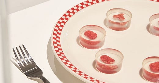
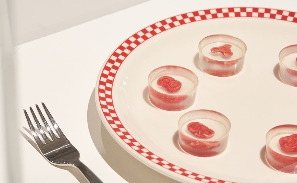
Above: the Ouroboros steak made from human cells - image by Felix Speller
Last week the Beazley Design of the Year shortlist was released and one particular entrant could not fail but catch my attention. The so called Ouroboros steak designed by Andrew Pelling, Grace Knight, and Orkan Telhan uses human serum made from unusable blood bank byproduct to generate edible tissue cultures. The full kit comes with tools, ingredients and instructions that enable users to make cultures from their own cells. Mmmmmmm.
This polemical piece is intended to critique the practice of using serum taken from the fetal calves of slaughtered, pregnant cows in so-called ‘clean’ lab-grown meat. For me, the critique goes further, highlighting just how embedded we are in the world and its ecosystems. Other solutions to the problem of how to feed people at least have the basic assumption that we will take in something outside of us as our nourishment – even the microbial food from Design Lobster #2 did not challenge this.
But by questioning even that assumption, these steaks imagine a hellish world where we have only our own bodies to sustain us, a revolting prospect that powerfully communicates our dependency on our biosphere.
Design takeaway: What basic assumption about your design would be too appalling to question?
🥩 The Pelling Lab for Augmented Biology have a wild-sounding podcast.
Object: UK Road Signs
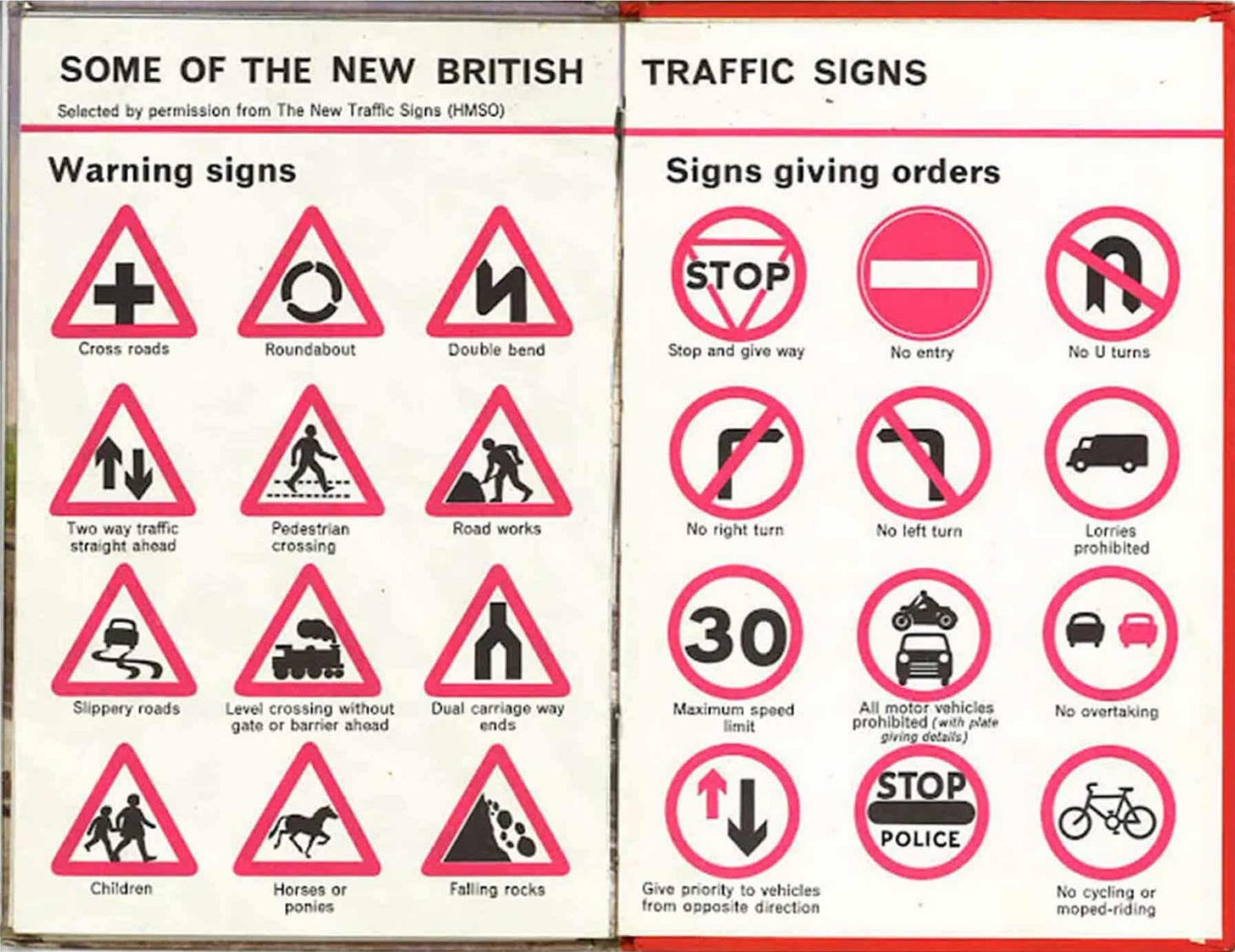
Above: a selection of the pictograms designed by Margaret Calvert for the new UK road signs.
In 1957 Margaret Calvert worked with Jock Kinneir on the huge task of overhauling British road signs for the arrival of motorways. Besides a great deal of work devising a new kind of font that was legible at high-speed, Calvert also designed a group of distinctive black, white and red pictograms for order or warning signs. A selection are shown above (very familiar I suspect to my UK readers…).
I’m interested in the way that many of the signs came from Calvert’s own lived experience. The school children sign was based on a photograph from her childhood and the galloping horse came out of her interest in the photography of Eadweard Muybridge. Her ability to distill these personal images into simple but distinct universal symbols, comprehensible at speed from a passing car, is really admirable. The team behind Google’s recent icon redesign might want to take a look. 😉
Design takeaway: How could you distill something from your own experience into something universally recognisable but still distinct?
⛔️ Watch a documentary about Margaret Calvert’s work on UK road signs.
Quote: “The nuance of how the problem is described transforms what kinds of solutions you are likely to consider, which means that there is a craft to defining problems that’s as important as defining solutions.”
– Scott Berkun, author of How Design Makes the World
Scott raises an important characteristic of the discovery phase of design work here. Many solutions are already built into the way a particular problem gets expressed. Designers should exercise special care at this stage – perhaps experimenting with different ways of describing a problem to see what variety of solutions these reframings provoke.
Keep discovering,
Ben 🦞
Has this email been forwarded? Sign up below to get the weekly emails delivered to you. ✏️


