#41 How would you camouflage a power station?
It’s Design Lobster #41 and it’s great to have you here. A special welcome to all my new readers who found me via the Substack Bridge announcement.
This week we are admiring a more surreal part of the British war effort and exploring why neumorphism is this year’s hottest digital design trend. A design massage for your mind.💆♀️
✨Enjoying Design Lobster? Please share it with a friend, colleague or fellow designer.
Question: When is dishonesty the best policy in design?

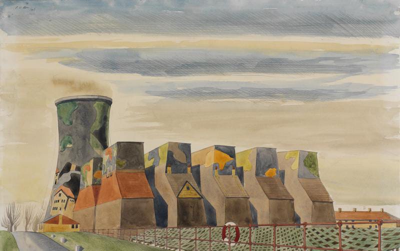
Long time readers know I do love design in disguise – in past issues we’ve looked at snuffboxes disguised as shoes, disguised parks and even disguised locks. So you can imagine how excited I was to discover the efforts of the Civilian Camouflage Unit. During the Second World War in Britain, thousands of artists and set designers had their skills put to use concealing infrastructure from enemy eyes. Some painted ships in dazzle patterns, others disguised pillboxes and observation decks as haystacks or trees. The advent of aerial warfare meant that it was also necessary to protect larger buildings from bombing attacks. In the example above by Colin Moss an entire power station was painted to have the appearance of a row of houses. A fantastically surreal project.
A lot of design maxims use the words truthfulness and honesty a lot, so the contrarian in me is always intrigued by design work that doesn’t fit into that mould. Of course, the designers of this camouflage were not really being contrary at all. When the problem is to bewilder and confuse an approaching enemy army or aircraft, the more dishonest and untruthful you can be, the better.
Design takeaway: Are there circumstances when your design might perform better disguised as something else?
🎦A short youtube documentary on the history of camouflage.
Object: Neumorphic banking app
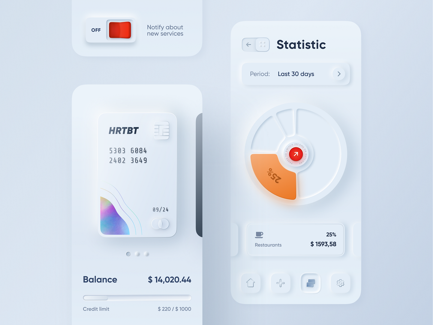
The Dribbble shot above launched a thousand imitations and a whole new design trend when it was posted last year. Coined neumorphism, a contraction of neo-skeumorphism the style carves interfaces out of a sort of glowing digital clay. Skeuomorphism – a style which it harks back to, recreated real-world textures and objects digitally. It went out of fashion about ten years with the advent of so called “flat” design This new trend has a renewed interest in light and form but this time in a purely digital space.
Neumorphism has been justifiably criticised for its often poor accessibility and others have made more detailed critiques of it on these grounds. I’m more interested in the trend as a symptom of the material anxiety that afflicts digital designers. Because screens have no inherent material qualities, designers reach for metaphors to organise the content on them. For most of the last decade the metaphor has been paper – interfaces made up of layers of cards and sheets. Now that those flat sheets of paper are being transformed into sculptural 3D shapes it seems we’re about to enter a more Baroque period of interface design.
Design takeaway: What real-world metaphors does your design use and why?
🗣This podcast by layout.fm talks more about the trend.
Quote: “Architecture is… the will to obtain the poetry of the real through an outrageous process of objectivity.”
– Eileen Gray, designer and architect
Long-time readers will know I am a huge fan of Gray. We admired her delightful Non-conformist’s chair in Design Lobster #5. This quote comes from an essay she wrote about E1027 – a house she designed on the French Riviera. It is addressed to architects but I think this quote has a lot to offer designers of all kinds. I love the idea of being outrageously objective and through that process achieving a sort of poetry of real life.
Design as the poetry of the real is a definition I think about a lot.
Keep discovering,
Ben 🦞
PS Design Lobster is now on instagram! Follow for sneak previews of upcoming issues and highlights from the last 10 months of issues.
Has this email been forwarded? Sign up below to get the weekly emails delivered to you. ✏️


