Happy new year! This week’s Design Lobster is kicking things off with a look at some rather overused design, starting with the Big Tech illustration style that has been saltily labelled Corporate Memphis by internet commentators.
It’s also become a tradition to have at least one lobster-themed topic for the first issue of the year, so today we’re also looking at the most ubiquitous typeface of the previous decade—Lobster. Welcome back 🦞
Question: What is “Corporate Memphis”?

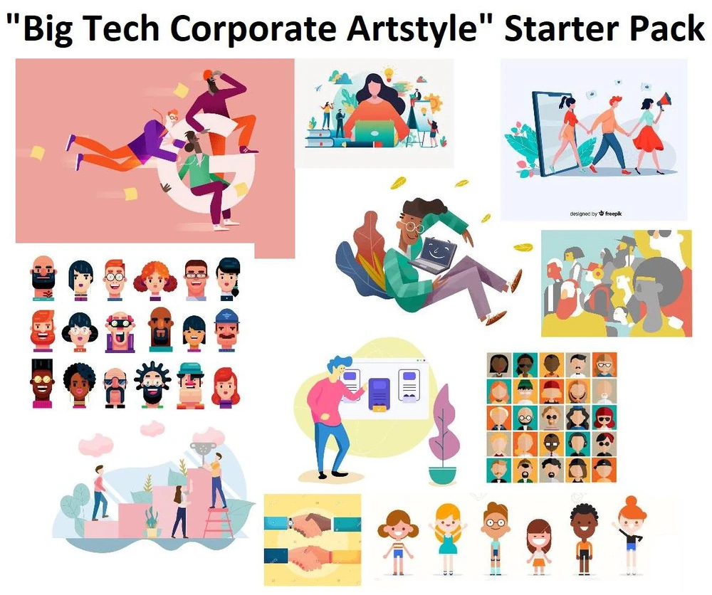
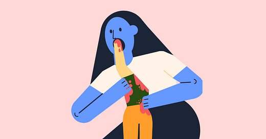
Corporate Memphis1 or Globohomo (global homogeneous) is an illustration style that rose to prominence in the late 2010s in Big Tech software. You probably recognise it. It’s characterised by flat color areas and geometric elements, with human figures rendered in a wide range of hues with disproportionate limbs and minimal facial features.
The origin of this kind of illustration was a project by LA agency Buck for Facebook in 2017. They were tasked with revamping the art direction for Facebook’s design system and came up with Alegria (Spanish for ‘joy’) a vector-based library of blithe, spaghetti-limbed characters who bounce or float around Facebook’s many digital products.
The style admittedly has a lot to recommend it. The forms are relatively easy to create, scale and animate in design tools and do a fine job of adding some warmth and humanity to landing pages, emails and the like. They should also be commended for genuinely trying to bring more diverse representation to brand imagery. But the style has been a victim of it’s own success, with tech company and tech company unveiling their own set of remarkably similar characters.

What has ensued since then is a growing backlash against the style, partly on the grounds of sheer aesthetic boredom, and partly due to the icky feeling that these eternally happy paper dolls are a mask for some of the biggest companies the world has ever seen.
If you ask me, the easiest way forward for brands is simply to move away from showing people in illustrations altogether (unless it’s strictly necessary). There’s always going to be something creepy about corporations ventriloquising their messages through multi-coloured puppets. It’s more than possible to add warmth and humanity without the use of actual humans, and maybe shifting away from the human form might open up some aesthetic possibilities that move the whole industry forward.
Design takeaway: How could you bring a human touch to your design without using an illustration like this?
📺 YouTuber SolarSands has a great video on the phenomenon
Enjoying Design Lobster? Share it with a friend, colleague or fellow designer 🤲🦞
Object: Lobster typeface
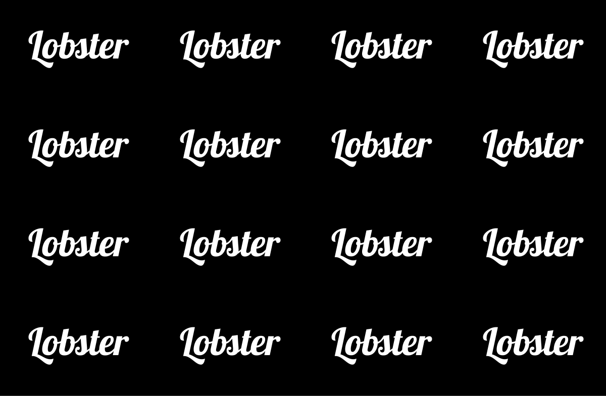
For a certain period during the 2010s it felt like every new business, from tech startups to restaurants had been required by law to use this typeface. Somehow hitting the exact right combination of retro and contemporary for a generation of time-pressed designers, it found its way onto shopfronts, packaging and landing pages galore.
The typeface itself was designed by Argentinian designer Pablo Impallari in 2010 and to his credit he put a huge amount of effort into crafting the ligatures (paired letters) and terminal forms (final letters). This is a notoriously challenging problem with script fonts like Lobster where the number of pairs for an entire alphabet exceeds 15,000. I recommend reading his post about Lobster here for more details.
Every period of history has fonts it tends to overuse. The noughties had Gotham and Comic Sans, the 2010’s Lobster and arguably Papyrus (thanks Avatar). And of course Helvetica has been a staple since its creation in the 50s. In the present day there suddenly seem to me a whole lot of condensed Garamonds cropping up among trendier brands. Will they be the next to be added to freshman graphic designers No-Use List?
Design takeaway: Are your font choices communicating the right message?
🔠 Design Lobster #53 covered the world’s most hated typeface
Quote: “Design is about crafting an experience that is unfamiliar enough to feel novel, yet familiar enough to instill confidence.”
– John Maeda
I wrote an essay last year about the tightrope designers have to walk between surprise and familiarity, which this quote from John Maeda sums up well. In today’s issue we’ve seen some design that has become overfamiliar, but we also shouldn’t forget that a certain degree of familiarity is essential to the success of any design.
Have a great start to the year,
Ben 🦞
And lastly, a design remix…
Enjoyed this week’s Design Lobster? Let me know by clicking the heart button ❤️
👇
Memphis of course was the bold and kitschy 80s PoMo style with which this style bears aesthetic similarities. The Corporate prefix is a nod to the Big Tech behemoths lurking behind the latest iteration.


Not gonna lie: I love Corporate Memphis.