Hi 👋
This week I’m interrupting our regular schedule with a short essay about being obvious.
When describing writing, the word obvious has a distinctly negative charge. In many design contexts however it’s upheld as a virtue. What gives rise to this discrepancy and what does it tell us about how to both write and design well?
You can see some of my previous essays in this series here and here.
I want to begin with one of my favourite sentences from Sally Rooney’s novel Conversations with Friends:
“He had a gentle tone in his voice and I wanted to climb into it, like something hollow I could be suspended inside.”
The first time I read this sentence I remember that I couldn’t stop thinking about it for a long time. Partly because of the sheer impossibility of the image, the way it transfigures an immaterial thing like a voice into something physical that we might enter or be concealed in. And partly because of what it seemed to be saying about the characters, the furtive need being expressed by Frances for Nick that contains both a cold and reedy hollowness and also the the trace of something sickly and sinister like a hanging pupa.
The sentence has always been one I reach for when I think about the power of good writing. Writing that is fresh and not obvious. Writing that makes demands on our brain to grapple with it and offers brief but tantalising glimpses of further meaning beyond that which we can immediately grasp.
When you read a sentence like the one above by Rooney, and then come across a cliché, the comparative deadness is unmistakeable:
“Her voice was as sweet as honey.”
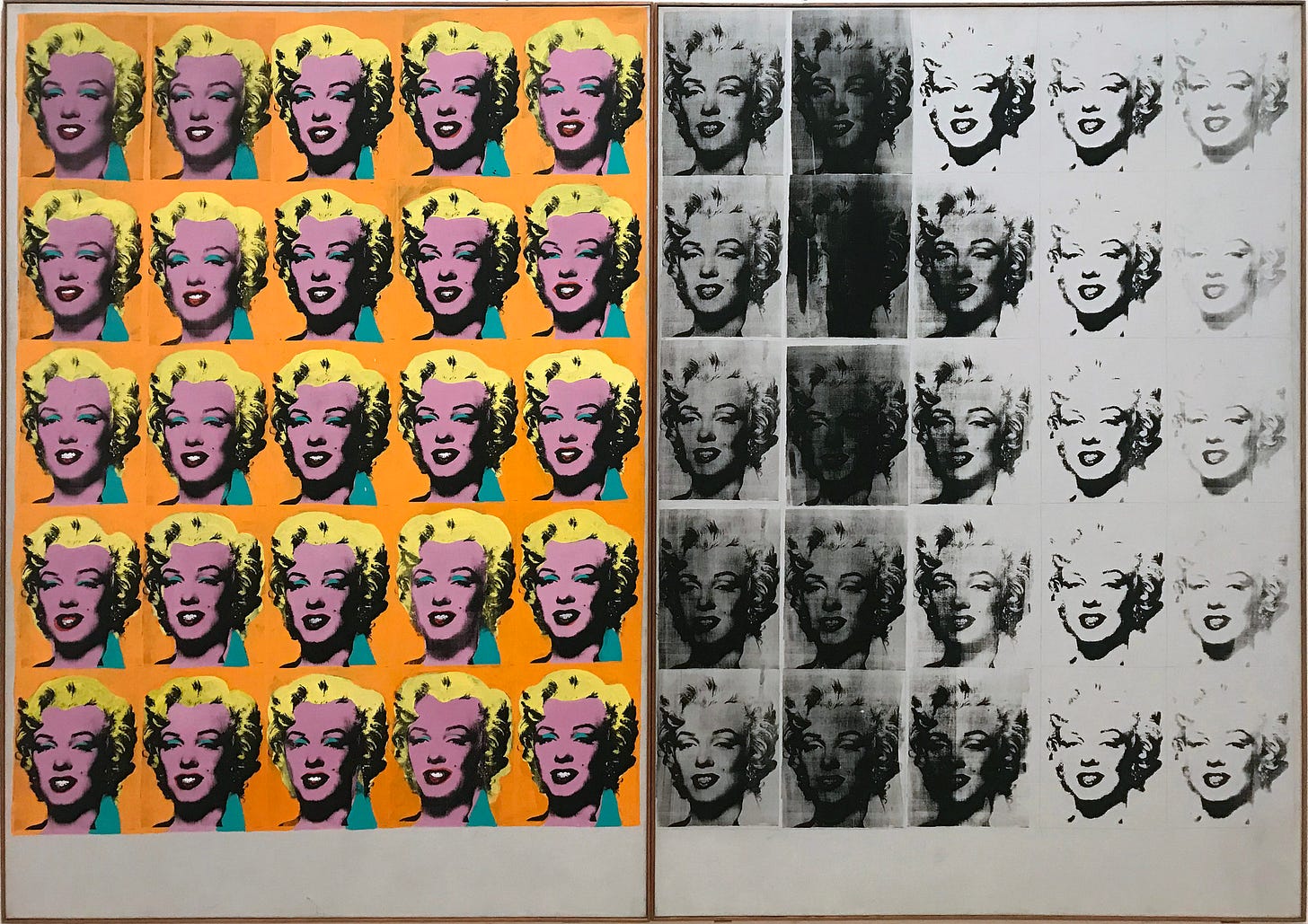
Instead of richness, nothing. The image stays fuzzy and never quite resolves. Like the reproductions of Marilyn’s face in a Warhol screen print, the words have been photocopied too many times and no longer have any force. They are simply too obvious.
It’s perhaps strange then—in many design disciplines and especially product design—to find the criticism reversed. To find ambiguity a sin and obviousness even to the point of mindlessness celebrated. The issues of this newsletter are replete with quotes and references to clarity, straightforwardness and plain-speaking. What makes a vice when writing, a virtue in design?
One answer comes in the form of this framework from Jason Brush. He visualises the way that obviousness has an opposite effect depending on whether you are mainly focussed on creating an experience or an outcome with your creative work. If the former, then too being too obvious and predictable will make for a dull experience. They’ll leave the film or put down the book. But if the latter, the same characteristics will instead make your design easier to get started with and use.
Different kinds of design project blend experience and outcome in different ways. A meditation app will require something different from one that files your taxes. Perhaps an underrated skill of a good designer is to be able to identify exactly where you sit on the experience-outcome gradient and pitch the level of obviousness required just right.
More likely than not though, in a design project you’ll be erring towards the simple and obvious. Some of us might dream of making our sign up flow as allusive as a Rooney novel, but the risks of errors and confusion are unlikely to make it worth it.
Enjoying Design Lobster? Share it with a friend, colleague or fellow designer 🤲🦞
I would have written a shorter letter, but I did not have the time
—Mark Twain
One of the things I’ve learned though is that being obvious can be as just as hard as being interesting, and that achieving either requires us to adopt a similar creative pose.
The core of it is trying to see things as they really are. When writing this helps us avoid cliché and find ways of describing experience that come from the specifics of our own contact with it. And when designing, this enables us to find the patterns and hidden order that are lying amidst ambiguous experience.
In both cases it’s a feeling of freshness that we seek. The writerly freshness of a surprising metaphor or distinctive voice, or the designerly freshness of reducing something to its essentials.
Where these two modes perhaps diverge is at the final moment. The good writer reaches out further for the words that will challenge and stretch our brains, whereas the good designer—always more restrained—returns inwards to find the order that will soothe them.
In 2014 Hotels.com ran a series of high-concept ads in which a military-attired gentleman—Captain Obvious—strode through various hotel scenes making exceedingly obvious statements about what was around him. The goal of the campaign was presumably to present the company as the most obvious choice for booking your next holiday.
The ad is interesting to this essay because it captures the somewhat pejorative feel that obviousness has as a concept. The phrase “Thank you, Captain Obvious” (or earthier alternatives like “No Sh*t Sherlock”) will often be thrown out sarcastically in English-speaking countries when someone utters a truism. In a culture that is built around writing and storytelling I have been wondering if these expressions are symptomatic of a broader bias against “being too obvious” that stems from what is required to make written or spoken stories engaging.
And then does this bias in turn affect how we approach design? Could we be getting in our own way and preventing our designs from being as simple and obvious as they could be for the same reason? I’ll be nurturing my inner Captain Obvious over the coming months to see.
Hope you can do something obvious this week,
Ben 🦞
Enjoyed this week’s Design Lobster? Let me know by clicking the heart button ❤️
👇


What a delicious essay!