It’s Design Lobster #75 and this week we’re asking what it takes to make something feel truly simple. From a series of Picasso etchings that inform Apple’s approach to product design, to an elegant bentwood step-ladder.
✨Enjoying Design Lobster? Please share it with a friend, colleague or fellow designer.
Question: How does Apple make its products simpler?
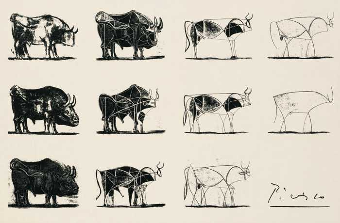
Between December 1945 and and January 1946, the sixty-four year old artist Pablo Picasso worked long hours in a printer’s workshop in Paris on a series of eleven prints that took the form of a bull and progressively simplified it from a realist depiction to an abstract arrangement of just twelve lines. This step-by-step process of refinement is reportedly studied on several of the courses at Apple University – the internal training program run by the company to communicate its values to staff.
“But isn’t it strange that it can be done through such simple means?…Whatever is most abstract may perhaps be the summit of reality.”
– Pablo Picasso
The series of prints reveal the way that simplifying something is quite different from removing elements. To simplify something is to reduce it to its most essential, which means that the important relationships become clearer than before. We could debate the extent to which Apple’s product designs over the years have successfully achieved this ideal. However I think its unmistakable that Apple is as preoccupied as Picasso with this same process. Simplicity on the far side of complexity.
Design takeaway: How could you make the relationships in your design clearer?
▶️ Watch this great talk by David Hogue on making products simple.
Object: One-step ladder

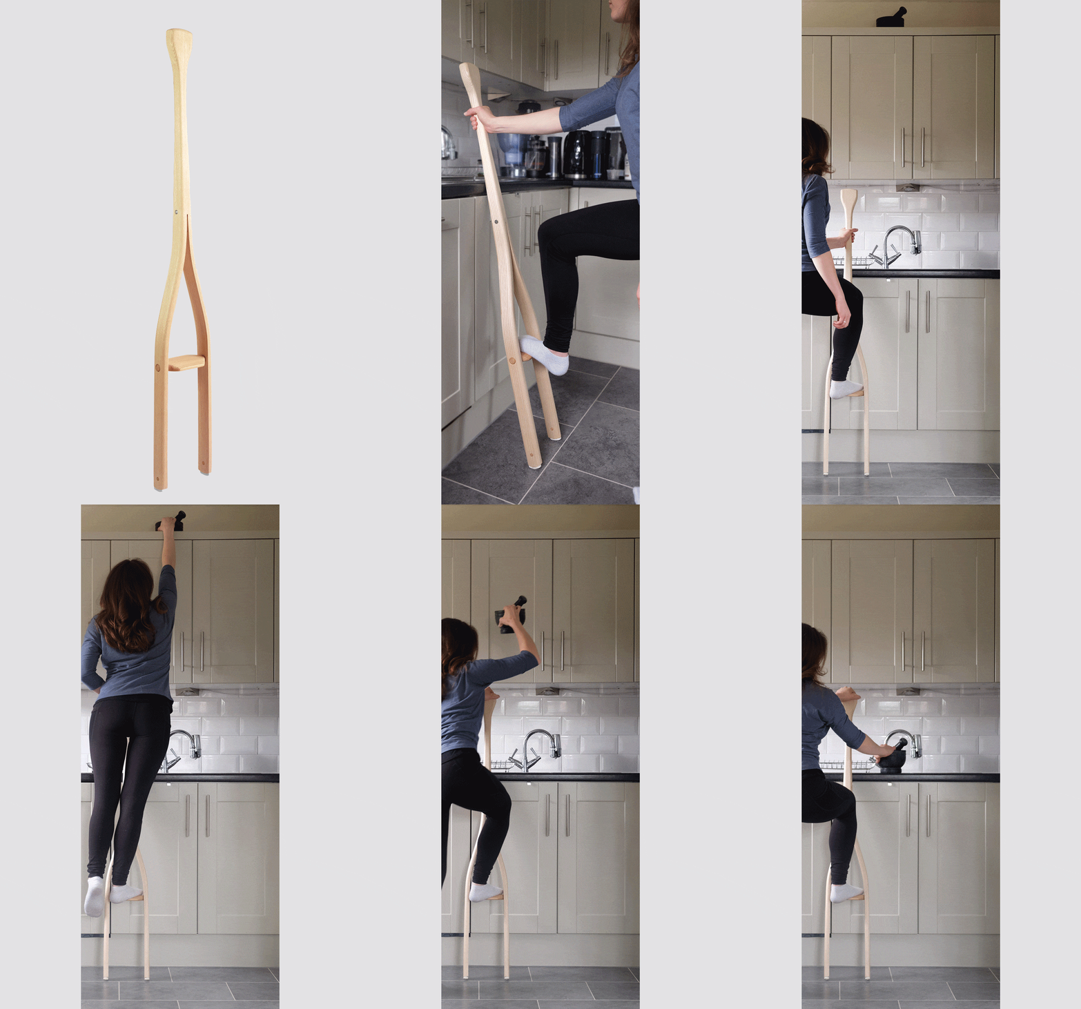
I was very taken with this project by designer Cam Rowley, who this year won the Conran Shop Designer of the Future Award. His design makes a step-ladder from a single piece of steam-bent ash. Riveted at the top to prevent splitting, the object allows somebody to quickly reach something high up by stepping onto the single step and stabilising their weight by holding the long handle. Special pads on the feet ensure balance at a wide range of angles.
The design at first glance makes me think of some archaic gardening or agricultural tool. Its simplicity and slenderness evoke Shaker furniture such as the tilting chair that featured in Design Lobster #54. It is the kind of object that would look lovely and rather enigmatic leant against wall when not in use. When objects become very simple there is a risk they no longer communicate their purpose, but I think the foot-size width of the step and the widened handle let you know just enough about what part of the body goes where, that you can still work out what it is for.
Design takeaway: Is your design still communicating its purpose, or has it become too simple?
🗣 Read an interview with Cam here
Quote: “The ability to simplify means to eliminate the unnecessary so that the necessary may speak.”
– Hans Hoffman
Hans Hoffman was a German-born American painter associated with the mid 20th century Abstract Expressionist movement. Though Hans was an artist I think there is lots for designers to take away from this quote. I love the idea of the “necessary” having a quiet voice that we can only hear if we prevent the “unnecessary” from drowning it out.
I hope you can eliminate the unnecessary this week!
Ben 🦞
Enjoyed this week’s Design Lobster? Let me know by clicking the heart button.
👇


