Weather apps and shitty robots
Reporting from Config '24
Happy Monday everyone!
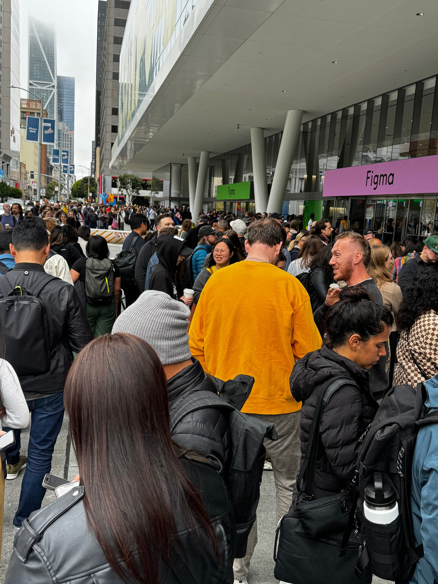
A couple of weeks ago I attended Config, a gigantic design conference hosted in San Francisco’s Moscone Center by Figma—the design tool that has rapidly become the industry standard for digital designers of all stripes. With hundreds of speakers and over ten thousand attendees 😱 it was an inspiring but also overwhelming experience that has taken me a while to fully digest.
Over the two days of the conference I saw a lot that made me think, several things that got me excited and a couple of things that made me a bit nervous, and so for this this week’s issue I’m sharing my thoughts on what went down. It’s not quite Hunter S. Thompson at the ‘70 Kentucky Derby but I hope you’ll get a sense of what it felt like to hang out at the beating heart, for a couple of days at least, of software design culture.
Figma have made all the talks available on YouTube and I’ve linked to all my favourites at the bottom, so head down there if you want to skip the commentary and go straight to the source!
1. Did somebody say AI?
About a half hour before the opening keynote on Wednesday the wifi went down across the whole venue so me and a few thousand others were still shuffling into the main auditorium as Dylan Field, the unexpectedly puckish CEO of Figma scrambled up on stage to announce a raft of new features for their flagship design tool.
Some of these features had been requested for a long time. There was a souped-up versioning system that will either solve (or I rather suspect further stoke) arguments between engineers and designers over changes to the design spec. There was a jazzy responsive setting for a prototype viewer. There’s even now a much requested hanging punctuation setting—type nerds rejoice 🙏
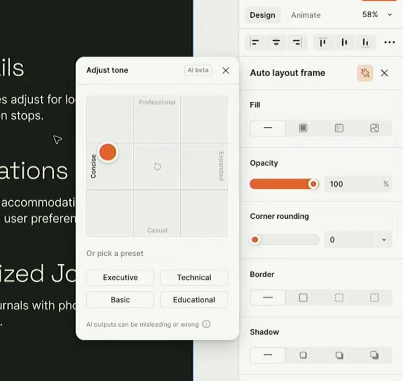
What everyone was waiting for though was the AI stuff. After Figma’s splashy acquisition of Diagram last year, we’ve all been waiting to see what Jordan Singer and co. have been cooking up. In by far the longest segment of the keynote, Dylan rattled off a litany of clever applications of AI, from a button that will make a prototype for you before your very eyes, to a feature that will translate your whole app to another language screen by screen. Later we also were introduced to a fascinating tone dial for manipulating language like a colour spectrum—definitely one that’s going in my list of imaginative AI design patterns.
The biggest announcement though was a feature called Make Designs, that simply requires you type a description of what you want in a box before the AI springs to life and designs it in front of you. On the Config stage Dylan made a pizza finder app and then a Lord of the Rings-themed portfolio website for an architect in quick succession. Both the examples were jokey but instead of laughs what I registered was a collective intake of breath in the room as 10,000 designers processed the implications of what they had seen.
Whereas the other features kept a designer in the loop, it was easy to see how one day a feature like this might actually replace us entirely.
I was struck by the specific formula Dylan and others kept using to describe the utility of this feature: Make the most obvious thing in the most obvious way possible. I am sure this was meant to reassure us that the machine is no match for our individual uniqueness and creativity. Maybe this is true, but as I have talked about before, in design (and especially product design) the most obvious solution is very often the one that performs the best. At least when you’re trying to get someone to quickly learn how to use something, deviating from what feels obvious can be risky. Based on what I saw I don’t expect us to get our marching orders any time soon, but I am not totally convinced that our salvation will be via coming up with ever more “unique” designs.
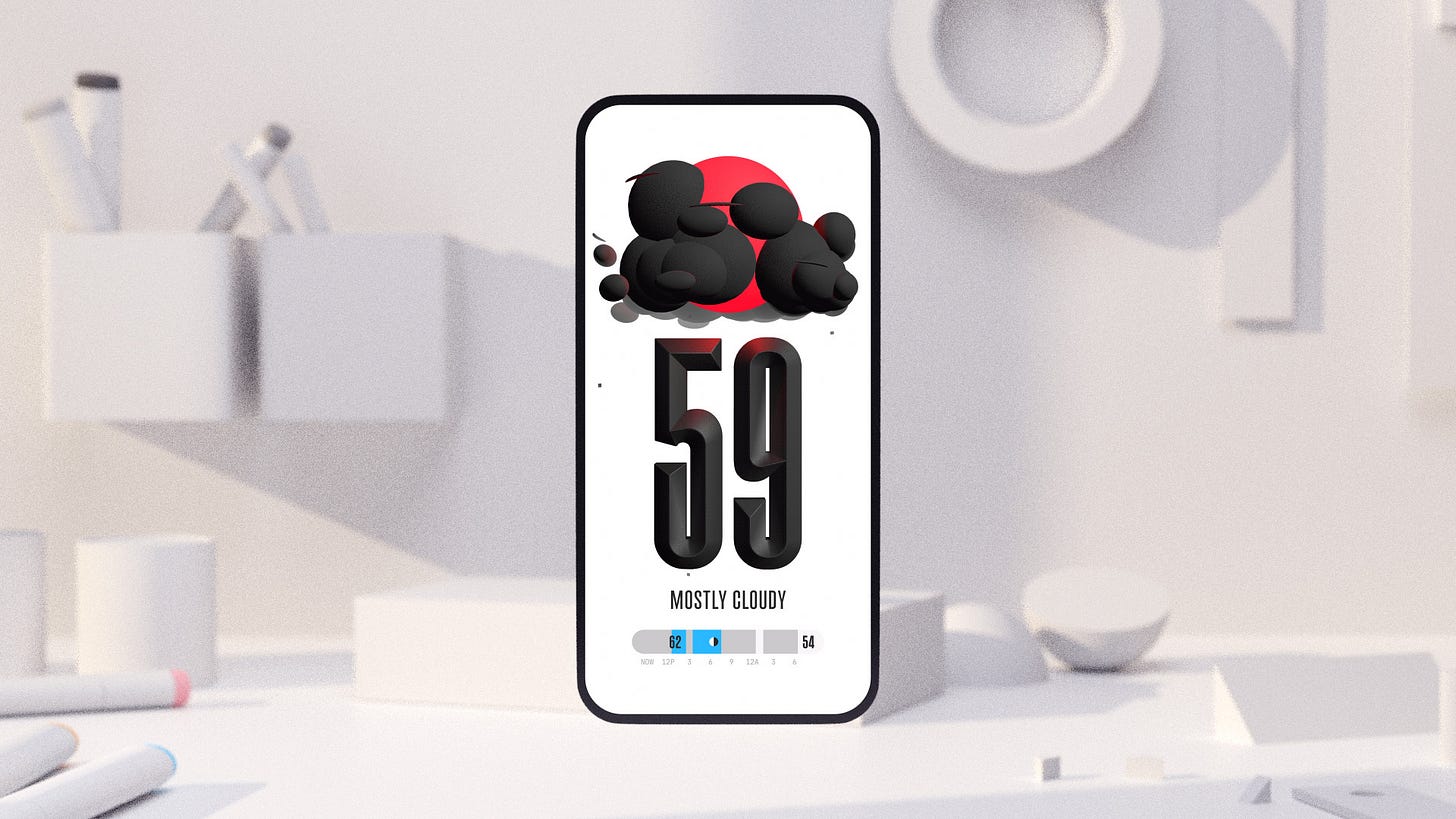
At any rate, after Andy Allen started tweeting about some suspicious similarities between the Figma AI’s output to Apple’s existing Weather app, Figma disabled the feature entirely, apparently on a temporary basis. I am curious how long it will be back in the oven for before we can play with it again.
Enjoying Design Lobster? Share it with a friend, colleague or fellow designer 🤲🦞
2. Personality
Other than artificial intelligence (and perhaps because AI loomed so largely over proceedings) the biggest theme I detected across the other talks I saw was personality. That is how to bring a uniquely human touch to the design of software. It felt to me like there is some dissatisfaction stirring in the collective subconscious of the design profession at the corner our design systems have painted us into, and a determination to reconnect on a human level with the people on the other side of the screen.

The Arc browser is part of a new wave of software products that have taken an ordinary category like a web browser and reinvented it with a hefty dose of personality and craft. Karla Mickens Cole and Nashilu Mouen who have helped create it, told the audience of their talk how they are unafraid to design using highly personal references—like for example the flowers in Brooklyn allotments they pass on the way to work. Their choice to invest huge amounts of effort to generate a unique and beautifully-designed membership card for every new user is another sign of a quite new approach to making software. Less globe-spanning and more handmade.
Andy Allen’s talk about his !Boring series of apps also epitomised this theme. He explained how artist John Baldessari’s epiphany I Will Not Make Any More Boring Art had inspired him to reinvent the humble Weather and Calculator apps—making them as rich, delightful and interesting as he possibly could. In the weather app for example, precipitation, wind and cloud cover are all modelled with 3D software so that you see a totally unique combination rather than a typical grid of the same-old set of weather symbols. The apps are sumptuous and overdone but also really quite lovely to mess around with in your hand.
Jiaona Zhang of Linktree put some of these efforts in context in her talk on how to design for Gen Z. She said that because this generation have grown up entirely online they see straight through filters and templates and and hate feeling like they’re being sold to with “Design”. Personality comes from being authentic and a bit messy and designing alongside your community, sharing the ideas you create with them along the way. Not being afraid of being a bit ugly comes into it too, as we’ve discussed in this newsletter before.
After one of these talks I got chatting over lunch with a designer from Denver who had been inspired by what she had seen but was struggling to work out how she would convince her team to invest effort into giving their travel booking platform “personality”. I am intrigued to see how those kinds of conversations play out in the industry in the coming years.
3. Responsibility, and a bit of fun…
At the end of the conference there was a fireside chat on the main stage with the film-maker Spike Jonze of Being John Malkovich and Her1 fame. At one point during the conversation he looked around the enormous space and said with a little awe, “this room is full of people building the future.” He talked about the responsibility that entailed and appealed for everyone gathered to deeply interrogate their motives around why they do what do. I liked the specific way he framed this: What is it that you’re feeling that you want to put into your work everyday?
That way of expressing the task of design reminds us that what we put in is in some way what we get out. That there’s a feeling, a kind of echo there that other people can sense. With software weaving together ever more of our lives, thinking about how those echoes reverberate feels ever more critical.
But at the same time, we shouldn’t wear that mantle too heavily. The stand-out talk of the whole conference for me was from Simone Giertz, styled on YouTube as The Queen of Shitty Robots. Her advice was to give ourselves permission to make something useless that we’re excited about, and allow the rest to figure itself out. Rather than being dutiful we should be playful and trust that play will carry us further in the long run.
So as we navigate these strange new currents in technology and culture, more than anything else I will be trying to keep things fun 😉
I hope you enjoyed this special edition, do check out some of the talks I’ve listed below and have an inspired week 🌙
Ben
The talks to watch
Courage against conformity • Emily Sneddon andTaamy Amaize, COLLINS
Leaving Fingerprints • Karla Mickens Cole and Nashilu Mouen, The Browser Company of New York
Serious Play • Andy Allen, !Boring
Building for and with Gen Z • Jiaona Zhang, Linktree
Infinite Curiosity • Llisa Demetrios, The Eames Foundation
The Broken Promises of Design Systems • Cam Worboys, Cash App
Shitty Robots • Simone Giertz, Artificial Stupidity Inc
Building a human future with robots • Jason Ballard, ICON
Enjoyed this week’s Design Lobster? Let me know by clicking the heart button ❤️
👇
Incidentally one of the fun facts I learned about Her during this chat was that Spike had decreed there should be no blue in the entire movie. His production team had to go through and eliminate every sweatshirt, baseball cap and pair of jeans. I now kind of want to design an app that has no blue whatsover in it.


Wonderful review of an amazing convention. Thanks for sharing. Sounds like time well spent.