Chat box? No thanks 🙅
Emerging AI design patterns to get excited about
Hello!
I’m on a roll this week and wanted to write about some of the more interesting design patterns that are emerging in products that use Large Language Models—the tech that powers the experiences we call ‘AI’.
The default response from so many companies to the AI wave of the last year has been to simply slap a chat box somewhere in their UI. Accordingly, lots of people have prognosticated that ‘chat’ is the ultimate and final interface for every type of task. Along with a few others, I feel increasingly certain that the future will be much more interesting and creative than this, and that instead we’re going to see a profusion of experimental design patterns over the coming years. Here are a few I’m excited about…
Circle for more
LLMs make it possible for a computer to see and understand what is in front of it and then use the internet to conjure up more information about that topic. In January this year, Google wrapped this ability into a neat design pattern where you can use your finger to circle anything on your screen to learn more about it. This collision of direct manipulation and world understanding unlocks all sorts of exciting design possibilities. It now feels like anything we see on a screen should behave like a hyperlink, a portal into more knowledge, understanding and detail.
Just like the iPad babies who are confused when they cannot swipe through paper magazines, we might feel similarly disappointed to encounter digital content in the future that is flat and locked up, with no ability to dive further into what is shown.
What I’m excited to see
Circle to create - in examples like the video above, this kind of technology tends to end up as being used for some kind of shopping mission, but I would like to see LLMs that help us to sample and remix reality to create something of our own.
Magic cameras - Apple photos already possess a rudimentary and quite hidden feature called Visual Lookup that helps identify flora and fauna in your photo library. I am looking forward to this technology being live, so that camera truly ‘sees’ the world like we do.
Invisible butlers

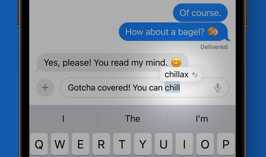
This is the form that AI-powered features all mostly took until pretty recently. We’re talking things like smartphone keyboard auto-correct, and camera image enhancement features that make night or portrait photos look good. I call them invisible butlers because they work hidden away in the background, fixing things before you even notice they have even gone wrong.
This kind of design doesn’t have the flashiness of more visual AI design patterns but its ability to get stuff done without taxing your time and attention makes them a great candidate for lots of ideas. After all, good design is as little design as possible.
What I’m excited to see
Money butlers - quietly categorising your transactions and managing a budget or savings without you needing to do anything. They’d let you know, sir, when something needs your attention.
Design butlers - I’m watching Jordan Singer’s keynote at Config in June and my dream is that he announces the ability for Figma files to manage themselves. Cleverly organising chaotic design work into a clean set of iterations at the end of the workday, renaming layers intelligently and generally acting as helpful design sous-chefs.
Live canvases

The current crop AI image generation tools are wondrous but they force us to describe precisely what we want to see which is often hard and frequently completely impossible. To get around this, tools like krea.ai and Leonardo allow you to start with the rough image you have in your mind’s eye instead of a cumbersome and lengthy prompt.
There is something profound about seeing what you envision coming to life live as you make simple marks, with some users describing it as an almost hallucinatory experience. Our brains our inherently visual and the more deeply tools can integrate themselves with this cognitive reality, the more magical they will feel.
What I’m excited to see
Product canvases - sketch the product you can see in your mind’s eye and see it come to life, with blueprints, materials and costing
Life canvases - sketch the life you want to achieve and the AI makes a plan for you to achieve it
Enjoying Design Lobster? Share it with a friend, colleague or fellow designer 🤲🦞
Magic brushes
There is a fascinating group of AI image and video manipulation tools like Playground, Visual Electric and Runway that allow you to create an image but then fiddle with it to your heart’s content by brushing over the area you want to change and then describing how it should be different.
This kind of selective manipulation pattern, powered by technology that makes any changes literally seamless feels like it could have applications far beyond image editing. Many tasks in a professional workflow are a kind of ‘touching up’ and I’d like to see magic brushes emerging in other kinds of tools too.
What I’m excited to see
Audio brushes - touch up audio in the same way you would an image to fix things like grammatical errors and even alter the emotional register
World brushes - one for the AR fans. Use a brush to alter parts of your environment, swapping in and out pictures and furniture until it’s just as you want it
Language editors

In a conventional word editor we have the ability to format how text looks: bold this, italicise that etc etc. LLMs give us the power to expand this toolset to edit the much more subtle aspects of a piece of text’s meaning too. The example above comes from a product called Wordtune that lets you highlight part of your writing and nuance the tone or explore paraphrases. I also love Google’s experimental tool textfx which is even more creative allowing you to ‘fuse’, ‘explode’ or ‘chain’ things you write.
Currently of course you can prompt ChatGPT to do this kind of thing, but doing so solely through chat is cumbersome, imprecise and slow. Adding some extra interface magic will make it easier and more obvious how to tune up your writing and take it to new places.
What I’m excited to see
Recipe editors - being able to magically swap in and out ingredients in a way that respects the flavours and intent of the original recipe.
Thinking editors - I’m thinking interfaces that help you explore how you are thinking about a topic more carefully. Trying on variations in point of view and focus to let you reach a more nuanced perspective.
You, everywhere

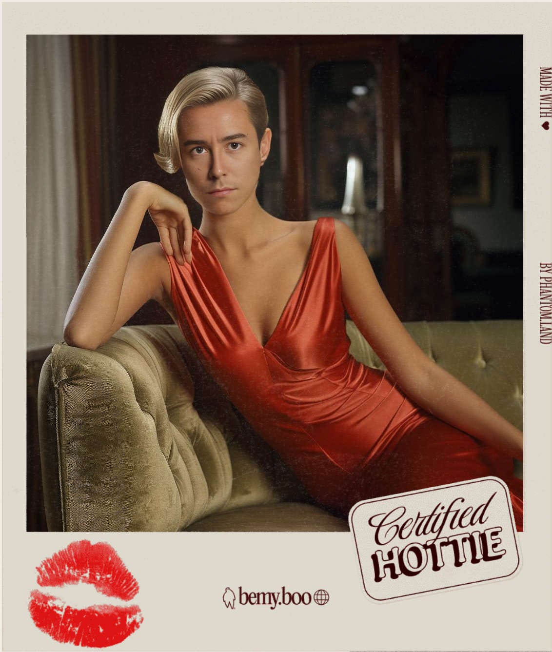
AI now makes it trivial to seamlessly blend your own image into any other with little more than a poorly lit selfie required. Still my all-time favourite AI application (now sadly closed), bemy.boo was a tongue-in-cheek Valentine’s Day 2024 delight that stylised a phone selfie into a 70’s era polaroid for you to send to a loved one. For a few days it went extremely viral and you can see why. Can of Soup, a recent Y Combinator startup also riffs with this capability allowing you to put you and your friends into any kind of context imaginable from outer space to Ancient Rome.
I expect to see this kind of personalisation woven into all kinds of digital experiences to make them feel more personal and just plain fun.
What I’m excited to see
You, and your spending - imagine a photo or video reel stylising your top merchants or categories for the past month. Peeping out from under a pile of Target purchases perhaps or sat at a dining table with all the restaurant meals you’ve ordered.
You, learning - interacive textbooks that come to life with your image hidden Where’s Waldo style in historical images.
Infinite content
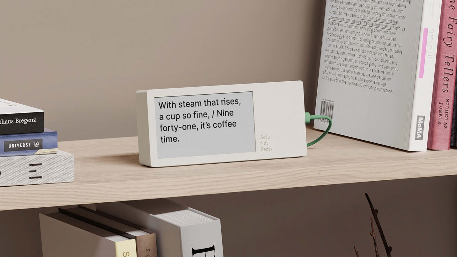
I’ve saved one of my favourite examples for last. Matt Webb’s Poem/1 is device that tells the time with a brand new poem every minute, composed by ChatGPT. Also in this vein, this Poetry Camera. Instead of taking pictures this device converts what it sees into a unique poem that is printed off onto receipt paper.
When creating new content becomes virtually free, all kinds of ordinary products can be reimagined as endless streams of written or visual content. We’re used to hearing stories of an AI apocalypse in online content as AI-generated fluff drowns anything made by humans, but the flip-side is delightfully whimsical products like this!
What I’m excited to see
Infinite profile pictures - having just one profile picture doesn’t feel adequate to express our overlapping and changing identities. What if it could shift in style based on what you’re up to and your mood?
Infinite artworks - Imagine a large digital billboard or a public screen that not only displays continuously evolving art but also incorporates real-time data like weather.
Hope you enjoyed this week’s edition of Design Lobster. Let me know what AI design patterns I’ve missed in the comments! We’ll be back to regular service in the next issue.
Have fun creating this week,
Ben 🦞
Enjoyed this week’s Design Lobster? Let me know by clicking the heart button ❤️
👇


So interesting! Especially keen to get my hands on a Poetry Camera!
Great piece! A chat interface was merely the vessel used to introduce AI's capability to the masses. Much more exciting stuff to come!