For our 70th issue we’re exploring the various ways design can deceive our eyes—from letterforms that seem smaller than they really are, to buildings that seem to be colliding. 🌀👁🌀
✨Enjoying Design Lobster? Please share it with a friend, colleague or fellow designer.
Question: What is overshooting and why does it matter?

Type designers have to work with the idiosyncratic and often unreliable ways that the human eye works. Frequently, to make two letterforms appear the same height, a designer must make the more curved one slightly taller – a technique known as overshooting. The amount of overshoot depends on the typeface but is typically between 1-3%.
“Typefaces are born from the struggle between rules and results. Squeezing a square about 1% helps it look more like a square; to appear the same height as a square, a circle must be measurably taller… For the rational mind, type design can be a maddening game of drawing things differently in order to make them appear the same.”
—Jonathan Hoefler & Tobias Frere-Jones
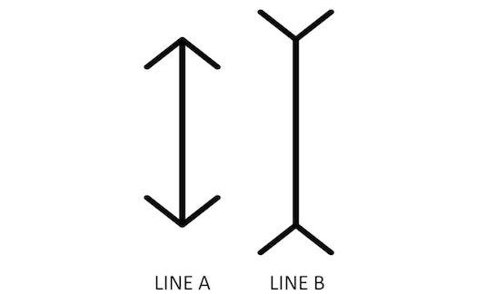
The reason they must do this is demonstrated by an optical illusion known as the Müller-Lyer Illusion (shown below). In this two lines of an equal length are given apparently different sizes by the addition of either an upwards or a downwards facing chevron at each end. The same quirk of our visual perception is at work in certain letterforms. I think we can all learn from type designers that what we perceive and what is real can often be entirely different things.
Design takeaway: What quirks of human visual perception might be important in your design?
🔠 A great TED talk on typography by Mia Cinelli.
Object: Finlandia Hall

The Finnish architect Alvar Aalto was given the brief to design a new concert hall for the city of Helsinki in the 60’s and his design, clad in white Italian Cararra marble aimed to bring some Classical grandeur to this important new cultural institution. Composed of six auditoria, the primary one rises up as a sloping peak on the northern end of the building. Curiously, a stripe of it is clad in a black stone instead of white.
The significance of this is only revealed if you stroll to the other side of Töölönlahti Bay, where the tower of the National Museum suddenly lines up with the black stone stripe, appearing to merge with the concert hall in spite of the fact it is several hundred metres to the south-west. Take a look in the photo above.
We talk about the importance of context a lot in design, and I think this example is a good reminder that we can deploy a bit of wit when we decide how to relate to it. Alvar takes a lot of enjoyment in playing with our perceptual faculties and in doing so prevents a rather grand building from coming across as too stuffy or over-important. In spirit, it reminds me a lot of Alan Fletcher’s Pirelli advert for London buses, which was designed about the same time.
Design takeaway: Can you have a bit of fun with the context of your design?
🏢 We explored another unusual building by Aalto in Design Lobster #43
Quote: “I am trying to be unfamiliar with what I am doing.”
– John Cage
I’ve written before about the importance of keeping our perception of the world fresh when we design. Experimental musician John Cage makes a similar point in this week’s quote. By keeping what we are doing a little unfamiliar we prevent ourselves from reaching for the easiest or most obvious solution. A stale-seeming world gives us stale ideas.
Whatever you do, keep it a little bit unfamiliar.
Ben 🦞
Enjoyed this week’s Design Lobster? Let me know by clicking the heart button.
👇


