It’s Design Lobster #24 and this week we’ve gone visual. Looking at the way design can tell a story (serious or light-hearted) on the printed (or hand-drawn) page. Let’s get wide-eyed. 👁👁
Enjoying Design Lobster? Please share it with a friend, colleague or loved one. ✨
Question: How can racism be visualised?
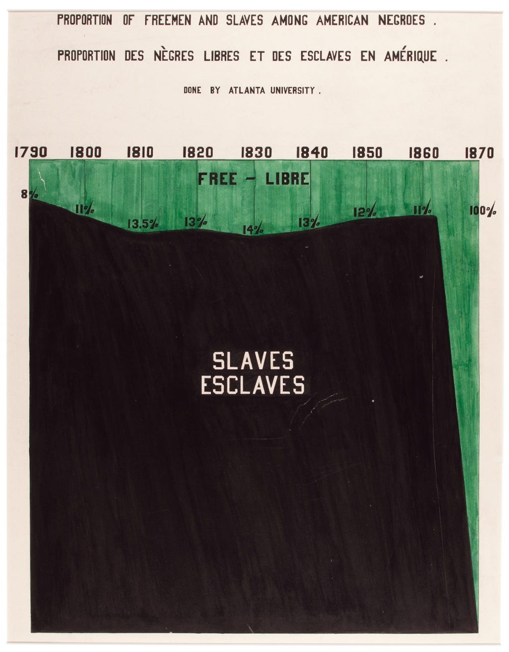
W.E.B. Du Bois was a celebrated African American academic, sociologist and writer and was one of the founders of the National Association for the Advancement of Colored People (NAACP) in 1909. Ten years before this he was invited by an agent of the federal government to contribute to an exhibit at the 1900 Paris World’s Fair entitled “The American Negroe.”
In the course of his prolific academic career Du Bois had established the first school of sociology in the USA at Atlanta so for this brief, his students at the university and many alumni made about sixty hand-drawn infographics like the one above. Collectively, through the skilful representation of detailed sociological research, these images explained how and why black America was being held back.
I think the poster above is an amazing piece of visual communication. The predominance of the black ink hits the eye with incredible force and makes the suffering it represents inescapable. In this way, the design cleverly undercuts the overarching imperial narratives espoused by the Fair - telling a very different story about civilisation and progress.
Design takeaway: How can your design challenge narratives, or surface unheard ones?
Loads more of the infographics here (scroll down).
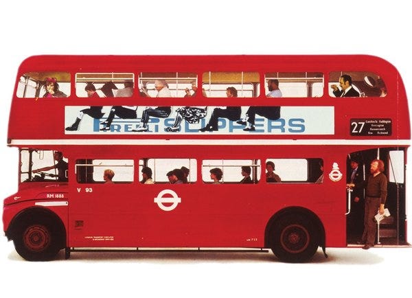
Object: Pirelli Slippers Poster
Alan Fletcher was one of the founding members of Fletcher/Forbes/Gill in 1960’s and Pentagram in the 1970’s, raising the profile of British graphic design with work for clients including Penguin, Reuters, The Victoria & Albert Museum & Pirelli.
The image above shows a poster the firm did for Pirelli Slippers in 1962. It employs unwitting bus passengers by carefully spacing several seated pairs of legs so that an illusion is created that they are all wearing Pirelli slippers and perched on the company logo. It was witty, irreverent and turned heads on the streets of Sixties London.
What I think this project shows brilliantly is the value of looking carefully at context. Designing something well is arguably 90% understanding the context in which it will be seen or used. Alan Fletcher’s understanding of the context of this poster meant he could transform the world around it, turning an ordinary row of seated bus passengers into a suspended line of slipper models. Cheeky. 😜
Design takeaway: How well do you really know the context of your design?
Alan Fletcher’s doorstep-size 2001 book The Art of Looking Sideways is a famous source of inspiration for all kinds of designers - bid for one on eBay here.
Quote: “Designing a product is designing a relationship.”
– Steve Rogers, designer
Every Design Lobster always includes an object because so often there is a thing of some kind (whether physical or digital) that is the outcome of the design process. Things are the stuff of design. Nevertheless, I like this quote because it keeps in mind that the network of relationships that any thing engenders are as (or even more) important as the thing itself.
Keep discovering. 🦞
Has this email been forwarded? Sign up below to get the weekly emails delivered to you. ✏️


I love the slippers ad!