


#159 Design through the looking glass
Insta-architecture and the Claude Glass 📸
Hello! This week we’re reflecting on design that poses for the camera or lays a filter over it. We’re asking if all design must pose for the camera now and peering through a Claude Glass—the 18th century’s equivalent of a photo filter 📸

It’s been a while since I last wrote to you as I’ve been busy working on my very first app. Inspired by the 18th century Cyanometer I wrote about in Design Lobster #128, it’s called This Blue and allows you to record the specific shade of blue in the sky and share this with friends. If you fancy trying the beta you can download it below!
Question: Must all design pose for the camera now?
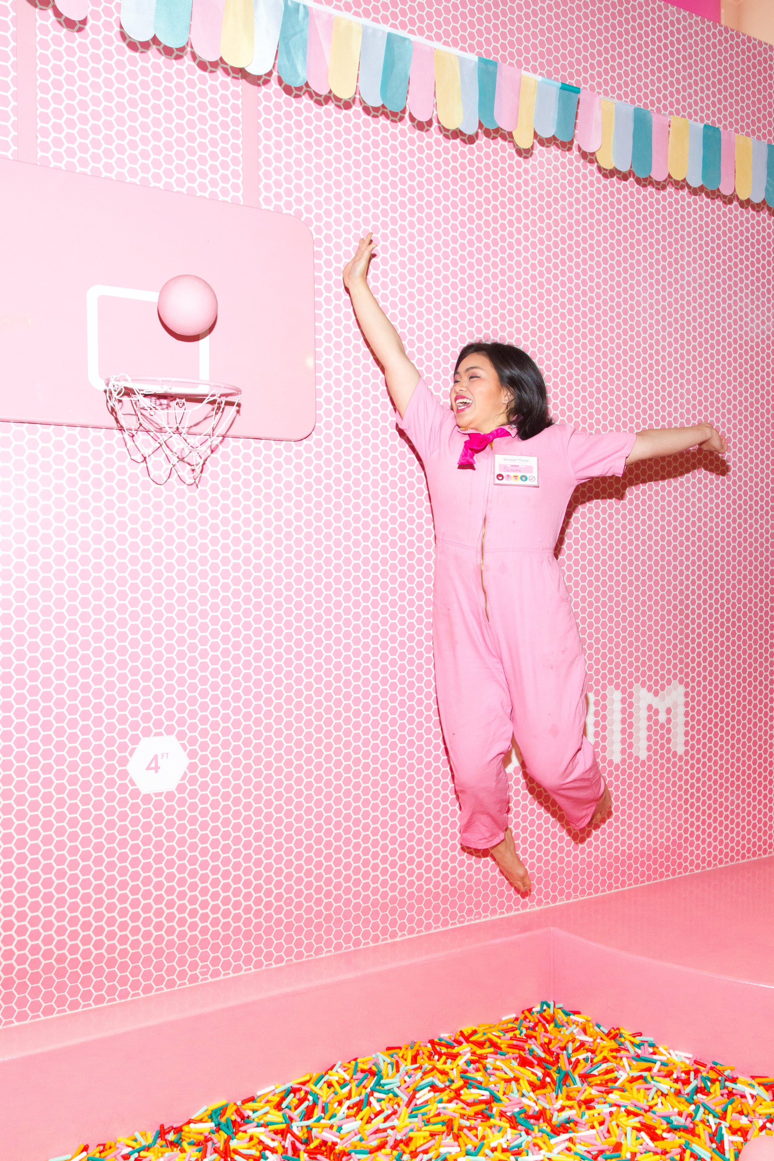
About halfway down lower Broadway here in New York City, there is every weekend an excited crowd of young people queueing up to enter the so-called Museum of Ice Cream, one of a recent crop of “museum” installations that have popped up in cities across the world on topics as diverse as colour, illusions, candy and dreams. More than any special commitment to learning, what unites all these spaces is their uniquely photogenic environments: most feature surreally oversized objects, mirrored surfaces and playground elements like the ice-cream sprinkles themed ball pool above.
Despite some rather unconvincing rebuttal by some of their creators, these environments are first and foremost created to look good, as they say, on the 'gram. Indeed they are little more than armatures for a series of instagrammable moments. Architecture dissolved into a series of photographic backdrops, swallowed whole by media so that little else remains other than the obligatory fire exit signs. They are, for me, a strange sign of our times.
The tension between architecture as image vs architecture as experience has existed for as long as photography and mass media, with the work of certain “starchitects” like Zaha Hadid and Frank Gehry long coming under fire for being better experienced as a photograph than an actual place to exist in. This debate has taken on a whole new dimension however as slowly but surely every person on the globe has begun to carry with them an internet-connected camera at all times. The ability of a powerful image to spread virally across social networks at incredible speed means that it makes business sense to spend a lot of design time thinking about how a space might be photographed and shared, such content after all being the cheapest form of marketing there is.
Design beyond architecture is has also not been immune to this change. The phenomenon of “yassified” design, perhaps best exemplified by the viral success of the squeezy olive oil brand Graza demonstrates how products of all kinds must pose for the camera now. With outsized rewards for those that crack the code of the most shareable image, this aspect of the design challenge risks becoming where nearly all our effort goes.
Amidst all of this, it feels important to make an appeal for the aspects of design that don’t make it onto a feed. The craft and the details that the camera can’t capture. Sooner or later any image loses its lustre and as designers we should remember that, and design accordingly.
Design takeaway: How well does your design perform off-camera?
📕 One of my favourite architecture books Experiencing Architecture by Steen Eiler Rasmussen makes a passionate case for the parts of design you cannot see, but still feel
Object: Claude Glass
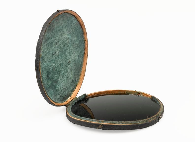
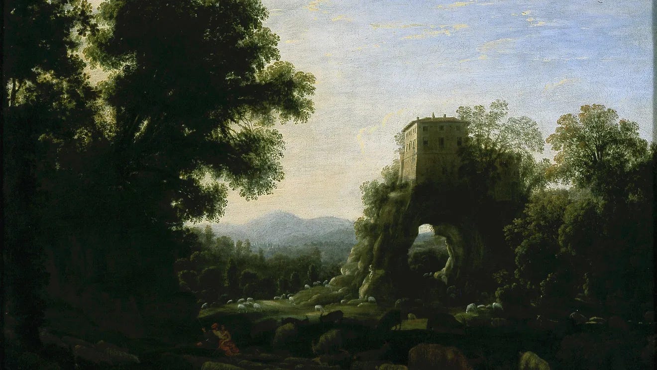
If you had visited a natural beauty spot in England in the late 18th or early 19th century—say the Lake District perhaps or Cranborne Chase—you might have been surprised to discover fellow tourists and even artists standing with their backs to the view, and instead peering at the vista through a tiny dark-glass mirror in one of their hands.
This strange accessory was known as a Claude Glass and its purpose was to present the viewers with an idealised version of the landscape they were in. Named after the painter Claude Lorrain, whose romantic and dreamlike paintings were highly popular at the time, the mirror’s darkened surface rendered the scene in the same style, deepening shadows and reducing the tonal range. The power it gave the holder of the glass was to see anything as if it had already been painted by a great artist. To turn anything in the world, in other words, into a work of art.
The parallels between the workings of a Claude Glass and the contemporary explosion of smartphone filters is perhaps obvious. One way or another, as we flip though the range of vintage filters on Instagram, we are engaged in the same act, of raising the reality before us to the level of art, or perhaps just a dream. To scroll through a feed of filtered images on a social media platform is to see reality heightened, made unrealistic and more magnificent than it really is. If you forget how stage-managed these feeds are it can be easy to feel inadequate when your gaze lifts from the screen to survey the unmediated and comparatively rather raw circumstances of your own life.
So it is that filters have become associated now with a kind of vanity, an airbrushing of real life so that it might better conform to a punishing external aesthetic standard. Even more so since so much of what is shared on social media platforms deploys a filter over our own image as much as the rest of the world. It’s well known now that plastic surgery clinics are filled with people requesting elaborate procedures to make themselves look more like they do when under the influence of a filter. Life attempting, rather sadly in this case, to imitate art.
Maybe it’s just me but for all the negative baggage the digital iteration of this technology has brought with it, I remain intrigued by the idea that there might be some positive dimension to overlaying reality. The Claude Glass, a comparatively crude technology, seems to me not to serve our vanity but to help us see the world more generously and artistically. I would like more technology that does that, please.
Design takeaway: How could your design help people see the world in a different way?
👓 In Design Lobster #127 we looked through some strange spectacles designed to cure motion sickness
Enjoying Design Lobster? Share it with a friend, colleague or fellow designer 🤲🦞
Quote: “I am a camera with its shutter open, quite passive, recording, not thinking.”
– Christopher Ishwerwood, Goodbye to Berlin
The famous opening lines of Christopher Isherwood’s 1939 novel Goodbye to Berlin felt like an appropriate way to end this week’s issue. Every design process can benefit from moments where, like Isherwood, we simply observe what is in front of us without judgement. Always harder than it seems.
Hope you notice something interesting this week,
Ben 🦞
Elsewhere…
💙 The rise of the Neo-Romantics - a timely and urgent piece by Ted Gioa: Putting the brakes on tech overreach will require a whole new worldview. And it will resemble the old Romanticism—with its advocacy of human priorities in the face of algorithms gone wild.
🏡 Brad Wood’s Digital Garden - this wonderful website is full of inspiration for your next digital design project.
🤖 ASCII image generator - Lots of fun to be had here to turn your pictures into strings of 1’s and 0’s.
🌈 Dan Friedman at Superhouse - If you’re in the New York area I can highly recommend this peek into an under-celebrated designer’s exuberant creativity. Ends 22nd March.
Enjoyed this week’s Design Lobster? Let me know by clicking the heart button ❤️
👇
Really liked this essay as it is thought-provoking. Interesting how social media is affecting design. Also one thought I have in response to filter is that, in a sense, filters have always been with us down the ages: artists and writers have always presented the world to us through a filter. Today, tech has democratized filters, and everyone carries one with them. But, the filters are no longer unique to the user, as everyone has the same set of filters. (Artists and writers, of course, have their unique filters, and hopefully what they filter will still be seen by the rest of us.)
I really liked your plea for, 'more technology to help us see the world more generously and artistically'.
Keep pleading...please