It’s kind of a blue week at Design Lobster HQ. We’re admiring a cerulean scientific instrument and and examining some distinctly bright blue porcelain. Let’s indi-go! (sorry couldn’t resist that one…) 🔵
Question: What is a cyanometer?
The enchantingly named cyanometer is a scientific instrument used to measure the blueness of the sky. It was invented in the 18th century by the Swiss physicist and geologist Horace-Bénédict de Saussure, who was also known for his pioneering work in alpine geology.
The cyanometer consists of a circular card with 53 shades of blue, ranging from white to dark blue. The card is held up to the sky and the observer selects the shade that best matches the color of the sky. The resulting measurement provides a qualitative indication of the amount of moisture and dust in the atmosphere.
The cyanometer was used by Saussure and other scientists of the time to study the properties of the atmosphere and the behaviour of light. A full scientific description of how different particles affected sky colour would await the 19th-century British physicist Lord Rayleigh, whose discovery of so-called Rayleigh scattering finally solved the mystery.
Thanks to reader Claudia for sharing this device with me!
Design takeaway: Could you use colour more precisely in your design?
📘 Maggie Nelson’s book Bluets has many more wondrous examples of blue objects within its pages
Enjoying Design Lobster? Share it with a friend, colleague or fellow designer 🤲🦞
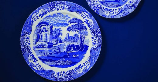
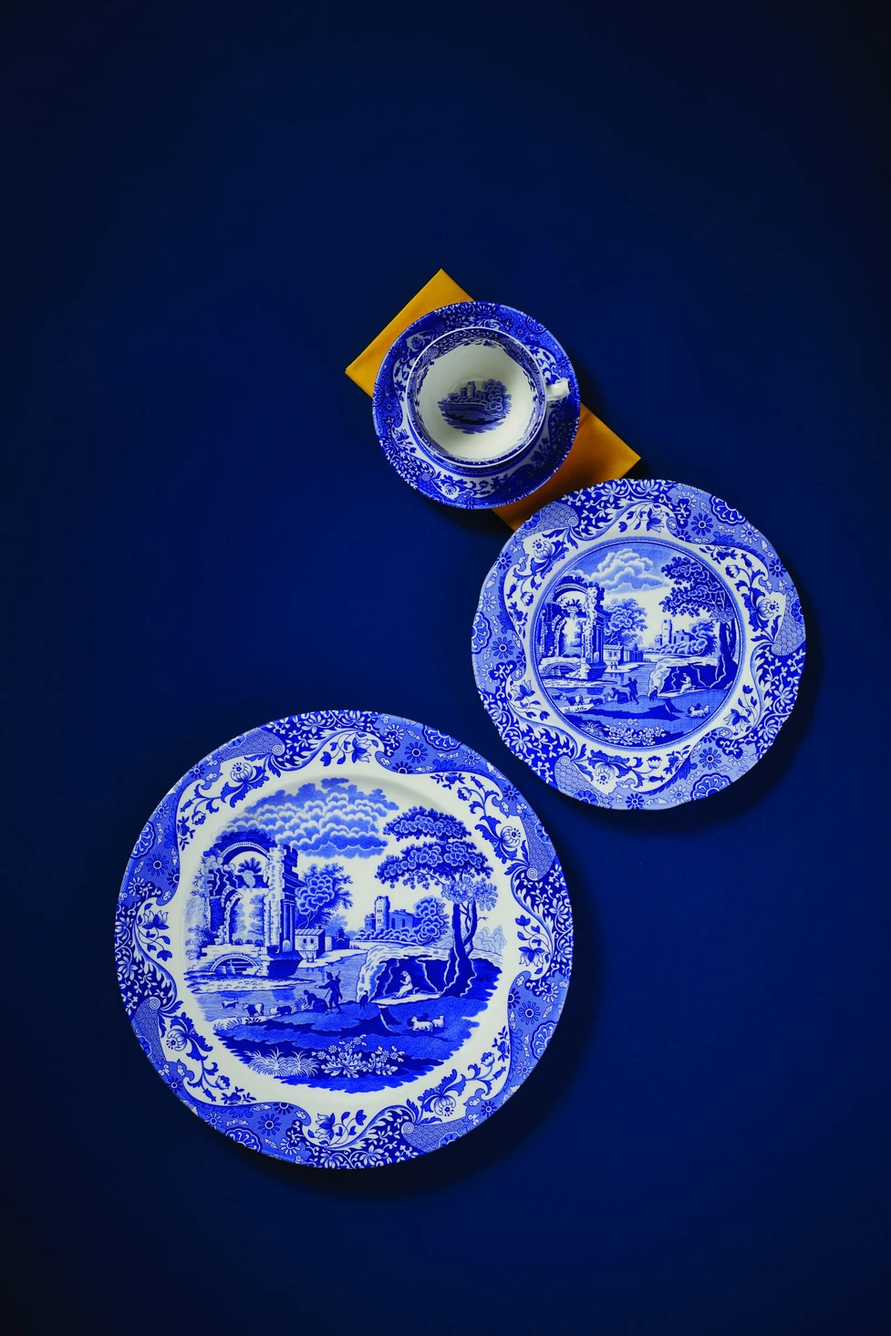
Object: Spode “Blue Italian” porcelain
This distinctively British ceramic pattern might be familiar to lots of you reading this. Known as Blue Italian, or Spode’s Italian, it was launched by Stoke-on-Trent pottery manufacturer Josiah Spode in 1816. The design combines an elaborate decorative border based on a Chinese Imari design with a bucolic classical scene where a shepherd and shepherdess tend their flock beside a ruin. Incidentally, it’s not to be confused with so-called Willow Pattern, which shows a Chinese rather than Classical scene
Each piece is made using a transfer printing process, in which the design is first printed onto tissue paper from an engraved copper plate and then after transferred to the porcelain using soap and rollers. The exact composition of the blue dye used for printing is kept secret. However, it is believed to be a cobalt oxide pigment that is mixed with a glaze.
There had been a long-held fascination in Europe with Chinese blue and white porcelain and Spode’s choice to bring together these distinctively Asian colours with a Classical theme was commercially savvy, making it feel at once new and familiar. A hit ever since launch, the pattern has now been in continuous production for over 200 years.
Design takeaway: How could your design mix themes to create something original?
🍽 Mesmerising production-line footage from Spode factory in Stoke-on-Trent, England
Quote: “If you see a tree as blue, then make it blue.”
– Paul Gaugin, Artist
I like the reminder in this quote to stay true to our own senses, rather than received knowledge. Being able to see things as they truly are, rather than how we are told they are, is the foundation of creativity and unlocks new possibilities when designing.
Have a great week,
Ben 🦞
Enjoyed this week’s Design Lobster? Let me know by clicking the heart button ❤️
👇


This is my first time reading your substack, interesting stuff!