This week’s Design Lobster is a design symphony. We’re exploring the surprising history of music visualisation and admiring an icon of album cover design 🎶
This week we crossed our 4,000th Design Lobster subscriber! A warm welcome to all the new readers who’ve joined recently 🦞
Question: Who invented music visualisation?
My introduction to the world of music visualisers came as a teenager booting up iTunes sometime in the late noughties. Whatever angsty indie pop I was into at that time was suddenly accompanied by a surprisingly hypnotising display of digital fireworks. Though the rather cosmic aesthetic didn’t always seem to jibe with what I was listening to there was nevertheless something satisfying about seeing the graphics react precisely to the beat. Originally created by Robert Hodgin for Boston agency The Barbarian Group, Apple purchased the rights to the code used to create the visuals and debuted the visualiser with iTunes 8 in 2008.
The advent of personal computing in the 80s ignited interest in the technical challenge of converting audio waveforms into computer graphics. The first commercially available music visualiser (and a spectacular commercial flop) was the Atari Video Music—yours for $169.95 in 1977. I love this quote from Atari engineer (and inventor of Pong) Al Alcorn, that speaks directly to the psychedelic quality of the visualiser genre:
"When the Sears guvs came by we'd hide them in the back room. Well, Bob Brown had designed Video Music, our weirdest product ever. Hook it up to your stereo and TV at the same time, and the sound triggered some pretty psychedelic visuals. The Sears guys took one look and asked what we'd been smoking when we did that. Naturally, one of our techs lit up a joint and showed them.
—Al Alcorn, from this interview. Fun fact: he also hired Steve Jobs to Atari in 1974 🤯
The desire to bring music to life visually extends back further than the digital era however. A recent internet rabbit hole took me deep into the world of colour organs. A genre of music instrument that had its heyday in the 18th and 19th century, and featured all manner of ersatz techniques to turn streams of audio into visual phenomena.
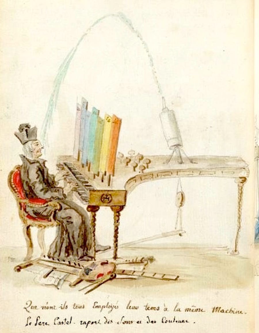
The earliest known example was the Ocular Harpsichord designed by Jesuit priest Lousi Bertrand Castel in in 1725. Castel's harpsichord had a complex mechanism that associated each musical note with a specific colour, using a system of coloured panels illuminated by candles. When a key was pressed, corresponding shutters would open to reveal colored glass or silk, thus "playing" colours alongside musical notes.
We designers are form-givers, giving concrete shape to concepts and ideas that otherwise exist more blurrily in our minds. Music visualisation is one of the more creative branches of this form-giving and thus an especially rich one to draw lessons from. When designing it is always worth questioning how you could be engaging more of your audience’s sensory powers, and indeed combining them in ways they might not expect.
Design takeaway: How could you bring your design to life by fusing different senses?
Enjoying Design Lobster? Share it with a friend, colleague or fellow designer 🤲🦞
Object: Dark Side of the Moon vinyl cover

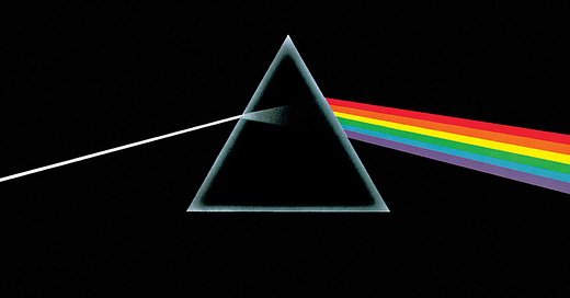
Pink Floyd’s Dark Side of the Moon regularly tops lists of the most iconic album covers. Featuring an arrestingly simple image of a prism dispersing light into a spectrum of six out the seven colours of the rainbow (indigo is missing) against a black background, it manages to convey something enigmatic but profound about the music within. With no title, track list or band name to be seen, the design is a lesson in restraint and as a scientific image also has a timeless quality that other albums from the era (typically featuring shaggy-haired 70s rock stars) don’t possess.
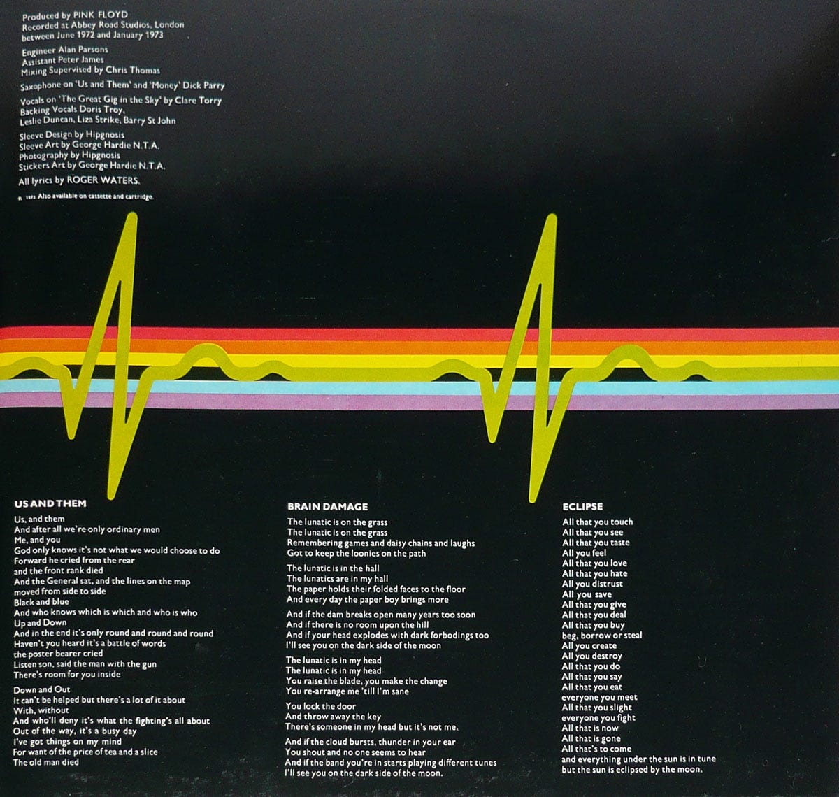
Hipgnosis’ founders, Storm Thorgerson and Aubrey Powell, came up with the concept for the cover in a flash whilst working in their Soho studio, and their colleague George Hardie did the detailed design work, using a school science textbook diagram as a reference. The spectrum of light wraps around into the inner sleeve where in another flash of inspiration the Hipgnosis team had the idea for the green wavelength to split into a heartbeat. Prog Rock angst and ennui encapsulated.
Nowadays, with most consumption of music occurring digitally, album covers don’t have the same cultural force that they used to so Dark Side has an enduring visual power that is unlikely to be equalled. The album went on to sell 65 million copies making it one of the best selling albums of all time. It recurs frequently in popular culture, even now and again in political demonstrations. According to the recent Netflix documentary about Hipgnosis the prism splitting light has also, over the years, been a consistently popular tattoo. Who knew.
Design takeaway: How could you condense your design into a single powerful image?
Quote: “Less is more and more is more. It’s the middle that’s not a good place.”
– Paula Scher
I wanted to include a Paula Scher quote this week because her design work for the music industry is some of the best. She was hired in 1972 by CBS Records and became celebrated for the hundreds of record sleeve designs she designed there and in her career after. This article tells the story of a delightful Charles Mingus cover she designed when she was 24.
Have a great week,
Ben 🦞
Elsewhere
I learned about the interior design trend of piping in Kelsey Keith’s latest dispatch (very worth your time). Here’s a lust-worthy duvet with an exquisitely piped edge by Sutram.
Reader Mike Sizer shared his very cool Figma plugin Dynamo with me which is designed to help you visualise the effect of Dynamic Type on your UI. Try it here.
Lochie Axon’s delightfully interactive homepage for Family is a tour de force 🙌
Bram Naus is on fire lately sharing fresh (and free) typefaces on X. Follow him here.
And lastly, a design remix…
Enjoyed this week’s Design Lobster? Let me know by clicking the heart button ❤️
👇


Love reading about her process. So 😎
Nice story