This week’s Design Lobster is deep in thought. We’re exploring the concept of a ‘slow hunch’ and admiring some Infospaces that creative individuals have made for themselves over the years. Get your thinking cap on and dive in 🧠
I’m really happy to announce that this week’s issue is sponsored by Fabrie. Their message continues below…
Stable Diffusion + GPT4 on a Collaborative Whiteboard for Designers
Want to incorporate AI into your design workflow, but don’t know where to start?
Want to turn your ideas into images and render sketches within seconds, but hate copying and pasting from app to app? Want to use ChatGPT to generate tables and mind maps, but hate switching tabs all the time?
Fabrie is an AI-enabled collaborative workspace made for designers! We've integrated Stable Diffusion, ControlNet, and GPT4 onto a canvas. Fabrie is where you can use all your favorite AI tools visually to iterate and ideate with teams.
Question: What is a slow hunch?
In a world characterised by instant gratification and quick results, I was interested to read recently about the concept of a ‘slow hunch’. This term describes a species of vague idea that clarifies only over time into an important insight or innovation. In the words of science writer Steven Johnson:
“Most hunches that turn into important innovations unfold over much longer time frames. They start with a vague, hard-to-describe sense that there’s an interesting solution to a problem that hasn’t yet been proposed, and they linger in the shadows of the mind, sometimes for decades, assembling new connections and gaining strength... But that long incubation period is also their strength, because true insights require you to think something that no one has thought before in quite the same way”
—Steven Johnson, Where Good Ideas Come From
Research has shown that the lengthy incubation of a ‘slow hunch’ has three specific benefits. Firstly it simply allows more connections to be made with the existing knowledge networks in your brain, so you can approach a particular problem from different angles. Secondly, carrying an idea for a while can also lead to selective forgetting, which helps release your thinking from a conventional pattern. Lastly, these processes set the scene for a restructuring of the original problem that might lead to a dazzling insight or original idea.
There’s no way of knowing in advance which of our hunches might contain an important insight, and which will lead to a dead-end, so the only way to make progress is to keep dwelling on them over time. Sometimes it can be easy to dismiss trains of thought that don’t yield immediate resolution, but we should be more patient with ourselves and give those half-formed ideas a bit more time to grow.
Design takeaway: What hunches do you currently have about the problem you are working on?
🤔 In Design Lobster #108 we explored abductive reasoning and its role in the design process
Enjoying Design Lobster? Share it with a friend, colleague or fellow designer 🤲🦞
Object: Infospace
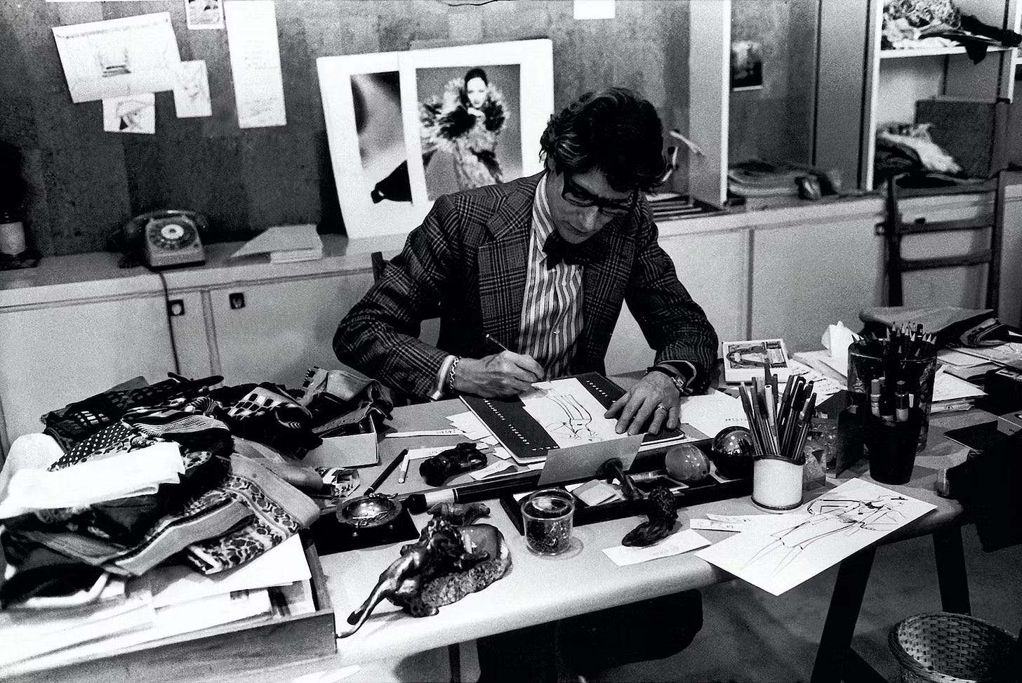
I’m stretching the definition of ‘object’ a little this week to talk about a special type of environment that people doing creative work are often found in. An Infospace might take the form of a messy book-strewn study or a studio plastered with sketches on every wall. Think Einstein’s study or Rosa Bonheur’s workspace.
These kinds of spaces have an important role in facilitating their occupant’s creativity, allowing connections to be made between different ideas and and enabling an artist, scientist or designer to ‘pickle’ themselves in inspirational material as they carry out their work. Having information arrayed around you in space physically activates more of our brain, which makes us more engaged with whatever it is we’re trying to solve.
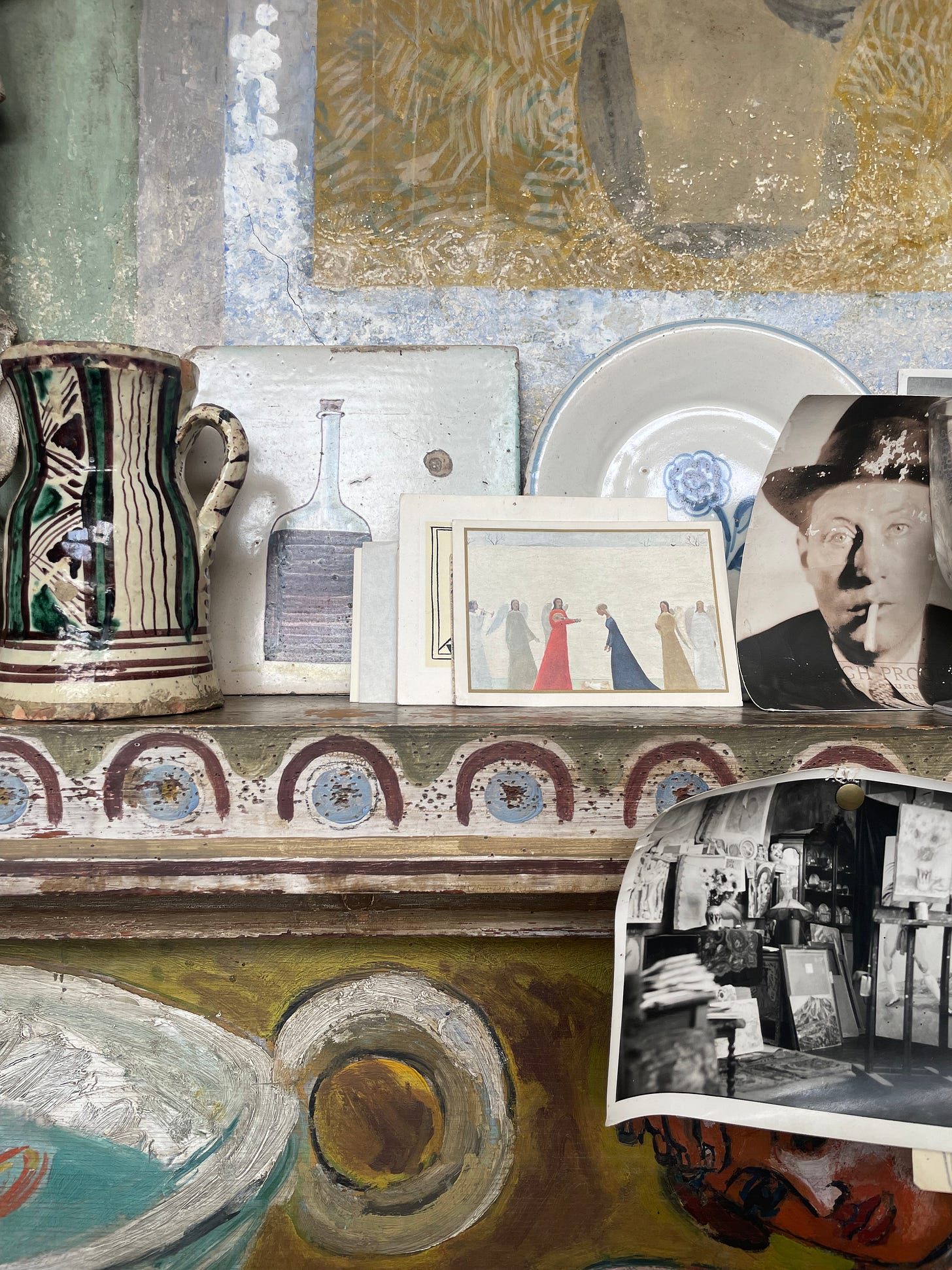
Earlier this year I visited Charleston in Sussex, where modernist artists Vanessa Bell and Duncan Grant both had studios. The entire house is an intense kind of Infospace, where the paintings, sculpture and paraphernalia served to encourage members of the Bloomsbury Set to ever greater creative heights. Walking around, you began to feel a different way of seeing things come over you – simply from being surrounded by so much interesting stuff.
Several online writers have raised the possibility that new technologies like Apple’s headset might allow us to overlay the real world with virtual infospaces, getting the benefit of a unique environment for each project, no push pins required. For my part, I think just having one or two nice things on your desk can often be enough to take your mind to new places.
Design takeaway: What would be on the walls of your Infospace?
🖼️ More pictures of Charleston in this gallery
Quote: “Have you ever tried multiplying roman numerals? It’s incredibly, ridiculously difficult. That’s why, before the 14th century, everyone thought that multiplication was an incredibly difficult concept, and only for the mathematical elite. Then Arabic numerals came along, with their nice place values, and we discovered that even seven-year-olds can handle multiplication just fine. There was nothing difficult about the concept of multiplication—the problem was that numbers, at the time, had a bad user interface.”
– Bret Victor
I think about this quote from the designer and technologist Bret Victor a lot. There’s something tantalising about the notion that there may be many activities we find hard today simply because we haven’t found the right interface yet. I’m excited about the new ways to think that lie ahead as our tools get better and better.
Have a great week,
Ben 🦞
And lastly, a design remix…

Enjoyed this week’s Design Lobster? Let me know by clicking the heart button ❤️
👇


