For Design Lobster #101 we are taking a saunter down the boulevard🚶♀️From a fascinating example of system-shifting design on the streets of Sydney to a new piece of street furniture in London. Lace up your boots and let’s explore… 🥾
By the way, thanks for all of you who participated in my short survey, the answers you gave were really illuminating and have given me lots of ideas for where to take Design Lobster in 2022!
✨Enjoying Design Lobster? Please share it with a friend, colleague or fellow designer.
Question: How might we “design out” crime from streets?
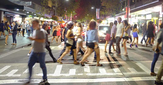
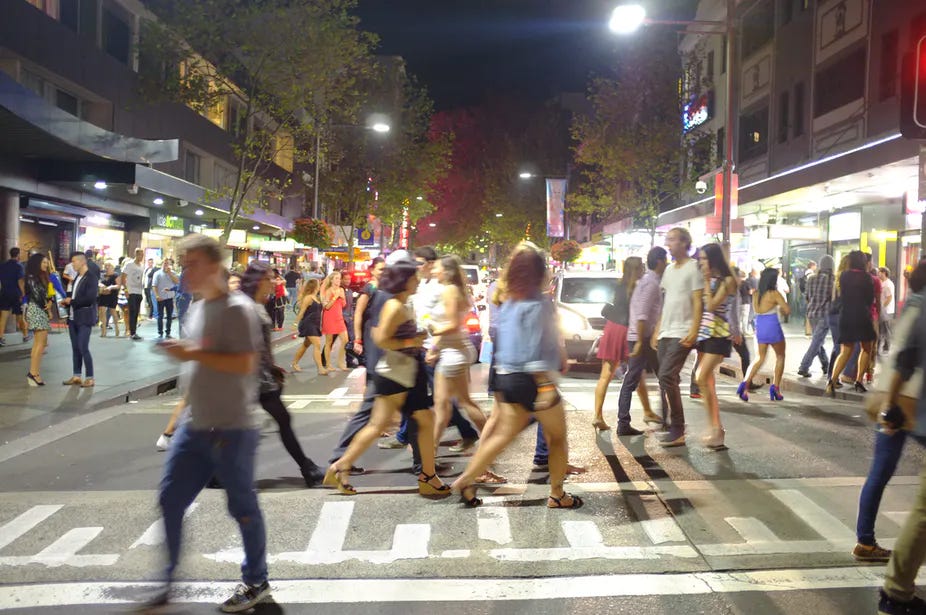
The Kings Cross area of Sydney is well-known historically for its colourful nightlife, but a rising number of violent crimes in the early 2010’s, including scary “one punch” attacks, led to the implementation of the so called Lockout Laws in 2014. These mandated stricter regulations around the sale of alcohol and closing times, and were accompanied by a heavier police presence in certain areas. Though effective at reducing anti-social behaviour, these measures came at a heavy cost to the viability of night-time venues and there was evidence that violence had just been transferred elsewhere.
Around this time, Kees Dorst and their team at the Designing Out Crime Research Centre were invited to explore alternative ways of reducing violent crime in Kings Cross. They observed the way that closing times resulted in huge numbers of people being discharged onto the narrow pavements with nowhere to sit, few toilet facilities and no public transport options besides an hour-long taxi queue. A recipe for frustration and tension.
In a leap of imagination, they reframed the problem instead as how to make Kings Cross “the best music festival in the world” – proposing food stalls, street entertainers, toilet facilities and better public transport options to promote a process of “unconscious sobering” among patrons leaving clubs and bars. The 2014 laws left the Kings Cross area a much less buzzy place than before, so the impact of these changes has yet to be truly tested. This project remains a great example nonetheless of the power of design to reframe a problem based on careful observation.
Thanks for reader Imogen for sharing the report that included this story!
Design takeaway: How could you shift the system you are working in with your design choices?
📄 This is the original report from the Design Council, a very thought-provoking read.
Object: UK EV Chargepoint
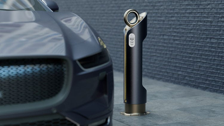
In November last year during COP26, the UK government announced a novel piece of street furniture that they loftily proclaimed as a new icon, ready to sit alongside the red Telephone Box and London Bus as a classic piece of British design. No small billing for an object only at prototype stage.
Designed by a team from PA Consulting and the Royal College of Art, the Chargepoint’s scalloped cylindrical form hosts an extendable power cable accessed by lifting and pulling the circular handle at the top, which lights up when charging. It’s designed to be accessible by those in a wheelchair and care has been taken over the tactility of the handles surfaces to ensure comfortable use.
For me, the design is strikingly conservative given the futurism of the brief. No doubt a very intentional choice given the ambition to install objects like these on practically every street in the UK in the next fifteen years. In response to why they haven’t gone for a brighter colour, like, say, red – the designers allude to this coming ubiquity. The vibrancy of an occasional red Telephone Box, might quickly become overwhelming on residential streets where there are likely to be at least five Chargepoints and probably more than ten!
Design takeaway: How do you prevent your design from becoming overwhelming?
⚡️ Watch the designers talk about the new Chargepoint
Quote: “…the street finds its own uses for things.”
– William Gibson, Sci-Fi author
William Gibson is a prolific author, whose many essays and works of fiction have explored cyberspace and cybernetics. I like the reminder of humility in this quote, which I think all designers should bear in mind when sending their designs out into the world. People will find their own surprising uses for the things we create and that’s something to celebrate and encourage.
Have a great week!
Ben 🦞
Enjoyed this week’s Design Lobster? Let me know by clicking the heart button ❤️
👇


Less booze more cruise is always a better option. The charging station is ugly.