#9 Indestructible clothes, telephone boxes & unhappy customers
Welcome to the 9th edition of Design Lobster. I hope you are safe and healthy. This week we’re looking into the future, and we’re looking into the past.⏱
Question: How might we make indestructible clothing?

Above: Vollebak’s Indestructible Puffer.
Preppers – that paranoid Silicon Valley gang of island or bunker buying billionaires – are looking annoyingly prudent given the current state of the world. A remote New Zealand hideaway (with a private jet to get there) doesn’t look like a bad way to spend lockdown if you ask me. But in the absence of that we could perhaps turn to Vollebak, an American company founded by identical twin brothers Steve and Nick Tidball that makes high-end concept clothes that have the same survivalist instinct woven though every fibre.
The designers at Vollebak, taking inspiration from extreme environments in space and on earth (the twins are both ultra-marathon runners), have created apparel made out of exotic materials to endow them with properties such as photoluminescence or steel-like strength. We tend to think of clothes as, even if not exactly throwaway, certainly as things that have a shorter lifespan and lower durability than the cupboards and buildings that contain them. Vollebak however think of clothing as a kind of microhabitat – that in itself should be able to meet your needs for shelter, sleep and perhaps one day even sustenance.
It’s a vision of human life that sees us as mammalian extremophiles, and has all too evident dystopian characteristics. And I think the myth of absolute autonomy it sells is ultimately ironic, because the manufacture of such a high-tech object is dependent on an international web of supply chains that would be the first casualty of any half-decent apocalypse. Back to the bunker then?
Design takeaway: What conditions can your design withstand?
Enter the Prepper fantasy here.
Object: Telephone Box

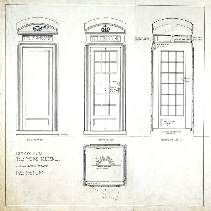
Above: Giles Gilbert Scott’s original 1924 telephone kiosk competition entry.
In the nearly 100 years since it’s invention, the red telephone box has become an icon of design and a cliche of Britishness. Over the course of the 20th century it went through a number of iterations (from K2 to KX in the 80’s) before the line was discontinued in the 90’s with the widespread availability of mobile phones.
There are some nice details in the original cast-iron design, I like the the slight elevation the podium gives to the caller and the ventilation grille punched out in the shape of a tudor crown. Gilbert Scott had intended for the box to be painted silver but the Post Office insisted on their signature red. But perhaps most surprising of all however is the inspiration for the overall form of the kiosk, which was in fact borrowed from the tomb of another architect – Sir John Soane – shown below.

Above: The Soane family tomb in the churchyard of St Pancras Old Church.
Designers choosing to disguise objects as something else always piques my interest (see issue #8) so I’ve been thinking about why Gilbert Scott might have chosen a tomb as the template for this new piece of street technology. At the time of the competition, various telephone box designs were already in existence and they had something of the quality of a confession box, with wooden joinery and pitched roofs.
In comparison the Gilbert Scott design confers a kind of monumentality and dignity to the act of making a phone call that I imagine the small-c conservative competition board would have liked very much. With the basic cuboid form set, as it were, in stone the main design event here is the roof. Gilbert Scott’s squared-off dome strikes a note of imperial grandeur and cleverly side-steps the preposterousness of placing a tiny full dome on the box.
Design takeaway: Could your design make something ordinary seem monumental?
Trawl the history of the phone box here.
Quote: “Your most unhappy customers are your greatest source of learning.”
– Bill Gates
It hurts when people don’t like something you’ve slaved over, and the temptation psychologically is simply to dismiss their point of view. We would be advised however to pause and let it sink in. The truth is you’ll never learn as much from someone you’ve already won over compared to someone you haven’t. That gap between you and them is often fertile ground for improved understanding and new ideas, so the wider the better.
Keep learning. 🦞
Has this email been forwarded to you? Sign up below.


